Wines also have interesting typography to them, although
they can be categorised as mainly being san serif and serif they also have
qualities which make them look and feel similar yet different at the same time.
I looked at the wine selection from Tesco to see how their typography is used.
Most of the typography I found on the wines are serifs. I
think this may because wine has a very long tradition of thousands of years and
through its creation and production for customers comes the usage of the old traditional
typefaces such as gaelic or gothic style fonts.


According to designer Sarah Hyndman, typography can also be
used for different purposes in order to attract and sometimes manipulate a customer’s
view on a certain wine or brand. Typography can be used to describe the taste
of wine, how strong or light it is; emphasise certain aspects of types of wines
e.g. red wine form white wine or rosé etc. For example, usage of bold and often
‘manly’ types of gothic serif typography can be associated to the strong,
bitter dark taste of red wines, whilst usage of softer and more cursive type of
serif type can be associated to rosé or white wine on the other hand. However, from
what I’ve found this isn’t always the case as cursive and soft typography were
also used for a lot of red wines such as ‘Red Burgundy’ and ‘Viña Albali Grand
Selleccion’, though the majority of them are very strong and both serif
typography as well.


Typography can also be used in order to change or manipulate
a customer’s perspective and price outlook of a wine. Traditionally, ‘Old World
Wine’ as said by Hyndman use busy typography with lots of illustrations and
colours and strong type in order to emphasise the richness of the wine but it
also signifies to the customer that it is ‘expensive’ wine as often we
associate serif fonts with authenticity and long history thus better quality
wine. In addition, it may also make the customers feel rich themselves as wine
can be associated with class and pompous. ‘New World Wine’ on the other hand
focuses more on modernity and has more minimal aspects to it in my opinion
which in turn can attract a younger more contemporary audience. I’ve also seen
that although the ‘New World Wines’ such as ‘Louis De Camponac – Cabernet Sauvignon
2017’ use a serif font and is from France (Old World) has a milder use of the
serif typography making it look more youthful and approachable to the younger
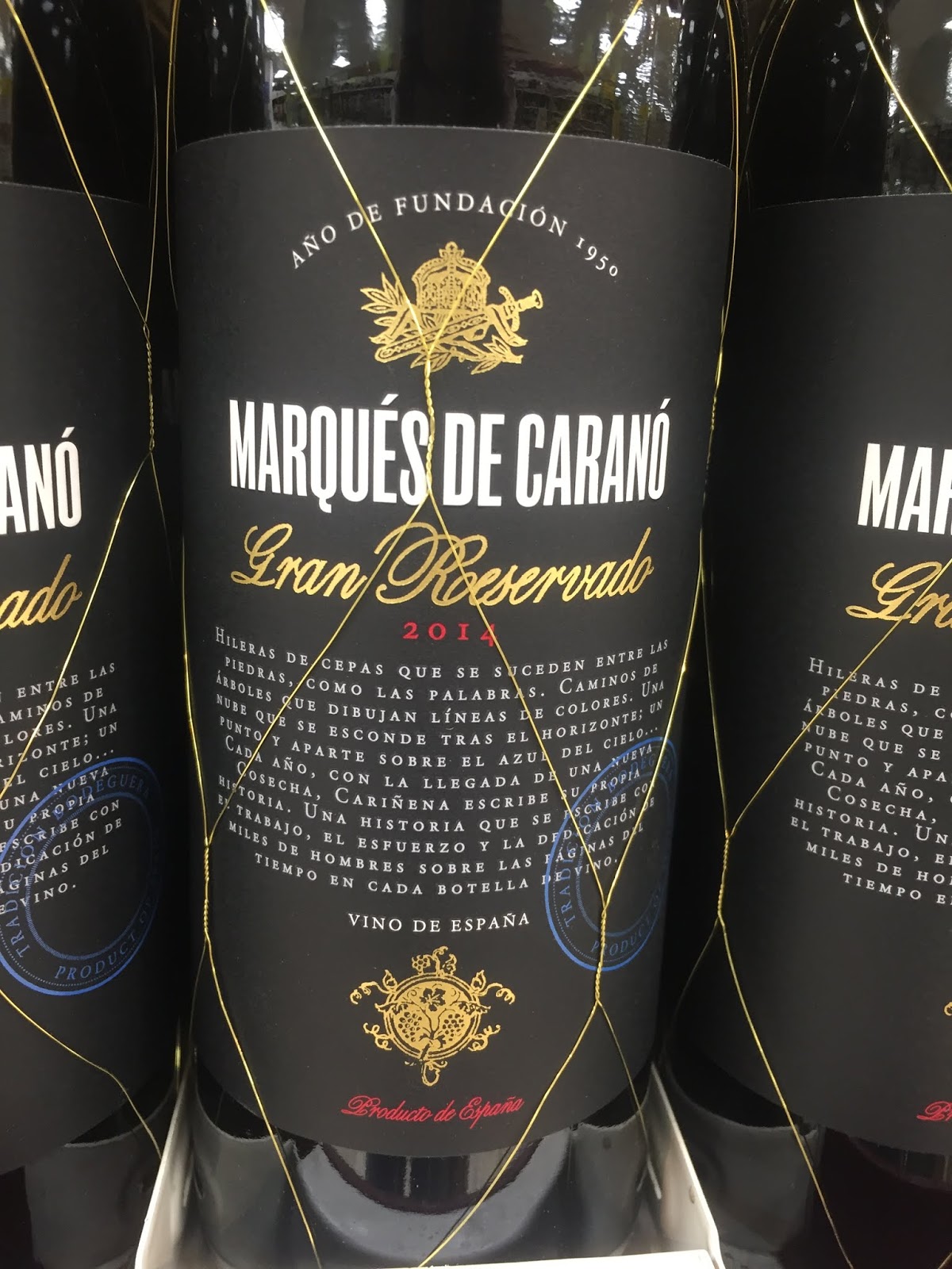
market. Details such as use of wide kerning e.g. ‘Barolo 2014’ creates a clean aesthetic
as well as elongated typography such as ‘Marqués de Carans’ adds a subtle
modern tone to the wine.


I think overall, the use of typography for wines is very
important to its taste, price and customers like Hyndman has said as there are many
different types of wine, typography will can help identity each wines characteristics
as well as help them sell to the customers. I also think that the usage of
typography to these wines are very effective and are very fit for their purpose
as they are able to sell and attract customers just by being read from the shop
shelf according to maybe how they look and feel and how relevant the typography
and design is in accordance to their description.
- https://www.digitalartsonline.co.uk/features/typography/how-wine-label-design-typography-really-influences-how-it-tastes-sarah-hyndman/