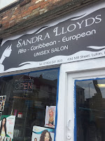
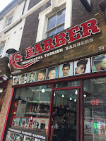
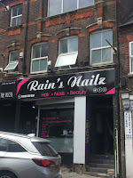
To start the research for this module, I looked at some of the most obvious typography that we see everyday which are shop/restaurant name signs/boards. I looked and took photos of the shops around the town centre of my town, Luton.
I noticed there were a lot of hair and beauty shops around the area which I never realised before. They also have different typographic styles some opting for more cursive and serif typefaces whilst some opted for san serifs. Some of them like 'House of Beauty' and 'WOW hairco' mixed both serif and sans serif/ cursive/ handwritten typefaces which I don't think really worked because it makes logotype look disjointed and the clashing type makes it look harsh. However, maybe to make it better using a softer sans serif type would've been better to balance with the fluid characteristic of the cursive typefaces that have been chosen. Although, considering that the shop owners may not have much or any knowledge about typography, the leading and kerning of some of the letters and words may not have been considered with added to the sloppiness and unprofessional look of the logotype.
In addition, the colours used doesn't really scream 'hair and beauty' to me as they are quite dark and are dull, therefore it may not be as effective and does not attract customers attention, as customers may associate brighter and bolder colours to a 'hair and beauty'' shop which can also link their perception of how good the service is in the shop and the overall image of the shop itself.
Other shops that were
quite prominent were he restaurants and take away shops. There were quite a few
shops that specialised in chicken and I realised that they used similar
typefaces and colours for their logotypes. Most of them used large and bold
serif fonts in capitals as well as colours like red and yellow. This makes the logotypes
very recognisable and easy to locate within the town as they are competing
against each other and other shops as well. Using these typographic strategies
may make them more successful and attract more customers in. In addition, using
serif fonts is also quite effective as it represents the strong taste and
sensations customers feel when they eat the food e.g. the ‘crispiness’ of the
fried chicken.
I thin kin some places, shops wanted to look quite modern and professional such as 'THE BARRACKS' and 'THE STYLERS', though both shops use completely different letterforms the use of tight kerning is very obvious. This creates a compact look which may create a contemporary look for 'THE STYLERS' however, the serif on 'THE BARRACKS' such as between 'a' and 'c' make the logotype look sloppy and awkward.
I think overall the typography in Luton's shops are somewhat normal for a small town. Taking into consideration Luton's town aesthetic and make up, it is in need of regeneration therefore some of these shops may have closed down already or in poor condition. In addition, this may be why the typography in the town is bad and quite an eye sore, old and not considered enough. However, though colour and size may be considered in order to attract consumers, details such as type family, typeface, kerning and leading were not making most of the typography 'bad' in a professional view.


No comments:
Post a Comment