I've talked to some peers about my idea of possible making an app to spread awareness about this issue, however Jocel suggested that maybe it would be better if I would create a game or quiz, where the users would answer questions regarding various app features. I thought this would be a very effective idea in tackling my issue. Libby also added how it could also be quickly distributed across various social media sites, reaching its target audience (teenagers and young adults) as well as a a wider audience and demographic.
Before creating my quiz I need to pinpoint my purpose for it:
1) What do I want the target audience to get from the quiz?
- An estimation or answer as to whether they are addicted to social media or not
- An understanding of the features which makes social media addicting
- Perhaps, realise through the quiz the features which makes social media addicting.
2) What kind of information am I putting out?
- Informative information through the questions as well as result for the quiz
- Exciting and interactive interface giving them a good user experience (don't make them feel like they're wasting their time)
- Youtube
- Snapchat
These five apps may be quite similar and over crossover features however they are still varied in in their purpose and specific app details which I think would be effective to be used as references to the questions that I'm going to create for the game, as it can pinpoint form the general features to the smallest details that differentiate them from each other.
1) Instagram
- Weekly Push Notifications - notifications sent out about people you follow e.g. their first story etc. *Addresses you directly, thus making you want to click on it and go on the app.
- Stories - includes various face filters, animations and stickers (more varied than Snapchat), more aesthetically pleasing and easier to use. VARIETY *Appears in various places so you always see them and want to click, Automatically changes to another person's story u less you click 'X' or swipe away.


2) Facebook
- 'Splash Screen' - Loading screen for anticipation (slot machine like)
- 'Blue Interface' - Blue is used as it keeps you awake and is not harsh to look at for long durations
- 'Like' button - Dopamine trigger;

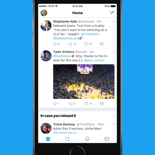
3) Twitter
- 'Loading Splash Screen' 'Spinning Wheel' - Appears when you slide down indicating new content loading, "variable ration schedule" Users will know that they will receive new content but not when, and what they will be seeing, making it more exciting and intriguing.
- Blue Colour Theme - *same as Facebook
- Retweet, Quote
- Limited characters each post
4) Youtube
5) Snapchat
I had another discussion with my peer (Libby) about my selection of app for the quiz, as I felt that as I was searching for their specific features, they were too similar and I was starting to feel like I was constricting myself. Libby also agreed, and said that it would be better if I did in on general apps instead in order to have a wider variety but also take into account that the audiences themselves may not use certain as as much as others (just like what I found in my survey tbh) and this way I'm not only widening the amount of features I can investigate but also not isolating audiences who may take the quiz.
Other features I found were:
- Infinite Scrolling
- Notification Sound
- Notification Number
- Minimal finger movements (layout is constricted and straightforward)
- Using hashtags - easier to reach goals
- 'Like'
A reference to my quiz was Adobe's creativity quiz that created some buzz before. I took the test again in order to get a sense of how the audience interact's with the quiz and it's features etc.


- Simple questions and limited answer options - making it straightforward, easy and quick
- Question Indicators - on the left hand side circle illustrations were filled in each time a question is done. Automatically, lets audience know which question they are on and when they finish the quiz
- Different background design each time - keeps each page fresh and making the audience anticipate for what's to come next
- Animation after each question relating to it - at first or me it was interesting but as I got into the quiz I skipped them as I wanted to finish it. But, this may also be because I have low attention span that they took long for me.
- Skip and Mute options - allows some control and flexibility for the audience - personalising the quiz
- Results - clear result satisfying the audiences goal to begin with.
- Share Option - distribution is clear as well, as it let' audience share the quiz for more people to participate in.
I think the quiz was really effective, it was easy to use and easily understood, the features were simple enough, however the animations may make it a bit long and frustrating to some (like me). In contrast, I also came across another quiz about social media. The quiz turned out to be really plain and looked like it was created from another quiz template making website. It wasn't really as exciting, although the questions were fairly interesting, the presentation was very boring and basic.
1) Which shade of blue does Facebook use ?
2) Which app uses this notification sound. (Snapchat)
3) What order does the features in Instagram go in (can be justified with how designers place the features in a certain way to minimise movement
No comments:
Post a Comment