Friday, 1 December 2017

Colour Theory Publication : First Crit

Today we had our first crit for our research publication on colour theory. I the criteria we were to display research we have made on three theories that we chose from theories either from Johanesse Itten's 7 theories from his book "The Elements of Colour" or Josef Albers' "Interaction of Colour".

During the crit, people have given me feedback on what I did well and what I could have done better and also suggested some things in which I could possibly use in order to develop my work further. I've noticed from the feedback's given to me that most people have given me very similar feedback such as:

  • "Sentences can be confusing at times..."
  • "sometimes slightly confusing separating certain sections of the paper order"
  • "good structure and relevant language used.."
  • "running colour scheme of emerald and pink coincide with the theory of complimentary"
  • "one way of improving your writing would be to say if it has been successful."
Looking at these feedback's and opinions from other people, I'm now able to incorporate a wider point of view which I can then use to develop my work further. Also, After reflecting on my work and reading people's feedback, I realised that my sentence structures may be too confusing and can sometimes 'too much'. This may be due to using very long sentences therefore I may  have lost rack of what I was writing or may have confused my opinions in my writing. Although, some people did say my knowledge and exploration of the theory were good and I have a "good understanding of the colour theories". 

I may also have to think about the layout of my actual publication as some people found it confusing while flicking through it. In addition, I also realised that may be I focused too much on the visual aesthetic of my publication that rather than the content that should be included in it in order for a viewer to understand a colour theory through my publication. Furthermore, I may also have to spend more time researching about certain aspects of my the three different theories that I picked in order for them to not coincide with each other, which may make it confusing for a viewer. I may also need to do more experiments and ideas in order to solidify my idea and make each theory separate from the others. 


I also had the opportunity to look at other peoples work, critiquing it, as well as get ideas from their work on how I could improve my own practice. Looking through other people's work, I've realised that I did not do enough in-depth analysation of my work and about how well or not well they went, how I can improve it and any other ideas I can take further. In terms of these, I think my writing lacked reflection, because if I did reflect on my work, I think I would've came up with ideas in which I can improve my work, therefore potentially having the time to do them before the crit. I will definitely do this in the next steps of the brief. I may also start incorporating examples such as the pieces of artwork that links to a colour theory in order for me to explain the theory better and it may also help with making the viewers understand the theories better.

In addition I may also:
  • Start documenting ideas more thoroughly through a series of images of my experimentations
  • isolate ideas in one page; clearer and cleaner layout as well
  • Don't cram pictures in one place
Thursday, 30 November 2017

First InDesign Induction

Induction for the basic techniques and basic understanding of how to use InDesign.
In Design is an industry standard page layout software for the commercial print industry.

InDesign can be used for:

  • books (covers)
  • magazines
  • publications etc.
  • designboards
*Columns - dividing the columns of text frames in the page
*Gutter - space between the columns 
*Margins - having the ability to consistently layout the text on each page
*Bleed & Slug - guides; more to do with the production of the publication.
Bleed - space at the edge of the paper (to do with trimming as it's very rare to actually print on paper which is the actual size. It's to compensate any inaccuracies in trimming (standard bleed is 3mm)
Slug - an area that sits outside the page and not part of the layout. It's useful for printer's marks (have to be printed but part of production process). It can be used for custom crop marks or fold marks for accuracy. 

*Document Setup - option to change the features that you have and applies it to every page.
*Pages - allows us to change the margins and columns on whichever page/s is selected.
*Layout - "" ""
*Facing Page - arrangement of pages directly corresponds to and reflect wha t he book will look like once the book is printed and bounded. Each end pages are single pages (front and back) --> "reader's spread" - how it'll look like when the reader's flip through it.
*Placeholder Text (Type menu)- allow us to investigate text formatting possibilities. 
*Cmnd+0 - fits the page page to normal size after zooming in and out
*72pt - roughly 2 and a half cm
*Auto leading is 120% 
*Kerning - spacing between 2 character (don't have to select the letters just put it in between the letter you want to adjust the kerning with.
*Tracking - spacing between more than 2 characters (select the letters) most likely to be applied on display sentences or words --> as type size increases the character spacing will appear looser; large font size text can benefit with tightening the tracking; smaller point size text will appear tighter and lost legibility, therefore it  may benefit in loosening the tracking.
*Linking Text Frames - click the small square on the bottom right of the text frame to link text together. 

*Photoshop preparation for InDesign 
  • Save image as tif. or photoshop - not  jpeg (lose of image quality), png
  • Has to be 300ppi (any lower than 300 can come out with lesser quality images)
  • Actual size
  • CMYK or greyscale

Subjective Colour (Idea Change)

Upon reading up on subjective colour its connotations and perceptions, I decided to change my idea for this theory (Subjective Colour).

My new idea is going to be based around shops which sells furnitures or particularly presents their furniture and home essential products in specific layouts which around the store. I'm going to focus on the shops use of colour and layout of their products and how they use harmonious colours in particular, or if they use harmonious at all.

From doing this i can hopefully observe if:
  • The shop uses harmonious colours in order to specify 'sets' of specific products
  • How the sets may affect customers who see the products
  • How the customer may feel in the environment 
  • Can the customer link certain feelings upon seeing certain colour schemes together

Subjective Colour

Johannes Itten has noticed how different people have various perspectives of what they deemed are to be harmonious colours. He noticed this while doing a lecture, when he asked his students to paint with preset colour combinations and students defying him saying, "We all think that the combinations that you assigned are not harmonious". Seeing this, Itten asked his student to paint with what they personally think are harmonious colours and found the variety of colour combinations that his students came up with.


Through this he found that each person can have their own perception of colour and they can associate certain colours and themes with different things, they have their own "private conception of colour harmony." Itten also pointed out that designers having their own personal 'subjective colour propensities" can "lead to misunderstanding and disputes, where one's subjective judgement  collides with another". Although this can often be saves with objective rules and observations e.g. using red for a butcher shop in order to portray the freshness of the meat being sold.

Looking at subjective colour in another point of view, different people an also see colour differently through scientific proves. Our brain's process differently depending on how the light bounce's off our eyes, therefore your perception of 'green' will be different with how your friend perceives 'green'. This was also proven by 'The Dress' that went viral on 2015 with some people perceiving it as blue while other's gold. Spoken language can also affect how people perceive colours e.g. Russian speakers have different word for dark blue (siniy) and light blue (goluboy), as well as Himba which is spoken in South-west Africa where they only have 5 categories for colour whereas 5.

These are just some areas which proves subjectivity of colour as we are shaped by our experiences, knowledge, culture which have influences in how we perceive colour.

The Dress

Wednesday, 29 November 2017

Contrast of Temperature

According to Johannes Itten's book 'The Art of Colour' he stated the differences between cold and warm contrasts. In his book he compared how cold and warm colours can affect people and people's senses psychologically and their subjectively views when they are put in a situation. He put people in a blue-green (cold) room and a red-orange room (warm) and found that people tended to feel a difference of 5-7 degrees between the rooms. This showed how blue-green can slow down circulation.

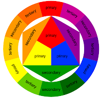
In the colour wheel we can see that the red-orange pole is the warmest and the blue-green in the coldest, however the line between what is cold and what is warm can become ambiguous as although the two opposite pole are warm and cold the hues in between them can either be cold or warm as they are contrasted with warm and cold tones.


Cold-warm property is also often described as opposites:

  • cold - warm
  • shadow - sun
  • transparent - opaque
  • sedative - stimulant
  • rare - dense
  • airy - earthy
  • far - near
  • light - heavy
  • wet - dry
The cold and warm contrast between colour is very versatile as it can also suggest distance e.g. in landscapes as distant objects can seem colder due to the constant air around.

Itten mentioned using a 12-hue colour circle in order to successfully achieve a cold-warm modulation  e.g. doing red-orange, orange, yellow-orange, red and red-violet, blue-green, green, yellow-green, blue, blue-green and blue-violet. If a full chromatic scale is to be done it can only be successful is all the tones are of the same brilliance otherwise there will be a noticeable light-dark contrast which can affect the chromatic gradation. 

Research on Emerald and Green

For this brief I was given the pantone colour 'Emerald' as a starting point for my project. I may take this colour as the focus of my project or it may only be a part of my project as it's only a starting point and something that we can work with in order to start my design process.

From the research that I did I've found that:
  • Emerald is hues are generally composed of yellow-green or blue green.
  • Only gems that are medium to dark in tone are considered emeralds
  • It is a birthstone of the month May as well as for the astronomical sign Cancer.
  • It was the pantone colour of the year 2013
Connotations and Meanings

The colour emerald has different kinds of meaning e.g. in cultures and religions:
  • Gem stones are often the sign of prophecy and hope to people
  • Ancient Egyptians believed that emerald stand for fertility and rebirth, meanwhile in China it was though that wearing green would bring you good luck especially if worn on Thursday's.
  • It was also thought to bring intelligence and eloquences on a person from different periods in the past e.g. in the Middle Ages, Ancient Romans in the 2nd century BC
  • It can also be seen as a sign of abundance, social class and royalty as it is often worn by royalties around the world such as Queen Elizabeth II, Ptolemy King of Egypt and Alexander the Great.
  • It's also thought that emerald (stones) contain mystical powers -> It has connotations to the Greek goddess Venus
  • It's also a symbol for unity in Islam and seen as the most natural in Christianity.
As the colour Emerald comes under the greenhouse I thought it was also applicable for me to research about the colour green and its meanings and connotations.

  • green in  secondary colour and is between blue and yellow.
  • Western culture associates the colour mostly with health, youth, nature, life, boring, hope and envy,  also more negatively with poor health and toxicity whilst in the East its viewed more positively with fertility and happiness. Its also used as a colour for safety (Green Cross, First Aid) and permission (green on traffic lights as an indication to go or green light indicating something is turned on).
  • It can be associated with love and sexuality - in  different cultures green have been used to identify certain groups of people e.g. prostitues in Ancient Chine who wear green headscarves, and Persian and Sudanese poetry describing dark-skinned women as "green' women to depict them as erotic. 
  • Green is also a sign for calmness and tolerance, it's also passive and neutral (e.g. the 'neutral' state on the pH scale).
  • It also has connotations with sickness and poor health - its often associated with poison in the west  as in the 19th century paints and pigments where very toxic as they are arsenic.
  • Green can also be associated with prosperity or having lots of money - the colour was often worn by bankers and merchants in 19th century in the United Kingdom. 


Monday, 27 November 2017

2 PM Crit for Design Principles

After generating ideas on our own we then had a critical where we share our ideas and get feedback from them and hopefully pint out how we can do it better and have new ideas to play with.

For my first idea of using the theory of contrast of temperature, I was suggested, as well as putting them on a warm and cold grid/spectrum I could also:
  • Arrange the different images in terms of hue or saturation which will then give me a series of images that i can put on pantone strips as part of one idea.
  • Make a map of the route and put the image on the map on where I found the image.
I agree with this suggestion as will definitely be something that I do as I think by doing these I am creating a broader series for one idea and will there give me a selection in which each pantone may look and feel different that another. I also think doing these suggestions will also help me generate more ideas whilst I do them as I may be think of other ways I can do them as well. 

For my second idea of using complementary contrast, I was suggested to  maybe not use leaves but instead use more artificial objects in order to get a more interesting result. I was also told to be more adventurous with it, therefore for this idea I was suggested to:

  • Maybe buy a morph suit and go around the are and take pictures in it while posing on different backgrounds.
  • Use clothes or your body with colour and take interesting poses on different backgrounds.
I think with these ideas I can probably take something interesting from it than only using leaves and scanning them in. I do think doing these as opposed to scanning objects in, makes the series more interactive and dynamic and will also give me a wider variety of unique photographs as well as usage of different kinds of backgrounds. However, I may not buy a morph suit as it cost quite a bit of money and may not arrive on time, however, I can wear a long emerald/green coat and take a picture in them on different backgrounds. I may also think of doing different poses with it on or maybe think of only having the coat on the picture to see the difference between the two.

For my third idea which I was having problems with as I was stuck on what to do with it, I was suggested to look at harmonious colours similar to what Johan Albers. They suggested:
  • For me to create 'harmonious series of colours' on different shapes and taking pictures of it and put it as a series (doesn't necessary be green or emerald)
  • From the colours and shapes that I have, get people to create their own 'harmonious colours' and I will then take pictures of it - maybe put in in context or give it a caption.
I liked these suggestions and certainly something I will try out. I think by doing these I'll be able to get a wide range of colour schemes and see what different peoples different interpretations of harmonious colours. I can also make this more interesting by not only using paper but also different materials if possible or maybe mix paper with different materials to have a more innovative series and photographs.