 |
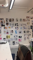
| Part of all our collage crit session |
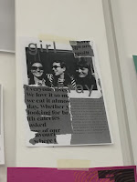
I like these designs as they have that kind of 90's grudge type of aesthetic to it with the overly sized lips overlaid on the face and the rotated title which is slightly cut up and the bright neon background. The image instantly becomes the focal point of the design and the bright background brings out the page more due to the contrast of the blacks and greys against the neon green. Also, the 'You've Got Mail' DPS design works as the title balances the body of the page as it's very bold and clean compared to the body that's very hand-made and cut and pastey.
I think this poster works quite well due to the dominant collagey cut out pieces of body text which contrasts the clean cut image and typeface used. It gives the poster a contrast between dynamic and static features making it look very interesting due to both features complimenting each other very well.
This poster caught my eye due to its colourful nature. The bright oink instantly stands out on the page along with the cropped images and is tied in very well with the simple title and sub-heading writing. I think the colours and images makes tis poster very playful yet simple at the same time.
I like this "Where have you bean?" poster as it's very simplistic. The thing that makes this poster work well is the stylised curved path the writing is going, making the poster look quite dynamic and involve movement with it. This is further reinforced with the slanted image which works very well with the title which makes both elements of the poster look like one. In addition, the contrast between the orange and blue-green works very well as both colours bring each other to its maximum vividness, almost.
These series of posters work very well due to it's very strong aesthetic. I lime the way they constructed their collage and ho they used different proportions of images and played with how pieces work together with each other e.g. the face and the mixtape image. They also added a hand-drawn element to their work which compliments the collage well.
Things that people did well which I can maybe incorporate to mine or experiment with:
- Scanning their collages and making it single colour to bring out the singular coloured images
- Incorporating hand-written or illustrative writing to my collage e.g. paint, fine liner, pen
- Not getting too caught up with using the existing systems but rather going against them and challenging their limits.


No comments:
Post a Comment