Friday, 8 December 2017

Grids Publication : Crit

Today, we had a crit for the grids publication that we created this weeks based on the different grid systems that we learnt and research about. During the crit, people have told me very similar things that I dd well and I could do better for my publication.

Some of the things people thought I did well were:

  • Having a "well organised and a good body of work" and "good body of writing for grids - shows an understanding..." as well as "I like the aesthetic of your collages, fit well with Roughtrade..." and "the transparent overlayed collage effects are pleasing too!"
I think I did well with creating a good style as a starting point for my publication and I could definitely improve and develop the aesthetic further by experimenting with all the grid systems that we studied about. 

Some of the things people thought I could do better were:
  • "negative space could be used as they are very full" and similarly "could show some more minimalistic layouts" and "use more greyscale" 
All of these comments were very similar and definitely something I realised I didn't do much in my publication. I will definitely do these suggestions as I think this would improve my publication further, by giving me a more varied type of structure and shows a broader use of the grid systems that we studied about.


Furthermore, other comments people told me were "could there be something to distinguish your work and research better". I don't really agree with this comment as I thought I have differentiated the research and my work quite well with the different paper stock and paper colours I used for my publication. I thought that by doing this it would be clear enough which one is my own creation and which ones are only research, however, if some viewers ay get confused, I think I will need to add more pages with could be transition pages in the publication in order to give a clear indication to the reader which one is which.

In addition, I also got a comment which is "..better single sided rather than having the pages stuck together". In contrast, I thought having them double sided would work better in order to create a fluid layout and structure for the reader where I could also match the grid system designs to the same ones; although to be fair it was my fault for having pages stuck together for accidentally printing them out one sided. Therefore, I may continue working with double-sided pages as I feel it would work with my working aesthetic better.


I also gave myself a list of what to do in order to improve my publication, based on the feedback my peers gave me which were to:
  • Use more greyscale collages
  • Use more negative space
  • Use grid and make collages which are more diagonal and dynamic.

Thursday, 7 December 2017

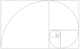
Creating the Golden Section on Illustrator

Yesterday, I learn to make the Golden Section grid on Illustrator by watching tutvid on Youtube. To make the Golden Section you need to create a 500 px by 500 px square first. Then, you will need to create a 1000 px by 1000 px circle, which you will then put on the square and cut the rest of the circle using the shaper tool.

After doing this, copy and paste the shape and on the with option of the shape divide the numbers with 1.618 as that is the ratio which fits.

Repeat the steps 7 times while also rotating the shape clockwise each time to complete the golden section grid.


Second InDesign Induction

Today we are in our second InDesign Induction where we look at how to create more complex grids that will help us with creating our grid research publication.

Hanging Grid 

  • We set a margin of 15mm for our A3 landscape page.
  • Layout --> Create Grids --> 6 Columns and 4 rows
  • Considering the gutter in relation with the margin; make the gutter half the margin (7.5 mm) --> Fit guides to Margins
  • Each guide is essentially a ruler guide
  • View (grids and guides) -> Lock Guide; in order for the guide lines to not move when working with other things within the page.
Master Pages
  • Achieving consistency across multiple pages
  • Double click on A Master page to view master page.
  • When on one of the pages of the document and want to put something on a text frame which is on the maser page, click Cmd+Shift to unlock and use it.
  • Changes made on the master page will automatically update all the other pages.
  • Putting page numbers--> A Master page --> create a text frame and go to Type option -->Insert Special Character --> Markers --> Current Page Number
Creating Guides on Master Page

  • Double click on A Master page to view master page.
  • Layout --> Create Guides
Creating Master Page
  • Pages palette --> New Master
  • To apply new master page to a page document drag new master page to page document you want to apply it to. *Everything lock will be removed and vice versa.
Fitting Image on Frame
  • Go to Object --> Fill Frame Proportionally or Fit Content Proportionally
  • Possibility of flexibility on the page/image by fitting the image on the frame.
*CHANGING THE SIZE OF THE IMAGE ON INDESIGN WE ARE CHANGING THE RESOLUTION OF THE IMAGE.

  • Find the Image info on the Link palette to find out or confirm the resolution (effective ppi (HAS TO BE 300) - resolution of image after we change the size of image in Indesign) --> SCALE % (HOW BIG OR SMALL THE IMAGE HAS BECOME) and is used to change the image's scale on Photoshop where it's link.
  • In Photoshop change the image size in Image *TICK RESAMPLE TO KEEP THE RESOLUTION OF THE IMAGE, change cm to percent and put % on the with and height.
Working with Illustrator Files
  • Changing sizes in flexible as it's vector-based.
  • or Copying and pasting AI file to InDesign, we don't have concern ourselves with links (as InDesign also works with vectors, where only copying and pasting the vector shapes)
Use of Colour in InDesign
  • Exactly the way you use colour in Illustrator
  • There are a number of way you can work with colour in InDesign/Illustrator --> Use the SWATCHES PALETTE.
  • Swatches palette allows you to create different colour swatches and change CMYK %'s
  • To edit a swatch simply double-click on it.
Van De Graaf Canon
  • 180mm x 270mm (2:3 ratio)
  • Layers in InDesign work the same as Illustrator
  • If you don't want a layer to be printed, double-click the layer and untick Print Layer (it will show in italics on the layers palette)
  • Create a new image frame for the diagonal lines on each corner for the page
  • Use line tool to make the lines on the centre of the dps
  • Use ruler guide for the vertical and line tool again for the diagonal line form the vertical line
  • Go to Margins and Columns and change the 4 margins (untick the link) 30 mm x 60 mm and 20 mm x 40 mm
  • ANOTHER WAY TO MAKE VAN DE GRAAF CANON
  • Layout; create guides -> make a 9 mm x 9 mm rows and columns with 0 mm gutters.
  • 'W' for Preview view.
Saving InDesign for Later or Newer Version
  • Save as 'InDesign CS4 or Later (IDML) or put it as a Package.
  • There are different PDF saving methods here are different presets for different pdf files:
  • Press Quality : highest quality
  • High Quality Print : prints very well in digital print resource but not very good for commercial industry
  • Smallest File Size : looks great for blogs and screen, emails etc. 
  • *If making a book maybe click Spread instead of Pages
  • *If putting PDF in InDesign, click option on bottom-left corner and click Show Import Options.

Tuesday, 5 December 2017

Liv Sidall Individual Tutorial

Yesterday, we got a chance to have an individual tutorial session with Liv Sidall who gave us a talk on her  experience in working in It'sNiceThat Magazine and Rough Trade.

I showed Liv my work on the colour theory publication brief and told her about what I was trying to do with my research publication against the brief that we were given. She liked my idea on the complementary contrast research about using my coat as the main subject of my research. She suggested me ideas on how I can maybe take the idea further by talking pictures of everything green I see everywhere, too much green in fact that it becomes insanely too much and abstract. She suggested taking close up shots etc. of images, or set myself rules like only taking pictures of green cars I see or something like that, as I mentioned to her that as I was given the colour emerald (green) all I can see now is green everywhere I go! She told me taking loads and loads of pictures as it may be more effective and more engaging that just talking a few of the same thing as it may seem lacklustre. I think I got some good ideas and inspiration from the individual talk with Liv as well as her talk and she has helped me with possibly pushing further with my project!

Grids : Front Page and DPS (Rough Trade)

Yesterday, we made various different collages with magazines that we brought in the session. We created collages which applies some of the existing systems that re already around e.g. modular grids, having grids, golden ratio etc. By the end of the session we were to put up our best front page and DPS page collage and pick 5 others which we thought were the best and explain why.

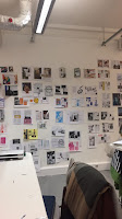
Part of all our collage crit session


I like these designs as they have that kind of 90's grudge type of aesthetic to it with the overly sized lips overlaid on the face and the rotated title which is slightly cut up and the bright neon background. The image instantly becomes the focal point of the design and the bright background brings out the page more due to the contrast of the blacks and greys against the neon green. Also, the 'You've Got Mail' DPS design works as the title balances the body of the page as it's very bold and clean compared to the body that's very hand-made and cut and pastey.


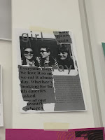
I think this poster works quite well due to the dominant collagey cut out pieces of body text which contrasts the clean cut image and typeface used. It gives the poster a contrast between dynamic and static features making it look very interesting due to both features complimenting each other very well.


This poster caught my eye due to its colourful nature. The bright oink instantly stands out on the page along with the cropped images and is tied in very well with the simple title and sub-heading writing. I think the colours and images makes tis poster very playful yet simple at the same time.


I like this "Where have you bean?" poster as it's very simplistic. The thing that makes this poster work well is the stylised curved path the writing is going, making the poster look quite dynamic and involve movement with it. This is further reinforced with the slanted image which works very well with the title which makes both elements of the poster look like one. In addition, the contrast between the orange and blue-green works very well as both colours bring each other to its maximum vividness, almost.


These series of posters work very well due to it's very strong aesthetic. I lime the way they constructed their collage and ho they used different proportions of images and played with how pieces work together with each other e.g. the face and the mixtape image. They also added a hand-drawn element to their work which compliments the collage well.

Things that people did well which I can maybe incorporate to mine or experiment with:
  • Scanning their collages and making it single colour to bring out the singular coloured images
  • Incorporating hand-written or illustrative writing to my collage e.g. paint, fine liner, pen
  • Not getting too caught up with using the existing systems but rather going against them and challenging their limits.

Sunday, 3 December 2017

Editorial Design Research (Grids)

46&2 - 46&2 is a team of creatives focused in branding and graphic design based in Melbourne, Australia. They often work with clients who are nature-orientated and are doing positive things in order to protect the environment and are also very environmentally aware themselves as a team as they also "practice sustainability [wherever we can]". In addition they also often include symbols in their work as part of 'visual sorcery & communication'. They like using the concept of symbology and create their own symbols. It helps with visually communicating their intentions in a far deeper way that words can and can also carry lots of intentions and connotations which can bring out their clients ideology, energy, image and aim overall. Their branding strategy is "intentional, clean, modern, as well as aesthetically pleasing, and conceptually rich...".


Francesco Delrosso - Delrosso is an Italian graphic designer and co-founder of Mille1miglia Collective. His designs are very research based and was famous for his design criticism for the city of Bologna. 
  • https://www.milleunomiglia.com/progetti/meridiano-lo-squarcio-sublime-tra-il-sensibile-e-lintelligibile/

Complementary Contrast

In Itten’s book ‘The Art of Colour’ complementary colours were described to be colours which “incite [each] other to maximum vividness when adjacent’ and annihilate each other, to gray-black, when mixed…”. Complementary colours are also colours which are diagonally adjacent to each other in the colour wheel. In addition, colours could also be balanced by its complementary which is important when creating visual practical work. Complementary colours are also unique as some complementary colours such as yellow/violet are of extreme light and dark contrast, red-orange/blue-green are of cold-warm contrast and red/green have the same brilliance.