Monday, 8 January 2018

Using Marber Grid to make book covers (Crit)

After, making our book cover designs we then had a critical and looked at three people's work. Looking at three people's work I noticed that people used a wide range of colour in their work variations in order to create different aesthetic and mood for each colour which can help create the identity of the book. I also saw someone create one big design which can cover both front and back back which I thought was clever and something I might try out for my own book covers.


For my book cover' people have mostly commented on:

  • incorporating a bold colour e.g red on the black and white to create intensity on the book cover.
  • using the grid a bit more adventurously
  • I need to work on the sizing of the text to make the cover look balanced.
  • If they didn't know anything about the book they thought the book genre was thriller or mystery (I think I did alright at portraying the mood of the book as it is a thriller book)


I think for further development I'll have to think about incorporating different bright or pop colours which I can use in order to show attention to a particular part of the cover which can be an important thing in the book, which can intrigue the audience, and I think maybe doing this consistently across three book can be really effective as they can be seen clearly as a series. 

Using the Marber Grid to make book covers

Today we design some book covers for the three books using the designs that we made during the Christmas holidays according to the Marker Grid, which is used particularly on the Penguin books. We had to create different variations of the books, where the three had to be link together as a set, in any way e.g. using on single colour for each.

Collaging and Photocopying

For the last exercise I decided to do some collaging and photocopy.

The Ones Who Walk Away From Omelas

For this book, I decided to centre it around the child and portraying a very rough sketch with different part missing or replaced in order to represent the child's lost identity in the world, and not being seen and known in the city as they are  being hidden in the cellar.

The Lottery

For the second book, I decided to visualise the tradition that the people do in the town where they circle around the chosen person that gets stoned. I think this effectively shows what the book can be about without giving too much away but at the same time also intrigues the audience.


2B R 0 2B

For the third book, I wanted to rerepsent the plot, where the population is being regulated, hence the portraits of people  in the collage, with the three photos having three small dots indicating ones the will die in the story. 

For this exercise I feel like I kind of just used my ideas from the pervious exercises as I was running out of ideas. I don't really think my ideas for these designs are very good, particularly the third one as I think if I was a reader I wouldn't really get the book from the cover and may mislead me from what the book is about as they design is very illustrative and looks a bit 'preppy' and 'teenage-y' which is not the book is about.

Friday, 5 January 2018

Photographing Objects based on 3 books

For this exercise I found objects which relates to the essence of the books that I chose. For photographing the objects I tended to  four on the negative space and white space on the background and kept the objects on one side of the page. I did this as I was thinking  where the title would go on the cover in relation to the cover layout as I thought it would balance the page out if done this way.

The Ones Who Walk Away From Omelas

For this is book I picked 'chain' as the object of focus in order to express how the child in being restricted from their freedom, as a chain can reference being locked up and controlled. 


The Lottery

For the second book, I picked stones to signify the stoning tradition that the people on the town did in order to have good fortune for the year ahead. I used stones as I thought it would interest the audience enough when they see the book cover without giving away the content of the story too much, as the reader may be intrigued as to what the stones can signigy, what they're used for, who uses them, when and why they are part of the story.


2B R 0 2B

For the third book, I decided to use a telephone. I used the telephone as it is an essential part of the story, where it's also part of the title as the title is the number people call in order to have assisted suicides. Similar to the second book I used the stones to intrigue the audience and they may also piece it together with the title of the book. 


I think by focusing on the white space in the photographs can give my book cover wide range of way in with I can manipulate the composition of the different features that needs to be in eluded in a book cover. It can also help me establish a hierarchy with my book cover and where certain information will be most suitably placed.

Tuesday, 2 January 2018

Using Illustrator to create designs related to music

I created five designs based on music which relates to three  of my books.

The Ones Who Walk Away From Omelas

This first design was influenced by BTS' song from their album 'A Supplementary Story: You Never Walk Alone', which also links back to the short story The Ones Who Walk Away From Omelas the band was partly inspired by the short story in reading their album. The song is also about journey and companionship, including lyrics such as, "This is the path I chose and even if one the is a fate I made up,: which can reference back to the people who leaves the city of Omelas. The graphic notations (circles getting bigger and jumbled up) show this part of the song, focusing on the base in the bridge increasing as it reaches the drop of the song to the chorus, which the 'flow' lines expressing the lyrics of the song.

The second graphic notation design was inspired by the song 'Spring Day' where Omelas was referenced as a hotel. The song is also missing about someone, "It's all winter here even in August", which can reference back to the story of the child missing and calling out for their mother. I focused the graphic notations on the different notes the singers sing and the way they join and break up syllables of words, which shows the different structures of the song and the different roles shared as the song is sang by seven people.


The Lottery

The third design I created was from the song 'Woody Wood Pecker' by Kay Kyser, which was released on the same day as the short story was released - June 27, 1948. For this graphic notation I decided to use the different instruments used in the song , as it used quite a few in different way, some very consistency and some only for certain parts of the song; as well as the note changes.

2B R 0 2B

The  fourth design I created was based on the song, 'Stranger on the Shore' by Acker Bilk, which was the number song in the Billboard 100 during 1962 when the short was published. It is a clarinet piece and does note include any vocals therefore, I opt to express the songs aesthetic. It is a very fairy-tale like, sophisticated and happy song as it was wrote dedicated to Bilk's daughter. Therefore, I tired expressing a very playful design, with the ascending pattern and the shaped gradually getting  bigger to get a feeling of 'floating' and bubbliness to it.

The fifth design I made was  for the song 'Ave Maria' by Franz Shubert. This song was used as a soundtrack for the film adaptation of the short story '2B R 0 2B' by Marco Checa Garcia in 2016, also named '2B R 0 2B'. I noticed the song was very repetitive and orderly therefore I focused on how long the notes where sustained and changed during the song and the key changes that was made. I also used a continuous line method as I thought I could express the songs fluidity effectively this way. 

Monday, 1 January 2018

Research on Graphic (Notations) Scores

Graphic scores are a way of interpreting music differently than traditional music scoring by using shapes, lines, colour, words etc. This is a more abstract way of expressing music and sometimes have guides in order for the player to know how to play them, but often the players are also left to interpret the graphic scores themselves and decide how they'll play according to the scores that they say, creating interest sounds.

Examples of graphic scores:

Picnic by McQueen - this graphic score was created in relation to the instruments played for a music piece, therefore indicating which player plays which part of the composition.


Cardew with their 193 page long graphic score 'Treatise'. 

Ideas I have for my own graphic scores designs may be:
  • representing each instruments played
  • representing different voices/ singers
  • different notes sang
  • different colours to represent each singer, instrument
  • symbols or shapes for each instrument?
  • the volume of sound - how loud or quiet they are? --? louder, bigger or darker shades of shapes?
  • including phrases or random stream of consciousness while listening to the song.

Using Microsoft Excel to create Excel Designs

The Ones Who Walk Away From Omelas

For  my first design I tried creating a more detailed visual representation of what the path away from Omelas would've looked like. I also tried using Horiuchi's method of using Excel and used the line tool and used the gradient features in order to create a smooth landscape. I quite like this design as it can give the readers an idea of place Omelas.


For the second design I created I decided use a person blindfolded with the idea of how the child in the cellar is alone and it trapped and hidden from society and is sacrificed, and also how the child itself didn't seem to know the reason why they are being sacrificed for the people of the city.


For the third design, I took the representation of the cellar as the way the people of Omelas kept the child to be hidden from everyone else. However, I do think this idea seems very vague and very weak compared to the other two as it's not as conceptual and interesting enough.

The Lottery

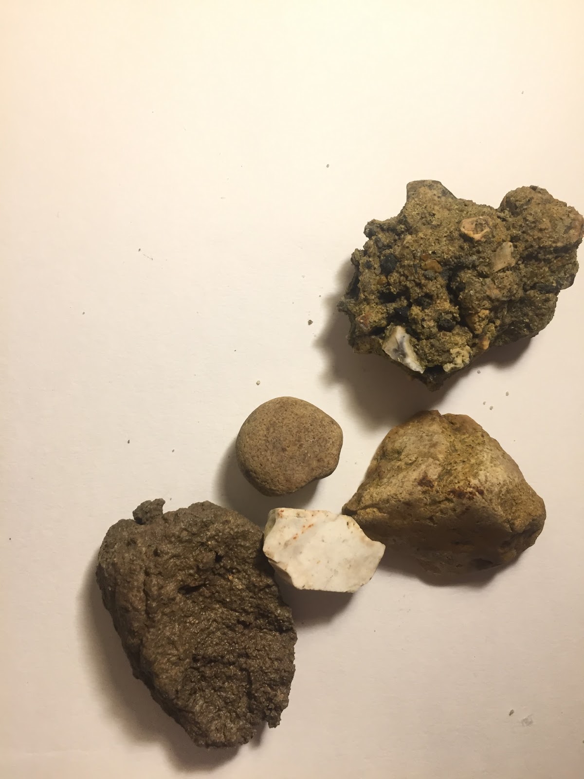
The first design I made is inspired by the 'stoning' the people of the town do to the person picked to be sacrificed for the well-being of the town. I recreated a stone with 'blood marks' to show Tessie's suffering of the unfair tradition that the town has been doing for thousands of years.


The second design I made takes inspiration from a quote from the story: "Lottery in June, corn be heavy soon." I used a crop with it's ends growing stones off it in order to represent the stoning that has to take place in order for summer crops like corn to grow properly.


The third design I made represents the five paper's that the Hutchinson's took from the box when they decided which family member has to be stoned, and highlighting the paper Tessie took which black dotted paper. 

2B R 0 2B

The first design I made for this story highlights the gun used by Wehling for killing himself and two other people to make room for his triplets. I used this item as it's important to how the sacrifice was made. I also put 3 red cells to represent the three people killed.


The second design I made is for the usage of the telephone in order to do the assisted suicides. Similar to the first idea I also made three cells red to represent the ones killed. I quite like how the design turned out as I had a hard time using the cells to make the design.


The third design I made was using the map of America and three dial circles from an old telephone connected together. I tried showing the country of which the story was based on and the usage of the telephone for the assisted suicide. 


I think for this exercise I enjoyed using the line tool better than using the actual cells such, just like Horiuchi, as I could get a better control of what I was actually drawing; also as it is vector based the lines were very clear and smooth. I didn't really like using the actual cells as I thought they look too 'blocky' and it reminded me of Minecraft art. 

Also, I think this time I had a better usage of the theme of sacrifice for my designs, compared to the Microsoft Word design and picked ideas which were more conceptual and can grab the reader's attention. I think for further designs, I just need to keep trying to create more conceptual ideas from the stories and also pick obscure links for each in order to create innovative designs.