Wednesday, 6 February 2019

SB2: Final Publication

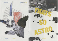
After all my refinements and developments, this is the final outcome that I've produced. As I've said in my previous blog, I liked the Cyclus Offset 100gsm paper stock much better therefore I decided to use it as the paper stock for my final. Not only is the paper stock light enough and it has a very zine-like feel, but it's also very cheap (£0.56 per A1) therefore it would be quite affordable it the publication was to be mass produced. Calculating the price more accurately, with the publication being A5 in size and having 20 pages and 11 spread only 5 pieces of A3 are needed so one publication is only (£0.70p); adding the printing cost in the university (£2.50); with the sticker and poster cost (£1.00 = £0.50p each)  the whole publication cost us (£4.20. I think this is quite reasonable and is probably the cheapest we can get it. 


From my developments that I did, I decided to keep the decisions that I've made as I thought that they already made the publication look good as it is and that if I decided to try and develop it more that it wouldn't feel as complete (also, because me and Jocel have decided to have those same elements of: type, type style, size etc.) that if I was to change something it would mean that I also have to tell Jocel in order for her to change her designs in order for us to have cohesive layout that would represent the whole branding aesthetic of the publication issues. In addition, I also think that they compliment the publication nicely and communicates the concept very well as well as the practical elements such as the hierarchy of information by using different point sizes and styles in order  to indicate to the readers and guide them through the publication. 


Furthermore, throughout the whole process of creating the publication, I have constantly been communicating with Olivia, in order to gain feedback and opinions from her for how the publication should look and feel overall. In addition, to the meetings that we had as a group of 4, we've kept in touch through email and sent files through our shared Google Drive. I think through this constant communicate with her, I felt more confident in creating the publication as there's someone that would help me if I was stuck on something as well as confirm that I am doing an okay job so I could develop further. In addition, to this as well, collaborating with Jocel was also good because I had someone to talk to everyday so I had constant feedback form both sides which made everything so much easier. The only thing Olivia mentioned as feedback that she'd like to change was changing her name from Olivia to Livvy in the credits, which I immediately did, other than that she was really happy of how it turned out which I was really happy about as well, especially because I was worried if she didn't like how I edited her collages, however she thought it was really nice and put together well.


I am also aware that I didn't really explore on any binding method for the publication. This was because I already knew that i was going to use Saddle Stitch as my binding method as it's the most time and cost efficient method of binding, especially for mass produced zines. It was also appropriate for the zine as it doesn't have that many pages and therefore could be stapled easily together. I thought that if I experimented with other binding methods it would be quite pointless and would just waste my time when I already knew what binding method to use that is not only cheap but also time and labour efficient too.


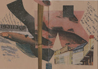
For additional content for the zine , we also though that it would be nice if there's additional content that readers can use and keep with them. We thought having a sticker and poster set would be nice as it's quite fun and fits with the zine publication theme as well. It can also be very engaging and is also another way of trying to get readers to anticipate for the new issue. For this publication I decided to take aspects of the collages that Olivia created and made them into stickers. I tried to pick aspects which fit with the theme of fantasy and mysterious as well to fit with the whole aesthetic of the publication. For the poster, I decided to use the double page spread that I put in the publication as it seemed to be the most impactful of the collage designs and looks and feels appropriate for the zine. In addition, it was also the page that both Jocel, Olivia and Nusheen really liked therefore I thought it would also be good for the readers to have as well.

Thoughts and Reflection:

Overall, I think that the publication is very well put together and is considered very well. I think that we were also successful at presenting the theme and concept that we wanted to portray for the Pisces character, as we didn't want it to look too obvious and basic, therefore we choose it's characteristic that would be interesting to use. I also think that everything has been considered very well design and practical wise which would help use in the future if we actually continue to make this into a monthly issue series. Furthermore, I also think that the collaboration aspect of the brief was also really good as we were able to communicate well together and bounced ideas together every time we had interim meetings as well as communicating through email and sharing a Drive. I also thought ti was a good decision for me and Jocel to work with two Illustrators or else it would've been to hard if we only collaborated with one as there's a lot of things to do - we didn't want to overwhelmed them with info therefore working both together and separately has helped us make quick progress with the publication issues. 

All in all, I'm really happy with how the publication came out and I think that it communicates the theme well, as fits its target demographic through the niche content that will understand and engage with as well as relate. In addition, it's also a good way to ease them through the whole idea of zodiac signs as it involved minimal jargon which can be overwhelmed and confusing. 

SB1: Design Development

After doing my initial development sketches, in order to fit the brief criteria I finally started to sketch them digitally in order to make it look more professional and refined. I decided to make it look like an expanding diagram of all the parts of the table design in order to specifically show what they look like and for me to give brief explanations as to what it is and why they are there.

I think doing it in this format will make my proposal easier to understand and visualise as it is done in a format where each component is under each other,  just like how they would be when made physically. In addition, the addition of the zoomed in elements to show details also work really well because it pinpoints aspects that judges should look out in order to have a clear understanding of how the solution will be implemented in real life.

The colour I chose is also in reference to the material I want the solution to be made with in real life - wood. I think doing this just adds a bit more refinement to the proposal, and although it may not be exactly accurate to the material colour and or texture, it gives a better view and aesthetic reference. Furthermore, I also added brief descriptions of what and how the element will be implemented giving justifications to my solution and ideas.


Thoughts & Reflections:

Overall, I think that the proposal element is coming together well and I am showing and answering the brief quite well. However, as I've been doing this brief and have been researching more information about it, I fee like it's going way out of the Graphic Design sphere. Although, it is 'still' design it's more product than graphic, therefore I feel like now I've gone way too deep in this sphere and been answering the RSA brief more so that I've kind of neglected the module brief; that I've become quite lost on how I can bring back the Graphic Design to it. At the same time, I don't wanna back out form this idea as I realistically don't have enough time, plus I actually quite enjoy it. However, perhaps because I have all these visuals, references and research I think I'll be able to think of a way of implementing this to graphic design, although right now I'm not really sure yet what that is. Luckily, though we have our final crit on Friday and I'm thinking of showing this brief to them. Hopefully, I can get some confirmation and guidance on how I can bring back Graphic Design to this brief. Although, I know I probably don't have enough time I'm hoping to really tie this back round.

SB1: Research on Table Mechanisms

As I was sketching my ideas, I thought to further make my idea more plausible, it also needs to have functional and practical research behind it and some references on the bets way it can be made physically so I looked at some mechanisms which I thought would be appropriate in creating it.

Possible Mechanisms

Pull/Slide (for the pull out multipurpose table - I found that the easier way to possibly create this, is by using slidable metal rods screwed on the table which will slide one by one as the table is pulled out. It also include a lock mechanism screwed in order to keep the table still when being used. I did find another when it also includes a pull out table leg to keep it still, however it may be a hassle and a bit dangerous especially with little children around, therefore I think the slide rods are a better option.


Push to Open (for cabinet drawers) - For the cabinet mechanism, I found that push latches are the best, as they can be easily screwed on the side or bottom of the cabinet drawers. In addition, they can also be adjustable depending on the sizes of the cabinet. It's also quite small and hidden so it wont be noticeable.

Tuesday, 5 February 2019

SB2: Asking Village Books for Possible Zine Distribution

I decided to try and talk to the people that run Village Books in town and ask them if we are able to distribute our free zines in the free section of the shop. Luckily, they said yes if we just pop in and give them a couple to put in their free section. However, I may also email them more formally about it and explain the idea and propose better as I actually came in their just to try and ask however, was pleasantly surprised that they said yes.

SB2: Last Meeting with Collaborators

We had our last meeting with our collaborators in order to discuss the final refinements and production of the publication that we haven't discussed through email. It's also a chance for the to see physical experiments that we made and in order for them to have a more insightful and informed suggestion and opinion on the designs that we did.

For mine and Livvy's publication in particular, I was worried wether she was okay with how I edited her collages as I found myself feeling like I've overly edited them and maybe this was something that she didn't like because she may have felt that her work wasn't show enough. However, she completely disagreed and thought that how I edited her collages reflected the mood that we wanted to created therefore she was satisfied with what I've done which I was really relieved about. She's also shown enthusiasm on the layout of the whole publication and thought they were well composed and would be easy to follow and read. In regards to the paper stock, I told them how I preferred the Cyclus Offset as it was lighter and softer, which they also thought would be good - "zine like paper stock". 

Furthermore, they were also enthusiastic when we told them that we were gonna produce a small batch of the publication and distribute to the uni and possibly outside (Village). Overall, I think that it would be good to distribute it outside especially of uni and it would be great exposure for them and us as well as get other feedback from audiences that aren't necessarily or primary target readers. It would be interesting as if it will be successful or if we should just continue it within university grounds.

Thoughts & reflections:

Overall, the meeting was quite fruitful and we've received good feedback and everyone was really happy with the progress and how everything is turning out. Hopefully, we can finally print it out the small batch and finish them in order to be distributed in the university and outside.

SB2: Publication Development

After the interim crit that we had, me and Jocel discussed and thought hard about how we could improve the unity and cohesive aspect of the front covers of our publications as it was pointed out how they looked too different from each other. We decided to use the same font for the front covers which is (Helvetica Neue Condensed Black) pt 90, we used this typeface as we thought its bold and strong image would be impactful as well as effective especially when presented along with design and other text info. We needed something that would grab a readers attention and immediately let them recognise the magazine cover and the other editions about how they are from the same publication and not different or separate to it. In contrast within the publication we decided to use the custom typeface that we made for the titles and headings. For the body text we used Helvetica Neue pt 9 as the basic style however I decided to use the italic style, the same as from my initial idea as I still thought this added a nice dynamic aspect to the publication. The sub texts on the front are Helvetica Neue Regular pt 12 whilst the Sub headings within is Helvetica Neue Italic pt 9 in all capitals, creating a clear information hierarchy within them. In addition, it also adds clarity and keeps everything nice and neat. In addition, I also changed the colours on the title to be exactly the Yellow Sapphire (or Primrose Yellow- FFC72C/ 019890) colour that represented the lucky stone for a Pisces, not only referring to the sign but also complimenting the overall colour scheme of the publication.

I decided to further test on different paper stocks as suggested during the crit. I decided to experiment on Cyclus Offset 100 gsm and Cairn Straw White 120 gsm.


new front cover
 
jocel's new front cover

Cairn Straw White 


Cyclus Cffset


Although I found that in the Carin Straw White paper stock, the textured and the creamy colour of the stock highlights the collages even better making the more prominent and more attractive on the page, really highlighting the visual aesthetic of the publication. However, I didn't like how the stock was a little bit heavy, therefore we I bounded it it wouldn't close as smoothly as I thought as I'd like the publication to a a real smooth transition between the pages when readers are going through them and sit smoothly when put on display. I was also hoping for a lighter weight to have a softer more intimate and organic feel to the publication, feeding off the timid and close characteristic of a Pisces - I wanted the readers to experience how a Pisces character acts through their own actions when handing the publication.

Therefore, I preferred the Cyclus Offset 100 gsm stock much better and I also liked how it's only slightly off white giving a nice soft tone to the publication. When printed I also liked how the colour turned out very prominent on the pages. Most of all, I particularly liked the feel of the paper stock as it's the perfect mix of smooth and a slight rough texture that you feel at the end of handling it. As well as it's a good weight that it's neither too thick or too thin, perfect for a zine/small publication. It also sits nicely after binding and overall looks and feel easy and nice to hold. Cost and practicality wise, its also half the price of .... (£1.00) as it's only £0.56p per a1 which is cost effective if it was too be mass produced as each publication would only be £3.62 including printing (excluding binding (human) and time costs)

Thoughts & Reflection:

Overall, I think the changes made to the publication were very effective and made it more justified and complete. My developments on several paper stocks also helped me to think of further production such as labour and time costs which would be viable in commercial terms on the mass production of the publication. I am happy with this result and will show this to our other collaborators from Illustration and see what they think. I'm also emailing Livvy about it first though as I wanted her to know the progress of the publication after the crit as it may seem like a drastic change if I show it ti her tomorrow when she's already seen the initial that I sent her. I didn't want to make her feel like she's out of the loop of things.

email to Livvy

Monday, 4 February 2019

SB2: Publication Initial (w/ Print out draft)

After creating the initial front cover designs and getting opinions on which one to take forward (#3) I
started to work on the initial layout of the publication and the content.

I initially started this design with a lacking grid system and choice of type which I progressively started to find really difficult to continue with and overall does not look nice nor does in have much meaning and reference to the content. Therefore I decided to stop this initial idea and start from picking main elements that i'll follow for the publication in  order for it to be cohesive.


Grid System

In order to have a cohesive layout for the publication I created a grid system which will be used throughout. I took a similar approach form the typography grid system and picked the four brightest stars in the constellation as the main points that I follow in the grid system

I used this as the basis on where the collages are laid out on the page, however after doing this, I found it difficult to lay out the text content with the collages. However, from previous modules and research I found Josef Muller-Brockmann's usage of the actual images as the grid for the content to be helpful and therefore chose his style as reference.


I used the collages as the grid for the content to work around it instead to avoid clash and a chaotic design rather than a complimentary balanced between the two elements. Using this style allowed the design to be more dynamic and interesting as not only the readers can focus on readers but also on the collages and make a reference between the content and the illustrations that are with it, making the visual aesthetic effective and successful in evoking the intended responses from the readers in creating a link between the visual and text content. Though I am aware that each pages will have a slightly different grid system as it relies on the collages, the principle is the same for all therefore creating a uniformed and cohesive grid style through the publication.

 example of grid usage and implementation w/ content

Type

For the type I used the custom typeface for the front cover and used Times Italic for the content as I thought it would be best to have both serif to avoid to much clash in styles with san serif fonts. I did try to use Didot, which was the initial reference for the custom typeface however I found that they become a bit illegible with smaller in point size due to the incredibly contrasting verticals and stems and it didn't help when it was Italics either. I decided to use the Italic style as well as I thought it would aid to the dynamic aspect for Pisces and how they are always 'wanting to escape' and have an active mind and thinking. Furthermore, I thought it also balanced with the collage visuals that Olivia created.

Colour 

I decided to keep the blue/yellow palette from the front cover throughout the text and the gradient effect on the heading for each section creating uniformity and consistency throughout the publication, adding the readers to the hierarchy of the information they are reading. In contrast, I applied the idea that me and Olivia talked about  previously with creating a blue to pink/purple them of the collages through the publication in order to further reinforce the deep and elusive characteristics of Pisces. This gradual change in the collage style and colour palette may not be noticeable at first however as readers may flip through it again, they'll recognise the changes. I think this shift in change also reflects the fact that other signs tend to not notice a Pisces quiet character making them more interesting and unique.


Size

We decided to make the publication A5 size as practically it's very easy and manageable especially when thinking of massively producing and making it in batches. It allows for less mistakes whilst being time efficient and cost efficient as well. It's also a very common zine/publication size that readers will be familiar with and would more likely to take with  them as anything bigger would be a bit burdensome to take around probably.

Paper Stock

I decided to experiment on sugar paper stock as I thought it would be a nice and cost effective stock that would compliment the collages and design of the publication. Initially, I liked the rough texture of the stock and its medium thickness. However, upon printing out the publication draft, the colours came out really dull and the design just didn't look right on the stock and was too contrasting in relation to it's content that the readers' would not be able to properly appreciate the context and content behind the publication. They also came out quite pixelated, however I've checked through my document as they were all 300 DPI with 300 Effective PPI as well, maybe it was the printer? I'll explore other paper stocks as well and hopefully get feedback on it from the crit as I'm planning to show it during the crit to get people to actually go through it and see if they can suggest any other appropriate paper stock.


Thoughts & Reflections:

I had a really hard time creating the layout at first however after coming to the conclusion of actually having solid basic elements to it, it became quite easy, however, the only thing is I've started to edit and reuse Olivia's collages, therefore I've asked her if she has continued to work on them and her thoughts on the initial publication, to make sure that we are on the same page and that she is happy with what I'm doing to her work within the publication as well.

asking Livvy for more collages

gathering  feedback from Livvy

Olivia contacted me back and has been working on collages which I was glad as I really needed more and they were collages which I thought would work incredibly well in the publication as they well nice and clean and she used a lot of clean geometric lines which we talked about previously as well. She also created more straightforward collages which included the visual fish signs which I thought were great because as much as we wanted to focus it on the fantasy aspect of Pisces, having that little bit of straightforward visual also helps bind the publication content and visual together in order to create a stronger visual aesthetic for the publication in relation to the zodiac sign it is all about.