started to work on the initial layout of the publication and the content.
I initially started this design with a lacking grid system and choice of type which I progressively started to find really difficult to continue with and overall does not look nice nor does in have much meaning and reference to the content. Therefore I decided to stop this initial idea and start from picking main elements that i'll follow for the publication in order for it to be cohesive.


Grid System
In order to have a cohesive layout for the publication I created a grid system which will be used throughout. I took a similar approach form the typography grid system and picked the four brightest stars in the constellation as the main points that I follow in the grid system


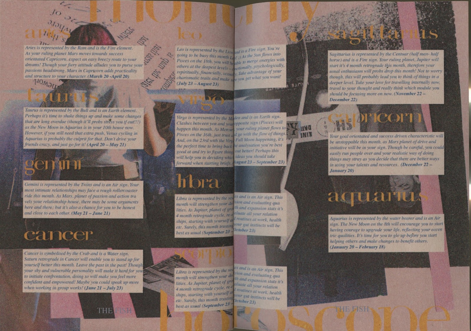
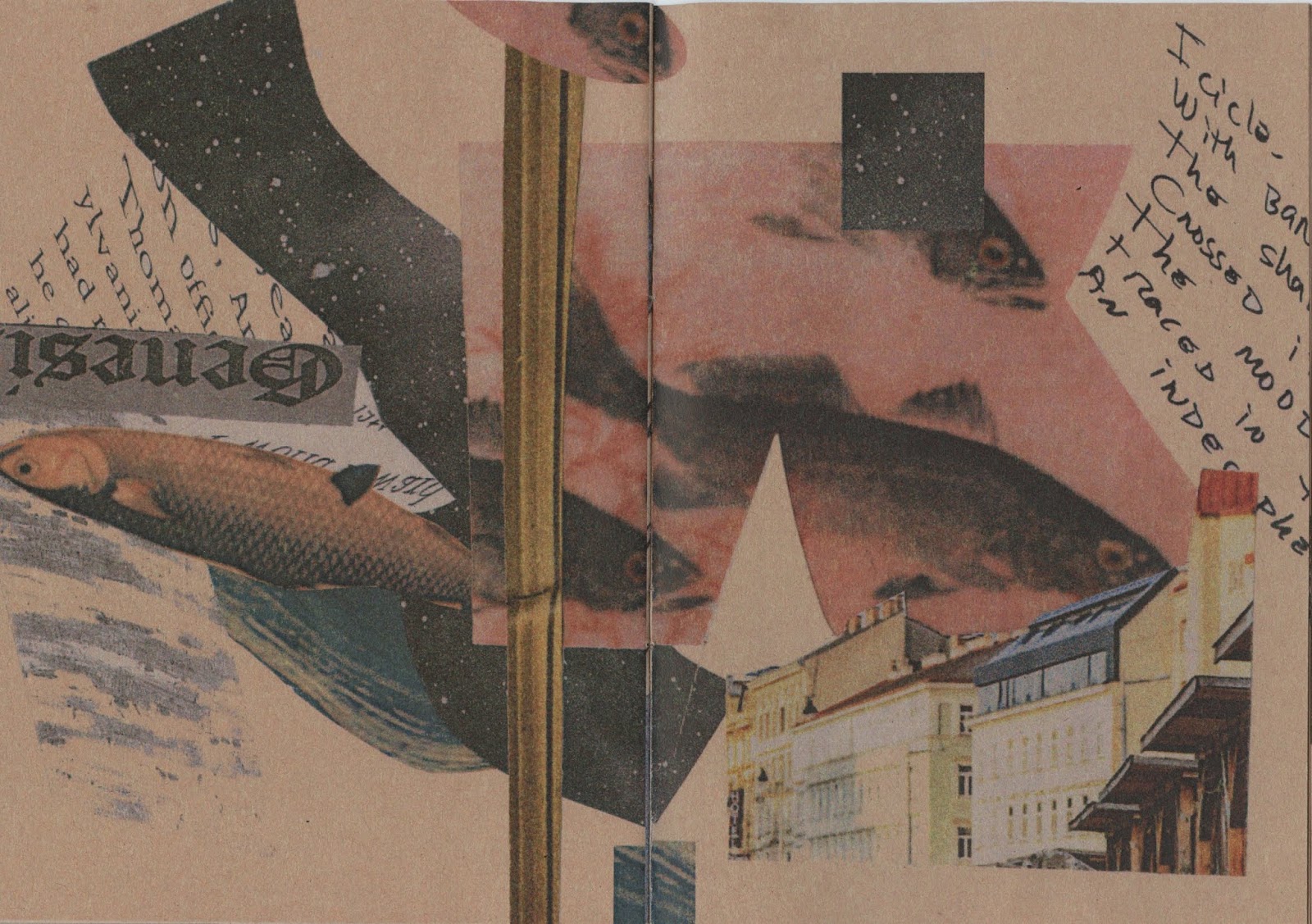
I used the collages as the grid for the content to work around it instead to avoid clash and a chaotic design rather than a complimentary balanced between the two elements. Using this style allowed the design to be more dynamic and interesting as not only the readers can focus on readers but also on the collages and make a reference between the content and the illustrations that are with it, making the visual aesthetic effective and successful in evoking the intended responses from the readers in creating a link between the visual and text content. Though I am aware that each pages will have a slightly different grid system as it relies on the collages, the principle is the same for all therefore creating a uniformed and cohesive grid style through the publication.


example of grid usage and implementation w/ content
Type
For the type I used the custom typeface for the front cover and used Times Italic for the content as I thought it would be best to have both serif to avoid to much clash in styles with san serif fonts. I did try to use Didot, which was the initial reference for the custom typeface however I found that they become a bit illegible with smaller in point size due to the incredibly contrasting verticals and stems and it didn't help when it was Italics either. I decided to use the Italic style as well as I thought it would aid to the dynamic aspect for Pisces and how they are always 'wanting to escape' and have an active mind and thinking. Furthermore, I thought it also balanced with the collage visuals that Olivia created.
Colour
I decided to keep the blue/yellow palette from the front cover throughout the text and the gradient effect on the heading for each section creating uniformity and consistency throughout the publication, adding the readers to the hierarchy of the information they are reading. In contrast, I applied the idea that me and Olivia talked about previously with creating a blue to pink/purple them of the collages through the publication in order to further reinforce the deep and elusive characteristics of Pisces. This gradual change in the collage style and colour palette may not be noticeable at first however as readers may flip through it again, they'll recognise the changes. I think this shift in change also reflects the fact that other signs tend to not notice a Pisces quiet character making them more interesting and unique.
Size
We decided to make the publication A5 size as practically it's very easy and manageable especially when thinking of massively producing and making it in batches. It allows for less mistakes whilst being time efficient and cost efficient as well. It's also a very common zine/publication size that readers will be familiar with and would more likely to take with them as anything bigger would be a bit burdensome to take around probably.
Paper Stock
I decided to experiment on sugar paper stock as I thought it would be a nice and cost effective stock that would compliment the collages and design of the publication. Initially, I liked the rough texture of the stock and its medium thickness. However, upon printing out the publication draft, the colours came out really dull and the design just didn't look right on the stock and was too contrasting in relation to it's content that the readers' would not be able to properly appreciate the context and content behind the publication. They also came out quite pixelated, however I've checked through my document as they were all 300 DPI with 300 Effective PPI as well, maybe it was the printer? I'll explore other paper stocks as well and hopefully get feedback on it from the crit as I'm planning to show it during the crit to get people to actually go through it and see if they can suggest any other appropriate paper stock.


Thoughts & Reflections:
I had a really hard time creating the layout at first however after coming to the conclusion of actually having solid basic elements to it, it became quite easy, however, the only thing is I've started to edit and reuse Olivia's collages, therefore I've asked her if she has continued to work on them and her thoughts on the initial publication, to make sure that we are on the same page and that she is happy with what I'm doing to her work within the publication as well.

asking Livvy for more collages

gathering feedback from Livvy
No comments:
Post a Comment