Information Insert
As well as visual information, I wanted the readers to obviously have actual written content they can read in order to have knowledge on what they are trying to buy in order for them to actually engage and buy the product. I thought of having a small B6 page publication insert which have short summarises and illustrations o f each part in order to give the readers a quick and easily understandable information rather than lengthy information like in normal catalogues. I experimented it on the Bockingford white paper that I had however, I didn't like how it contrasted too much with the brown tone of the Cairn Eco Paper. Perhaps the previous Fabriano Unica Cream paper will work better as they have similar tones as the Cairn Eco paper and have similar qualities that present the idea well. Also, I printing the illustrations black but I think they contrast the paper stock too much so I'm going to opt for brown too in order to compliment the aesthetic overall making the whole design look complete and professional.
Typeface
I decided to use 'Futura' as the typeface for the publication, as I felt it fitted and complimented the rough and 'organic' look of the embossed design due to its modern and contemporary characteristics. As well as the fact that I liked how quite geometric the typeface is that it's looks professional and casual at the same time. Also, I choose Futura as the typeface as if I chose a serif font I think it would just overkill the aesthetic of the design and if I chose a neutral type like 'Helvetica' it would just look really really bland, and I thought Futura was a good mmix of a fun and informative type that's why I chose it.
Stab Stitch Binding
Although, I did say I intended the design to be a concertina I did want to explore another avenue that I could possibly do for the binding as I felt that it should be able to take the readers on a smooth and controlled manner in order for them to understand the layers of the pages and how they interact and relate to the publication inserted within it. I thought that stab stitch would be a great quick binding method that isn't only durable but also aesthetically pleasing to look at. However, upon doing this binding, I found that the pages didn't flip as smoothly as I envisions and made me scared of flipping the pages in case the paper rips. Reflecting this on an audience POV, readers would probably have a hard time navigating through it and would not try to read further because of this making it ineffective. Therefore, I may explore other methods instead, and also take into account the publication insert as well. Should I bind it together with the concertina design? should it be an insert within an insert to a catalogue?
Previously, the laser cut title didn't work well because of the letter not cutting properly, therefore i decided to make them all capital sand it a much bigger point size hoping all of it would cut through. However, a similar thing occurred, although it is much better than the previous one. But, because of time constraints and availability of room facilities, I couldn't develop more therefore I had to use the one I had. The title is much more readable now, still not complete which is a shame as it's for the front page and its needs to be impactful and easily understandable by the readers when they read it. Although, because it is an insert within a catalogue, would the readers already probably guess its
content? Or could emphasise the title by having it on the front of the B6 publication insert instead. Furthermore, I've also laser cut the missing layers of the design as well as the new version of the final layer which shows the all the layers better and more clearly.
More Embossing
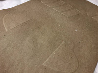
After choosing my final paper stock to start emboss on the Cairn Eco Kraft stock that I have.The embossing went really smoothly and I was able to make various versions of it, as well as a version with both of the differing brown tones shown. I did this as I still wasn't sure which side was better aesthetically, as I felt that the dark brown side was more prominent and would maybe have more impact with the embossed shapes, however the light brown has a nice soft tone and aesthetic to it which I also liked. I asked some of my peers for opinion and they agreed with on on the dark brown side and suggested it was the better side as well so therefore I think for the final I am choosing the dark brown side of the paper as the main front of the design.
 |
| dark brown side |
 |
| light brown side |
Binding Method
After the stab stitch binding, I thought of coptic binding as another alternative as I've also decided that I'm going to sew in the insert B6 publication so it's secure inside as well as give the design some depth and bulk when handled. Coptic stitch is perfect as it securely holds the pages together without them ripping or breaking apart.
Thoughts & Reflection:
I think that this development and refinement stage was really fruitful and speed up my design process better in order for me to produce my final before the deadline and still have time to do my writing for design boards. I think that I've resolved my ideas more now in order for my final to be resolved.


No comments:
Post a Comment