Printing Process
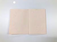
In order to further solidify this idea, I thought of embossing as an effective process in presenting these concepts. Apart form it's tactile quality, embossing also gives a very nice natural, and homely feel to the whole design, which reflect back the tone of voice and ethos that the product is trying to convey - a way to become more socially active and communicate more in the kitchen area and beyond.
Laser Cutting
In order to create the embossed pieces, I had to laser cut the shapes first. The shapes themselves turned out really well and they were cut to size of the actual publication already which is B% (as this is how most catalogues are set out). However, when I tried to laser cut the Title (A Multigenerational Kitchen Island) some of the letters didn't cut all the way through maybe because they were in small letter and were too small to cut. However, I still used them in my embossing experiments as I didn't want to waste time as well as materials. Although, for further developing the design I well make sure that I change it's setting, maybe change it all to capitals?
Furthermore, in order to apply accurate information in the design, I thought of having the shapes that are going to be embossed as the scale down version of the actual measurements of the product:
- Main Table - Originally 2 m x 0.80 m ; scaled down to 20cm x 8 cm
- Pull Out Table - Originally 1 m x 1.4 m ; scaled down to 10cm x 14cm
- Cabinet - Originally 0.26 m x 0.15 m ; scaled down to 26 cm to 15 cm
Paper Stock
Bockinhford (190gsm)
I decided to experiment with this paper stock as I really liked the clean almost frost white colour that it has. I thought that the embossed shapes would look really nice and prominent on it.
+ shaped were really prominent maybe because of it's thickness?
+looks really clean and sleek
- can get dirty easily
- in certain lights shapes might not be seen properly
- looks a bit clinical
- is it too basic and simple?
Fabricano Unica Cream (250 gsm) -
 Afterwards, I decided to experiment on the cream version of the paper stock as I thought the cream tone would give the the design the character that it lacked when on the white paper stock. I just thought that on the white paper stock it looked too plain and doesn't really have any appeal at all.
+ more pleasing to look at that the white version
+ also prominent shapes maybe due to it being 250 gsm thick
+ It would look good with another paper stock or combined with something darker to bring out that 'natural', homely feel.
Cairn Eco Kraft (170 gsm) -
 I also decided to test on the Cairn eco paper as I really liked the earthy natural quality it has. I think that using this paper stock will also be a good visual reference on how the table will look like and the material that it will be made out of. I think it may also effectively highlight the homely style and friendly quality that the product in meant to portray to the audience.
+visually it strongly references and shows the material the product will be made out of
+ aesthetically successful at portraying the homely feel
+cheap
+easily embossed on even though it's only 170gsm.
- may rip easily when being rolled when embossing
- two sides have slightly different tones (may not be consistent?)
Thoughts & reflections:
After doing these experiments I showed it to my peer in order to gather feedback. All of them really liked and favoured the Cairn Eco paper stock, as they thought the embossed shaped were a lot more prominent and noticeable on it because it's dark. It also made them think of the material the table is going to be made out of (wood), which I think highlights that it succeeds this representation when shown to the actual audiences as well. Overall, following my peers I think I will chose the Cairn Eco stock as the final paper stock to use as it does the job aesthetically as well as design wise. It's also very cheap, however the two different shade on both sides, I think I can work it to my advantage as in embossing you also get two different surfaces, therefore working this to my advantages, the audiences can feel various textures and colours whilst going through the concertina as well, enhancing their experience and senses, which may engage them more with the design and the product.


No comments:
Post a Comment