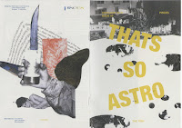
I decided to further test on different paper stocks as suggested during the crit. I decided to experiment on Cyclus Offset 100 gsm and Cairn Straw White 120 gsm.
 |
| new front cover |
 |
| jocel's new front cover |
Cairn Straw White
Cyclus Cffset
Although I found that in the Carin Straw White paper stock, the textured and the creamy colour of the stock highlights the collages even better making the more prominent and more attractive on the page, really highlighting the visual aesthetic of the publication. However, I didn't like how the stock was a little bit heavy, therefore we I bounded it it wouldn't close as smoothly as I thought as I'd like the publication to a a real smooth transition between the pages when readers are going through them and sit smoothly when put on display. I was also hoping for a lighter weight to have a softer more intimate and organic feel to the publication, feeding off the timid and close characteristic of a Pisces - I wanted the readers to experience how a Pisces character acts through their own actions when handing the publication.
Therefore, I preferred the Cyclus Offset 100 gsm stock much better and I also liked how it's only slightly off white giving a nice soft tone to the publication. When printed I also liked how the colour turned out very prominent on the pages. Most of all, I particularly liked the feel of the paper stock as it's the perfect mix of smooth and a slight rough texture that you feel at the end of handling it. As well as it's a good weight that it's neither too thick or too thin, perfect for a zine/small publication. It also sits nicely after binding and overall looks and feel easy and nice to hold. Cost and practicality wise, its also half the price of .... (£1.00) as it's only £0.56p per a1 which is cost effective if it was too be mass produced as each publication would only be £3.62 including printing (excluding binding (human) and time costs)
Thoughts & Reflection:
Overall, I think the changes made to the publication were very effective and made it more justified and complete. My developments on several paper stocks also helped me to think of further production such as labour and time costs which would be viable in commercial terms on the mass production of the publication. I am happy with this result and will show this to our other collaborators from Illustration and see what they think. I'm also emailing Livvy about it first though as I wanted her to know the progress of the publication after the crit as it may seem like a drastic change if I show it ti her tomorrow when she's already seen the initial that I sent her. I didn't want to make her feel like she's out of the loop of things.
email to Livvy


No comments:
Post a Comment