
Monday, 26 February 2018
Final Poster
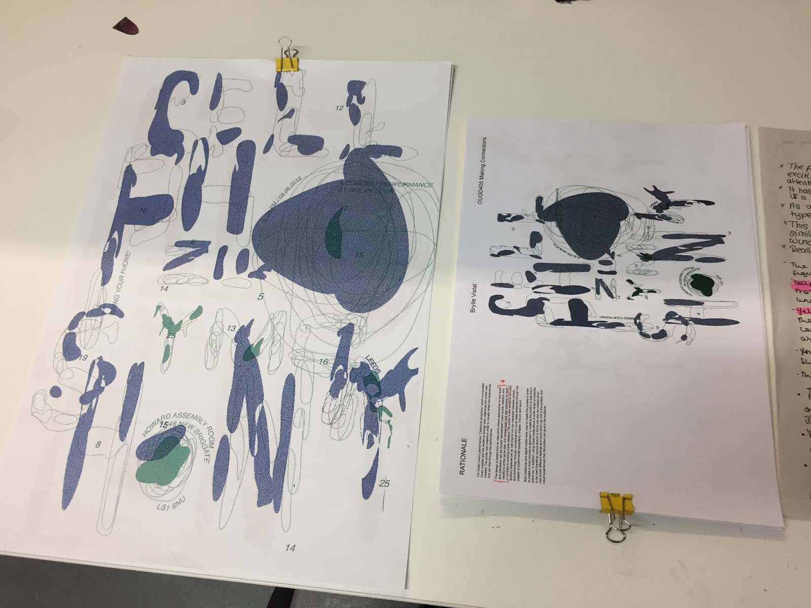
After actually creating the final two posters that I originally planned to have, at the end I decided to only pick the blue-green poster as I felt that it was more appropriate and a much better colour scheme than the red and yellow because i felt that the red and yellow was a bit too much and les more towards a kind of playful illustrative, kind of quirky atmosphere. Although, I did try printing out the final poster on yellow paper but found that the green lines faded to a more blueish colours which I didn't particularly like. I also thought of printing it on tracing paper as I thought the lines would look quite good with the transparent paper and I was quite happy with it and I thought it was a fun last minute experiment with the design. Also, I've asked my peers what they think and the majority have picked the blue and green. However, I did have a hard time creating the glitch effect for the coloured blocks of the design, however when the were printed I actually quite liked the kind of faint grainy glitch effect, although I would've like to see a more glitch effect to see how it would look against the smooth lines overlapped. I guess the grainy effect did tone it down a bit because having the overlapped lines predominantly on the page with a very itchy effect may make it look quite gaudy and too chaotic. I was also satisfied with the type used and I think it works quite well with the design as I think manipulating type of choosing a serif font won't give it the same effect as it is now. Overall, I'm quite satisfied with the is poster design even though I had a really hard time in the beginning of the module about it because I thought my ideas were a bit too obscure and didn't really fit with the ideas that everyone else had.

Friday, 23 February 2018
Cellphone Symphony Final Poster Design
Design dev.
I picked design two for my final poster as I thought that out of all the designs that I created it had the strongest concept and idea in terms linking in back to the idea of the concert. I also thought that the design would give me a wider room to experiment with it terms of materials and production of it physically e.g. the choice of paper stock and production method like screen printing or scanning and photocopying single coloured.
To improve the design I decided to make the single coloured blocks to a more pixelated and bitmap texture to mimic the pixelated effect of a phone when not working. Also using the colours dark blue and green in order to reflect the infamous colour design for the Nokia 3310.
Publication two (Twenty Six Characters)
We started our second publications by bring 5 objects that has some kind of meaning to us, for me: a plaster, hand cream, headphones, perfume and post-it-note. With these objects I took photos which relate all of the object to one idea (to cover up). To be honest, I had a hard time doing this and thought that my photos didn't really work.


Instead, I tried experimenting with using one of my objects as kind of like a magnifying glass in order to focus on the rest of the objects, however I didn't really have a concept within these pictures but aesthetically I think it looks quite interesting. However, I think I really need to think of a strong concept of idea for the publication that I can work with or maybe think of a narrative or sequence as that is something that I'm struggling now. Over the next few day, I will have to think this over in order for me start my publication properly.


Cellphone Symphony Crit
Today, we had a crit on our poster ideas and got some feedback which help me decide other developments I can do for my poster.
I had a fairly good critique and got some helpful feedback from people. Overall, I got very similar feedbacks which I can take into account for my final piece.


I had a fairly good critique and got some helpful feedback from people. Overall, I got very similar feedbacks which I can take into account for my final piece.
- People have collectively thought that the type is a bit hard to read, therefore maybe I can improve the type by possibly making the lines thicker and more prominent on the page. Contrary to what people have said about the arrangements of the though, I will still keep it as it is part of my main concept and taking it apart will only defeat the purpose of my poster concept.
- People have various different opinions about the colour choices, with some liking the red and yellow while some preferred the blue and green and told me to use it. In order to satisfy these suggestions I will try and create the poster with these two colour combinations and pick which one I like the most and highlight my idea better.
- In addition, I may also need to work on some of my writing and try to focus on only the important bits which can highlight my concepts and not waffle about something else.
Looking at other peoples posters I quite liked how some of them were really brave with there designs and picked unusual conventions of creating a poster such as phone apps like Snapchat which made there poster look quite bazaar but really worked and stand out.


Thursday, 22 February 2018
Group Publications
For our group publication we choose the theme of 'Eyes' as it was a consistent theme throughout everyone's zine, where at least most if not all zines contained some kind of design centred around eyes. We thought this was quite a good theme as it already collaborated all our ideas unintentionally but also we did not just use one publication from one person but combined everyones together.
Developing the existing ideas that we have for the zine, we decided to add elements of text which explains aspects of eyes and facts about it which could enhance the idea as well as highlight what the idea is. We also decided to use various materials in order to print a better quality zine. Using tracing paper and different sized paper where appropriate in order to demonstrate and strengthen the idea of the theme; as well as add interactive elements to the zine in order to possibly attract a group of audiences. The theme also loosely dictates the production the paper as we have taken the idea of the eye test chart with the letter gradually getting smaller but instead have the size of the page smaller and smaller as the zine pages progresses. This could engage the reader to explore the zine as it could add to the dynamic and interactive element to the zine.
Luckily, all of our group members were in and we were all able to create designs which we could all collate and create the zine with.
Studio Brief 2 - Publication One (The Fanzine Factory)
Starting with working in groups, we created 9 different zines amongst us by collaborating through a zine making exercise where we would pass our 12 page publications to the next person to let them create a design through their own interpretations and experimentations.
Through creating zines from different people, I tried to work with the design that the person before me did e.g. only using collages etc. or a certain element of the collage e.g. eyes. Doing this, may have created a small narrative for the zine or a sequence which may make sense even without text due to the similar concepts behind them. In addition, I also tried to do something different from the person before me and creating contrasting designs from theme with may have interrupted the flow of the publication, but at the same time can be an interesting break from a sequence within the zine.
Looking at the people's designs in the zines, I tried to take some content or use of materials used as visual cues in order for me to create a design which links to their design, in terms of visuals. If I was working completely alone, I would've probably only did similar collages and may not have used some materials that I have borrowed form other people which added some interesting elements in my designs. Also, if I was working alone I would've probably did a zine with a clear structure such as a story narrative or some kind of concept, where as working in a group gave my zine a much more dynamic sort of designs, and with various materials used as well as ways of creating textures and collages which are quite different to how I would a make them. This also made my zine brighter and more conceptual in a way as each design was made by different people who had different ideas.
However, I did try and limit myself by constantly trying to get ideas from pervious designs from the people before me in order for me to have a starting point concept for my designs rather than just randomly creating random collages on the page.
I feel like I didn't really break out of my comfort zone as just used techniques and materials that I have used before, and I wish I could've done something different or used materials that I mainly would not use on collages. However due to constraints of time it made it difficult for me to do so.
In terms of my publication, someone folded a page of my zine where it was made 3D and created some depth for my zine. I've also looked at other peoples zines in the group and fund interesting elements in their zines.


- I like how this collages looks very dynamic with the combination of hand drawn elements and geometrical shapes on the design. I also enjoy the pops of colour which makes it stand out.

- Similarly, this zine also has some kind of 3D element to it as the cover is ripped and doubled.
- You can also see the second page of the zine and it gives it a very nice layered effect on the zine.

- These are the common designs that were found on everyones zine's and the starting point of our group zine publication, I thought it was interesting how it occurred quite frequently on everyones zine despite not communication design decisions with each other but rather we communicated through visuals that we created.
Tuesday, 13 February 2018
Jaeho Shin Posters
Jaeho Shin is a Graphic Designer and member of a graphic design and art direction team Uofc and Studio Jaemon.


Much of Shin's work are brand identities for clients such as Rapport, Dotorii and Busan Metropolitan City. He also creates poster designs which are very trendy and contemporary. He often uses bright and contrasting colours as well as manipulated typography which works quite well for commercial purposes and it may seem to be targeted towards a younger and more contemporary audiences and audiences. I really like how he works with layout and typography and how he places about with they original type. He also has a really solid feel and aesthetic going on which solidifies his way of working; as he has quite a dark, kind of contemporary grunge aesthetic going on which can appeal to a lot of people. He also effectively use colour in his designs and uses them very well to convey the mood and emotion of the design that he is creating in order t match the identity of the brand.
http://cargocollective.com/jaemon/Jaeho-Shin


Monday, 12 February 2018
Ellen Lupton project brief
Ellen Lupton talks in her essay about the idea of deconstruction in Graphic Design. She gave the example of the designed created by students of Katherine McCoy and Daniel Libeskind for the "French Currents of the Letter". She explains their usage of spacing, sizing and kerning the letters as the journal progresses in order to demonstrate the physical attributes of the text as well as to introduce to the reader a very non-linear way of reading and linking the words together. This resulted in a very obscure but interesting book design, which I find particularly interesting but don't really quite get yet.


Post-struturalism and post-modernism also links to this idea as post-modernism is the bending or breaking existing rules of design and typography during modernism. A great example of this is Wolfgang Wiengart who started the New Swiss Typography movement, with his unique ways of manipulating letters stripping them off their characteristics, because I think as the lettering as somewhat deconstructive they essentially have a different physical appearance which also changes their use and characteristic. I think it's also a way of having a more individual way of creating designs, which could be from a subjective view or an objective view.


Saturday, 10 February 2018
Golan Levin
Golan Levin is a performance artist and a software engineer who specialises in using technology and software in order to create cart with computers and making computers into a "personal mode of expression".
He focuses on the interactivity of his designs through different performances, installations and virtual environments where his audience can use and play about. Levi also highlights how we interact with different softwares and digital technology and emphasises the relationship we have with our machines by creating designs which explores different ways in which we communicate with machines and software.
Levin's way of exploring human interaction with machines as well as the demonstration of how people communicate with machines span from making installations that visualises a person's gestures and speeches in real time meaning the audience directly is engaging with his designs and are in some ways part of the design, as they are needed ignorer for it to work and to be prove. This is a great way of changing how the audience and art relationship is as it may be normally seen that an audience is only able to observe a piece of art or design, however in Levin's designs the human is needed in order t complete it.
I quite like the ideas behind Levin's work and the interactive aspects to it as you can really get engaged with the idea as well as feel like you are communicating with the machine, and maybe in might even make you realise how you communicate with the machine and how it's integrated in our every lives so much.
Friday, 9 February 2018
Final Poster Development
From peer critiques I had for my the poster designs, everyone thought that my poster was really hard to read and that the letters were quite scattered so it didn't really make sense. I quite understand this problem as I realised someone may not actually read it properly without looking at it for a long time however I still didn't want to change the shapes as they are the main point of the design (the separated blocks in order to complete the letters). Instead, I decided to alter the layout of each letter on the page in order for it to become much more legible than it was. I also found that by doing this, it made the poster much neater on the page. I also think that doing this it will make it more effective and make a to more people read it.


Also, because I have these two colour schemed posters as my final choices, I decided to ask some peers which ones they think would work much better because the responses I got from the crit were very half and half and I also quite like both of them as well. Most of the people I asked thought blue and green worked much better because the colours worked better together due to their cooler tones and having a more technological connotations to it than the red-yellow. Therefore, Ive decided to make the blue-green combination my final poster, but also because the blue-green poster will most likely be more intriguing for the audience, due to the lines being much more prominent and detailed compared to the red-yellowmcombination were the lines are kind of hard to see and tell.
Wednesday, 7 February 2018
Poster Experiments on Different Paper stocks
As the second poster idea was chosen to be further developed, I decided to experiment on different paper stocks to see which stock will fit my colour combinations the best.


- The white paper stock obviously makes the colours stand out of the page but also works well with the 'transparent shapes that are used as part of the letters, possibly making the letter more legible.

- The yellow paper does enhance the nice bright shade of green however the red seems to not fit the combination. On the other hand the red paper hiders the colour of the maing it hard to see, however the dark blocks does show up well, perhaps if the lines were dark too it would look much more impactful and prominent on the page.

- I attempted to print on newsprint however, I found out that it was too thin to print on it, although the print that did go on the newsprint was quite nice on the pale greyish tone of the paper along with it's smooth finish, I just wished I could actually print on the newsprint to see the full effect of it.
- I also tried making the glitches blocks black, however, I didn't really like how they were too prominent and kind of takes away the focus on the other designs on the page.
Sunday, 4 February 2018
List of improvements for Poster designs
From the grits that I have I've made a list of the major things people have said I could improve and other ideas which I thought could change the design for my posters.


I thought I'd list what I could improve so that I could have a clear idea of the processes that I will do and so that I won't get myself confused and stressed due to new modules starting and needing to work on different things at the same time.
Saturday, 3 February 2018
Workshop and Talk with Steve Hockett (Wonder Room)
On Friday, we had Steve Hockett do a talk for us about Wonder Room and his practice as well as a one day workshop and brief.
Hockett described Wonder Room as a one-man small studio and he prefers to work dn do designs which are quite 'unfinished' and rough as he feel they have more emotion and feeling in them than polished digital designs. He predominantly used risograph printing (method somewhere in between scanning and screen printing) for his designs as he prefers their finish. Also, he mainly uses one or two colours for his designs initially because of cost, but also he found the use of one of two colours restricted him in a good way as he was able to create quite interesting designs with the contrasting colours.
During the day, we had an opportunity to have a one day workshop with Steve. We did a continuous drawing exercise where we were to replicate the picture (of a slogan or animal) that was passed onto use by the person to our left. We did this in 10 intervals and about 3-4 times. During the exercises we found very interesting and fun designs that were created; we also got to see the progression of the drawings as we were also given challenges in-between such as drawing the pictures in only 1 minute to 5 seconds, to changing one aspect of the drawing or taking away an aspect of it. We found odd and fun things that people did and I think this was to stimulate us to do creative thinking in such as shirt a mount of time. As well as, look at the details of the drawings in order to replicate them properly, and also look at the errors in detail and not focusing on perfecting it as much. Also, it may be to introduce such errors and work with them in order to add colour to the designs.


After the exercise, we split to groups two's and created a zine among us with the drawings that we made. My group created a zine based on the idea of bootleg items. We found this idea interesting as people mostly drew fashion brand but as they progressed they started turning quite distorted and different from the original, the same as how bootlegs have differences from original brand logos. We created stickers with drawings that we thought were really far off from the original and created stickers with them that we stuck on peoples clothes and took pictures of in order to replicate 'bootlegs' in real life. I think this worked as we took this idea and put in in context were people will instantly get what it's about and we also blew up some logos big and stuck them on the walls which instantly made the logos different as it was taken in an environment were it's not usually placed which can be quite odd. Though I liked the idea of our group I think we could've excited it better and by looking at other people's zines ours didn't really have a narrative, which I thought was something missing as something we could've thought about much sooner, therefore I think this is something that our zine was lacking in compared to others.
Our zine:


Other teams' zines:


Friday, 2 February 2018
5x Poster Designs
From Monday's brief I've create five initial poster ideas for 'Cellphone Symphony" they all include all the information such as who its by and where and when it is held.
Design 1
This design idea was based on distorting printed numbers according to the number, e.g. 3 distorted three times, 6 distorted six times. The numbers were distorted by moving is while being scanned, giving it a very 3Dish and flossy effect with the light that got reflected creating a ;rainbow' effect which I found really interesting. i thought it looked really cool at first but as I was trying to design the poster, it didn't really work out and I think the type that I put over it doesn't really fit and shill be changed, To be honest, I didn't really like this design and I think I will change it or develop it better; maybe changing the type and it's layout and the numbers by possibly repeating it more etc.

Design 2
This design was based on the idea of the letters broken into different part depending on their place on the alphabet e.g three = three pieces. I think this design work quite well as the letter are being broken they are also being overlapped creating layers and a kind of pattern throughout and it also shows connected made between the letters and the numbers just like how the audience's phone numbers are all connected to system in order to be part of the symphony. It can also represent overlapping audio and audio waves which work together in harmony. Having red and yellow gives the poster a strong contrast and shows the energy and mood that the concert will have. Next time, maybe I can make the poster by hand and see if I can photocopy and scan the images and overlay them to see how different the impression will make and how handmade marks differ from flat digital drawing.

Design 3
This design was based on how many strokes each number takes to write. I've noticed that 1-9 can be written in 1, 2 or 3 strokes therefore I divided 1 to 3 circles across the page. I've chosen circles as I thought they could effectively represent the smooth strokes and stimulate audio sensations. I've also chosen colours which contrast well with each other to give the poster more impact. I realise I didn't really play with the type that much and stuck to a normal Helvetica type through I thought it works okay and aids well to the poster as it is quite flat and simple.

Design 4
This design was inspired similarly by design 3 as the numbers are replaced by the letter correcting it on the alphabet. Though it is simple, I thought it could look good as it looks almost abstract and a code or equation that the audience need to work out. I thought doing this could grad the audiences attention and make them think of what it could be about.

Design 5
This design was based on the different types of notes the numbers make when pressed on an iPhone. The circles represent the different numbers and depending on the positioning of the circle the number is either a high note or a low note. Circles were chosen as circles were used to represent each number on the phone. The thick and thin 'squiggly' lines representing the connections between each number and notation, similar to how each audience's phone is connected to a different sound/ note. I think though this design is also quite abstract, it could also intrigue an audience and make them communicate with the poster by trying to figure out what it means. Again though, I do need to work on the type as it may be too safe.

As most designs were digital it was because I didn't really have much time to do them, but I think as it did them I know that I should try more handmade approaches to make them more experimental and different than other posters, and think of it as if it isn't a poster.
Informal crits on posters w/ friends
I made my friends crit my work and got more feedback which may help me further. From the chat I got feedback such as:
- "Do more handmade stuff"
- "Change the way you laid out the type on the last design, i hate it, maybe put it along the circles"
- "Maybe use different types of markers to create the circles on the second design"
I think generally they wanted to see more handmade experiments and more consideration for the type, which I agree on and will try and do for the developments of my designs.
Thursday, 1 February 2018
5x Poster Design Interim Crit
This morning, we did a crit in our crit groups to get feedback for our poster designs for studio brief one.
From the crit I got suggestions on which ones are my best ideas and which ones I can improve better at and make it more radical and fun.
From the crit I got suggestions on which ones are my best ideas and which ones I can improve better at and make it more radical and fun.
|
| design 1 |
|
| design 2 |
|
| design 3 |
- "the whole idea if like...if you didn't explain it to me i wouldn't understand it"
|
| design 4 |
- "rotate the bar a bit so it lines up with how the letter go"
- "it looks a bit like a book cover"
- "lay it all down by hand...and if the numbers were thicker..."
|
| design 5 |
- "get a massive speaker and put your phone on top of a speaker and a tray and put pieces of paper down and then tap each sound..."
From the crit, I think some good suggestions which I can try and use to develop some of my design, I also realised some stuff from the fit that I didn't notice before e.g. the white bar on design 4 apparently makes the poster look like a book cover, which may be because it looks like the spin of the book. I could try changing the border from took make it look less like a spin. Also, I also thought that my first design was the worst, as I just didn't like how the composition of the numbers and the type looked together as I think it looks very rough and GCSEish. However, my group actually didn't like design 3 as the concept behind it was too vague and hard to understand if the poster wasn't explained. Although, maybe I can come up of way in which I can present the concept in a much clearer way such as better use of the shapes. For design 1 though, people suggested keeping the images as they liked how it looked crisp and 3dish and so maybe I can use that as the background more by making it larger and more prominent on the page.
Though the criteria was really helpful in terms of picking which ones were the best and worst and which ones people preferred, I didn't really get much suggestions on how I could radically change the designs which I was kind of disappointed about. I think to radically change my designs I have to think of ideas myself from what I gathered from the crit. Also, looking at other people's designs I realised that I didn't really think about the audio and communication part of the design, therefore these are also the areas which I shall consider when further developing my designs.
Though the criteria was really helpful in terms of picking which ones were the best and worst and which ones people preferred, I didn't really get much suggestions on how I could radically change the designs which I was kind of disappointed about. I think to radically change my designs I have to think of ideas myself from what I gathered from the crit. Also, looking at other people's designs I realised that I didn't really think about the audio and communication part of the design, therefore these are also the areas which I shall consider when further developing my designs.
Studio Brief 2 Briefing
PRODUCE AND DESIGN 3 PUBLICATIONS FOR THIS BRIEF.
WHAT IS A PUBLICATION??????
- document all process with audio, video and wiring and tell about how that make me feel e.g. elated, relief, confused, engaged, bored
- focus on reflected what it is about the process that made me feel that way. might be a struggle but actually makes something interesting after
- PUBLICATION 1 - Due in groups Monday 19th feb
- PUBLICATION 2 - 26 Characters - 5 objects that means to me, consider the size, shape, colour etc. extract sense to discover relationship with each other--> links between them. -- use the objects to make 26 still lives, compositions e.g ESTABLISH A NARRATIVE OR SEQUENCE WITHIN THEM. --> consider size, rhythm, colour, compositions, and number of pages. NO ADDITIONAL TYPOGRAPHY EXCEPT TITLE ON COVER
- THINK ABOUT WHAT MAKES A BOOK, SEQUENCE AND OBJECT, WRITE IT DOWN AND BREAK THEM!!!
- PUBLICATION 3 - "If it bleeds, it leads" aims to discuss the use of uncomfortable images (images are sued to scare, shot or recruit people) can be used in journalism or propaganda.-> how they can change according to the context they are seen---> decide on approach and explore it through a small publication that contains images and text. --> FRIDAY 23RD FEB. GENERATE A THEME OR QUESTION THAT WILL START OF THE PUBLICATION AND HOW IT CAN RELATE TO CHOSEN IMAGE. HOW DO I DEFINE AN IMAGE? WHAT IS AN IMAGE. IMAGES CAN BE FOUND UNCOMFORTABLE IN DIFFERENT WAYS...
Subscribe to:
Comments (Atom)