I had a fairly good critique and got some helpful feedback from people. Overall, I got very similar feedbacks which I can take into account for my final piece.
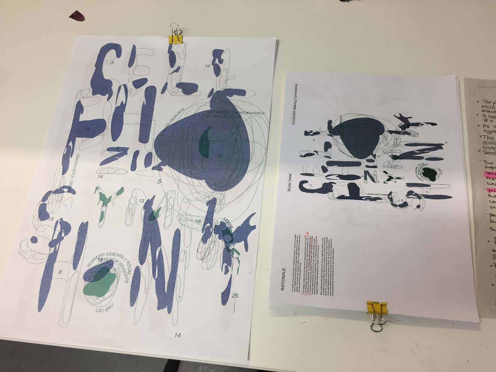
- People have collectively thought that the type is a bit hard to read, therefore maybe I can improve the type by possibly making the lines thicker and more prominent on the page. Contrary to what people have said about the arrangements of the though, I will still keep it as it is part of my main concept and taking it apart will only defeat the purpose of my poster concept.
- People have various different opinions about the colour choices, with some liking the red and yellow while some preferred the blue and green and told me to use it. In order to satisfy these suggestions I will try and create the poster with these two colour combinations and pick which one I like the most and highlight my idea better.
- In addition, I may also need to work on some of my writing and try to focus on only the important bits which can highlight my concepts and not waffle about something else.
Looking at other peoples posters I quite liked how some of them were really brave with there designs and picked unusual conventions of creating a poster such as phone apps like Snapchat which made there poster look quite bazaar but really worked and stand out.


No comments:
Post a Comment