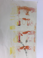
As the second poster idea was chosen to be further developed, I decided to experiment on different paper stocks to see which stock will fit my colour combinations the best.

- The white paper stock obviously makes the colours stand out of the page but also works well with the 'transparent shapes that are used as part of the letters, possibly making the letter more legible.
- The yellow paper does enhance the nice bright shade of green however the red seems to not fit the combination. On the other hand the red paper hiders the colour of the maing it hard to see, however the dark blocks does show up well, perhaps if the lines were dark too it would look much more impactful and prominent on the page.
- I attempted to print on newsprint however, I found out that it was too thin to print on it, although the print that did go on the newsprint was quite nice on the pale greyish tone of the paper along with it's smooth finish, I just wished I could actually print on the newsprint to see the full effect of it.
- I also tried making the glitches blocks black, however, I didn't really like how they were too prominent and kind of takes away the focus on the other designs on the page.


No comments:
Post a Comment