Tuesday 31 October 2017

[Video] What's wrong with the new Google Logo? : Will Paterson

Watching Will Paterson's take on the new Google logo he mentions something about 'Optical Balance' 


Overshooting - curve parts of type overshoot the guidelines to keep a consistent type. 
"to optically compensate the size, so it looks like the same size"


Paterson showed the difference between normalised type (Google) and overshooted type and saw the difference between the two and how the overshooted type looked much more balanced and better  aesthetically than the other - though it may be mathematically wrong. I think this links back to my own project and design as the bases of my typeface 'Helvetica also does the same thing - overshooting (I noticed this as I was drawing my guidelines with some letters like 'X' not being centred accurately. This made rethink about how I could make my design better in order for it to look consistent.  Also, I think for my design, it's also important for me to think about overshooting in order to stabilise my type and keep it consistent and balanced. Furthermore, I think by overshooting my type it may look much better than trying to force it only a grid, as people will essentially be looking at the type itself and not where the guidelines fall or how the type is drawn within the guidelines. Similarly, thinking about how each of my letterforms will form into words I will need to think about their sizes in order for them to not look disjointed and awkward together.

First Typeface Development: Unconformable

For my first typeface development I decided to create the whole typeface (Unconformable) in order to have the bases done, for me to explore the typeface further. I tried using a rule while making the typeface and tried sticking to it.


Upon trying to create the typeface I felt that I already started to deviate from my rule as I felt that the typeface didn't look very good, however I still tried to stay within the rule to keep it as consistent as possible though with some outlier which made my development look quite messy. Nevertheless, some letters did stay consistent e.g. b, o, p, r, v and x. Also, while creating the typeface I realised that trying to measure the actual angle of the counters and half counters was difficult and when I tried doing it the letterform looks awkward, therefore I decided to discard this idea and continued to create the letterforms with less curvy lines. However, if I'll continue doing these curvy lines i'll need to make sure they're accurate at some point in my development to keep the typeface clean and consistent. i think I'll need to create a rule for this or make sure to make accurate guidelines as possible.


In addition, while looking at the typeface, I didn't really like the curves that I made on the terminals of some of them e.g. on C and D, as well as the stems for some of them (f and g for example) and the overly curved tittles on i and j. I think with these letters I stayed to rigid to the rules that they didn't look right. I also, didn't follow the rule on letters m and n , though I realised this when I finished making the typeface. However, looking at it now I think they look better and cleaner this way than following the rule on these letters. For my next development of my typeface, I think that I will try not staying too much on the rule as I realised the letterforms only look forced and awkward when I do this. I'll also think bout the aesthetic of the typeface and see how parts of the letterform will show this.


Sunday 29 October 2017

Studio Brief 3: Interim Crit

We did an interim criteria for our Studio Brief 3 in our groups in order to generate more ideas and collect opinions on our initial designs. I made five initial ideas which I presented to the group and got feedback from.

During the crit people liked different ideas one was the third idea which was 'pleasing to look at' and also votes on the fourth and last ideas, however the most prominent one was the second idea. Also, their was a suggestion of combining idea four and three where I could use the grid from idea four and use it as the grid on developing idea two. In addition, it was also suggested I'd make a double-sided poster for my final outcome showing a type specimen, quote and rationale on the it. However, I would think about when I could make this and if I have enough time; although I would like to make it as it could be a great way of showcasing my work and  ideas.

For further development, I've chosen to develop idea two as I think it would look great as a series and I think it has the strongest basis of rules out of all the ideas I have, which would make the typeface look consistent and could possibly work well in context such as an editorial page. Also, with consistency it will develop it's own characters such as being 'refine', 'functional' etc. To add to that, I may also make the curves very accurate by following the curves on the letter which they originally came from, this outcome ,ay either come out interesting or awkward as the curves may look too much and heavy for the typeface, however I will still do this as it may lead me more to further developing my work. I will also develop this idea with experimenting and combing it would idea four (combining grids) as I think it could come out with interesting typefaces and could maybe improve the work; this may mean that the letterforms will fit perfectly on the grid or i'll have to force the letterforms in them. Overall, I think the crit went well and I've got ideas and opinions on which direction I should take my design further.
Design influenced by not conforming to rules of typography regarding the ascenders and descender on the guidelines.

Design based on the idea of taking the rules of typography and doing the opposite e.g. straight stems = curvy stems.
Design influenced by 'Social Loafing' where negative space from letters are used to portray 'laziness' and unconformity.


Design inspired by the 'Philippine Revolution' where the once fragmented country from the Spanish Colonisation come together for revolt.

Design based on the idea of rock unconformities where there is a discontinuation in rock layers due to erosion and other significant events.


[Podcast] Design Matters from the archive : Massimo Vignelli


In this podcast Vignelli talk about his favourite typeface and vulgarity and meaningless design and wha the means by 'forceful' design.

"If you can design one thing, you can design everything."

All discipline of design is the same though only specifics can change e.g. designing graphics. 
He only uses 4 typefaces: Garamond, Bodoni, Century Expanded and Helvetica. There's also Calson and Baskerville but they can similar to Garamond and Century Expanded but he only used the other two as they're "basically similar to the other two which are much better". Vignelli stated how "trendy,  not lasting value, phony and incentive in the detail, not elegant and not strong" and junk and since it's junk we trash it or don't use it at all. He strongly believes that traditional typefaces which have hundred of years of history are still better than modern typefaces especially Bodoni ("Bodoni is the best one".)

Vignelli is 'horrified of any type deformation"; he doesn't like typefaces which are not economic. * Although, I do agree with Vignelli to some degree, of using a restricted range of typeface when designing as some typefaces can be very similar to each other and have the same or similar personality, However, I think that being able to be free and be conceptual and creative with creating new typeface is a good thing. Although those new typefaces may not be economical they can still serve other purposes in other context and can relate to certain audiences and medium. I don't think just because a new typeface is created or a typeface is rendered that it is automatically meaningless design, but is instead something that is taken in a different point of view with possibly a different purpose.

he felt that most typefaces were design for my money - one way to make a living (not enough , refinement in creative mind = meaningless)

Vulgarity: "not wipe in out but reduce it"

Young people in big companies are not cultured enough or articulate enough which creates problems and misunderstands as they convey what they want rather than their needs.

Giving 'The Vignelli Canon' and sharing it free online is important for Vignelli and something of his study should be shared.

Good things will have permanence.

He believes it's a crime for designers and marketing people to produce "a continuous flow of crude  and vulgar design" as he believes that they look down on people and think vulgarity appeals to the masses and therefore creating bad designs and visual pollutions which is degrading our environment and is criminal.  I think this is a very strong opinion from Vignelli, and is also quite true. Marketing using vulgarity has been create and seen throughout the 50's and even today and is something that I think will not stop anytime soon. It may be too integrated into our minds that it's automatically seen as 'okay'; although nowadays it's being addressed more and more, especially through social media and the concept of 'double standards'. 

"...it's easier to like things that you don't know."

Vignelli likes forceful design - emotionally charged, intensity of whatever it does, it's not only armouny but provocative at the same time... the balance between the elements is exciting..." On the other hand, he doesn't like 'limpy designs' -pure, meaningless designs, stripes, pastel colours; anything which the only sole purpose is for aesthetic reasons and decoration doesn't relate to the situation. *I disagree with Vignelli's description of 'limpy designs' as these ind of desings could just be done as a way of expressing someones feelings and emotions. Also, nowadays people are more aware of 'aesthetics' and somehow how it looks could outweight it's purpose e.g. Apple iPhones.


Josef Muller-Brockmann : Grid systems (Typeface Alphabet)

In his book Grid systems Josef Muller-Brockmann talked about typefaces in which he mentioned how the "knowledge of quality of a typeface is of the greatest important for the functional, aesthetic and psychological effect of printed matter". He's also selected 9 typeface which he though were typeface that were "pleasant'" and "easily legible". I think that it's also important to think about the functionality and effect of a typeface swell as as how it looks in order for it to be considered a 'good' typeface. I think that it should be able to communicate the brand of image that it's trying to portray as well as be able to come across to an audience in a way in which it's intended to e.g. an economical typeface for a supermarket brand. It should also be pleasing to look in order for it to have impact and a face; as well as the fact that people these days are more conscious about typography, especially logotypes for companies e.g. fashion brands, as consumers feel that owning something from a certain brand can say something about who they are and their identity.


Saturday 28 October 2017

Studio Brief 3: Typeface (Initial Research)

For this studio brief we got a word which we need to use in order to create our own typeface. I got the word 'uncomfortable'. I research dit's origin (to conform) which is "conformer" in Latin and "conforme" in Old French. In addition, I also searched connotations and synonyms of the word in order to get five distinct ideas in order to create my typeface. I researched things such as social psychology of conformity, rules of typography, lithography(geology) and revolution in a certain place. From these research I create initial ideas which have heir influence and references in them. 


"Kerndown"

We were different genre's of brands of which can be distinguished using the amount of terming used on a word.

Budget Supermarket


  • The kerning is quite tight and is lined up straight which makes it look economical and trustworthy as supermarkets needs to promote a customer friendly image the would make them want to keep coming back.
Luxury Brand
  • Again the kerning here is also tight making it look refined and professional in order to promote an affluent image.
Condom Brand
  • Having the leading of 'z' quite large compared to the rest makes it more playful and mischievous.
IT Company


  • Tight kernings and straight layout in order to portray a neutral image.
Indie Band
  • Letter are 'scattered' but still in order to make it clear and makes the word look edgy, fun and quirky.
Funeral Director
  • Neutral and emotionless
Kids TV Show
  • Letters are rotated and spaced out kerning as well as having some overlay to kale it playful and attract the attention of children.


Monday 23 October 2017

Studio Brief 2 Rationale & Final Outcome (Design Boards) : Final Crit

Upon doing my designs I feel I have a consistent and different design ideas which all relate back to the artist that I am studying- Rana Begum. I feel that through my research and additional knowledge about the artist and their work I have explored a wide range of development ideas which I could've taken further and refined into my final design idea. In addition, I also feel that I have explored a wide range of media and material that the design can be put into as well as while developing the designs such as paper, leaves, collaging and using Illustrator to manipulate the typefaces. I think that I also considered the type of audiences that it can appeal and relate to; also keeping in mind the connotations and the overall impression and aesthetic that Begum has on her own designs.

I think that most of my design ideas have an interesting idea behind them isn't too obvious or literal o the work that Begum does however, still relates back to her i some way or another, e.g. natural geometry idea. However, some may be a bit too vague or similar to each other e.g. folding and distorting the letters.

I think that my choice of visual language is appropriate and links to Begum and her work. I have used similar colours that she uses for her own work such as yellow and red; bright single colours which are simple and flat. I also layed out my designs out similar to how Begum would lay out her sculptures which are in different angles which takes advantage of perspective and the audiences' movement. In my designs e.g. Poster in no.6 the lay out of the text is influenced by aspects of constructivism and Josef-Muller Brockmann's work which have also been influenced by constructivism. In addition, I decided to use the typeface 'Futura' as I thought it would fit the best with Rana Begum' aesthetic out of the 6 typefaces from 'The Vignelli Canon'. It is a very geometrical modern sans-serif font which has functional characteristics to it. It also looks very clean and has a slick and straightforward vibe to it which matches to Begum's designs and the way she works with the placements of her sculptures and how geometrical they are.

Furthermore, I also think that I have consistently put my designs in context. They are put in different medias such as a website, poster and tote bag; I have tried to be as consistent as possbile by only using the logotype itself rather than having variations of it in different styles (though I have showcased it in different scales and sizes I have only used one colour on it and did not separate parts of the logotype.)

However, if I was to do my designs again I would like to alter some parts of it. I would like to possibly add more text on the poster to show more information about the artist so that the audience will have sufficient information about them and not leave them confused. Furthermore, i would also like to possibly put the logotype onto even more context such as on a business card in order to see if it can be distributed on a new media and if it's suitable for the artist that I'm basing it on or if it matches her colour and image.

While reading the feedback given to me by my peers, most of them have suggested for me to out more text with the logotype as they feel it would look much stronger and better as they think that the logotype itself may not be as strong. They also suggested to interrelate the different designs e.g. have the design on final outcome no.6 on the website animation. Furthermore, people have also suggested for me to maybe develop my final further and make it more refined. Overall, people have said that I that I have a "clear development to get to the final outcome" and "didn't just stay safe". They also mentioned how I have "very good large amount of context and description is very thorough, with the idea being "informed and was (there) enough context behind the final logotype.
    

Response to Final Crit

  • I could maybe further develop me final designs and put it in context on a wider range of media and materials that it could be used in.
  • I could also include more text in my posters or more information about Rana Begum in the posters as it looks too minimal at the moment.
  • I will also need to proof read my paragraphs due to excessive spelling errors and maybe also change the font as someone thought it was too heavy.
 

Saturday 21 October 2017

Erik Spiekermann & House Industries

Erik Spiekermann

"its like music, people make the music i make the sound".
  • doing rough sketches of letter e.g. aensg
  • find something he likes, look at it intently and a lot and put it away and the next day draw it from memory (looks completely different) *an influence but not a copy
  • like taking thing apart and looking at it in detail; reading in different language 
  • language of science (latin); language of diplomacy (french) language of exploration (english)
  • there's different languages that one can know e.g internet language, iPad language
  • He has influence, work with, trained, hired hundreds of people around the world e.g. London
  • every letter has a rhythm; it has a face it all combines together 
  • rhythm between words, letters 
  • contrast between outside and inside shape

House Industries

  • deal with social relationships
  • balance and contrast
  • how does each letter relate to one another; emphasis
  • how to move and reshape letters 
  • referencing type forms in order to create new one

Tuesday 10 October 2017

My Thoughts About 'The Vignelli Canon'

Upon reading the 'Vignelli Canon' and basic research of it's author Massimo Vignelli, I got an understanding that every design must have a base. A designer must first understand the core of what their designing in order to come out with a piece of work that can fully uphold itself and convey to the audience properly. Also understanding certain design practices such as texture, light and colour so that you can produce a design that can surpass through time.
 Being ambiguous is also a good thing as it shows various perspectives within designing, though it can also connote lack of control. He also notes that preserving iconic logos and designs serve better than change as they already have certain connotation to the public and is essentially part of a culture and history. Vignelli also voiced his preference to order. Having a certain to paper sizes for example, as opposed to complicated systems that results in an endless confusion and inefficiency. 

He is also a firm modernist and believes information and simplicity is key to a good graphic design. It's not what typefaces or letterforms have certain connotations in order to portray a certain mood but what you can do with basic and standard typefaces in order to relay your intentions to the audience to.  It's by using certain features effectively e.g. type size that you can relay a message successfully. Vignelli also mentions, "It is really the white that makes the black sing." This to me screams simplicity and the importance of creating order and a phase in your design. It's being able to create a fluid design that takes an audience through a journey especially when designing a series or a set e.g. a book, magazine spread. - "White space, not only separates the different parts of the message but helps to position the message in the context of the page." 

Overall, I do agree with Vignelli to some extent. Being able to have the knowledge of the basics in order to create designs that are able to 'stand by itself in all its clarity'- something everyone can look at and understand. However, I do believe there's room for a wider range of typefaces than Vignelli's 6 basic typefaces (Garamomd, Century Expanded, Time New Roman, Futura, Helvetica and Bodoni) than can also portray simplicity and is suitable for a certain piece of design.


Sunday 8 October 2017

Studio Brief 2 : Interim Crit

In my interim criteria I showcased my five logotype design ideas for the rebrand of Rana Begum. In my interim criteria I have gotten feedback that would help me develop my ideas even further. 

Feedback for each Design Development


Logotype Design 1 - People seemed to like the idea of finding everyday objects and creating simplified letterforms from them but looking at the two developments I created it seemed that people liked the first one better as the other one seemed too typical and "seen before".  

Logotype Design 2 - Again people seemed to like this idea - "I really like the leaves underneath like if you screen printed that I if that's just all in one colour it'd look a lot cleaner and that will look really cool". 

"...turn leaves and patterns into a silhouette.." "you could make Begum out of the objects and have Rana as a different pattern on top.." "...cut the leaves in straight lines...give it some geometry" 

Logotype Design 3 - I never realised this, but people thought there are architectural qualities in this work which may have been inspired by Begum's architectural inspired sculptures; "I think you can have architectural qualities without having to be a skyline...this has got a hint at it..", "it suggest things it's more subtle..." , "I like it I think it's got a really nice aesthetic..." I was also suggested to have "...some white lines going through the black shapes.." 

Logotype Design 4 - As I presented this design idea right away people were quick to suggest to "slid them into each other", "push them together" even with my second development which was together on the leading - "they have to hit, they have to touch...", "I kinda wanna stretch yours and move them so they touch" 

For my lowercase design idea people liked it, however they thought it was too detailed and some bits cut off bits of the letters were maybe unneeded. 

Logotype Design 5 - This final design was thought to be my weakest design. The cut through the letters were noticeably done on Photoshop making it look like a GCSE style work. I was suggested to maybe cut some pieces out and scale them bigger or stretch them.

Overall Feedback

  • Maybe have some animated e.g. design 4
  • Put them in context
  • Think of the spacing between the letters - maybe form it into a box of pyramid - "make it into the geometry itself..."


Yorkshire Sculpture Park - Logotype

The second part of this brief continued on from our previous work on sculptural forms, however this time we had to create a logotype for a specific exhibition or artist that was involved in Yorkshire Sculpture Park.

I chose Rana Begum the curator of 'Occasional Geometries' as I feel it's easier for me to develop logotypes to rebrand her as I have previously looked at geometric forms and grid systems- which is very much her way of working.


Who is Rana Begum?

Begum is a very minimalist designer and is inspired by architecture, Islamic art and constructivism. She's also an observer of geometry in everyday life as seen in her Instagram uploads where she often takes pictures of stair, buildings, traffics cones etc. She often do not make work with conceptual meaning but rather abstract and simple designs that are intriguing in a silent and calm way ("It's not shutting 'look at me, look at me' but sometimes it's just about pausing and noticing how certain elements light, form and colour - come together." Begum uses light, form and colour as the bases to her designs and uses the manipulation of colour and light and movement of audience in order to create various perspective to her designs, which makes the audience stop and look at the small details and get engrossed in her work. also, in my opinion her "conceptually thin" designs may come from her cultural background as she has suffered from racism in her childhood (being a British-Muslim) that she has decided to create work where people just see what they see and it eliminates some kind of differentiation. 

Friday 6 October 2017

What is Studio Brief 2 about?

In Studio Brief 2 we are to produce five logotype proposals for a rebrand of our chosen artist or exhibition. We are also to experiment or take influence form Vignelli’s six basic typefaces. We must focus on changing and manipulating existing letterforms in order to express the essence of what the exhibition is about as well as to intrigue the target audience. In addition, we must also experiment with a range of processes such as forms and marks, collage and trace.

We will need to research about the artist or curator of the exhibition as well as the ideas behind the exhibition. What the main theme and concept of the exhibition. How the work in the exhibition communicate to the audience and how the audience may interpret the work in the exhibition. Also, if there is a specific target audience or is the exhibition targeted to the general public.

As of now, I may decide to choose the exhibition ‘Occasional Geometries’ to build my logotype on or it’s curator ‘Rana Begum’. Picking ‘Occasional Geometries’ can give me a general concept of the artist within the exhibition- some may overlap but overall they all share the same viewpoint and may help me on designing my logotype. On the other hand, choosing Rana Begum may give me more of an insight to her own practice and the ideas behind her own work.


For my initial ideas, I may begin to look at the Begum’s way of working and the reoccurring theme in her work; her influences and her main inspirations of her work. I may also begin to experiment with Vignelli’s six basic typefaces and make initial logotype ideas with typefaces that I deem suitable for the artist that I have picked.

Yorkshire Sculpture Park - Negative Space, Silhouettes and Sculpture forms within Type


To start this module, we were to design three 3D typographic designs in response to an exhibition that is currently in Yorkshire Sculpture Park. Firstly, we explored and experimented on creating 3D sculptures ourselves using collages and prints. Following a trip to the park, we decided to create our 3D typographic forms on ‘Occasional Geometries’. This exhibition was curated by Rana Begum and was centred on abstract minimal installations which lends itself to the movement of the audience, various perspectives, changing light and the relation of different work that are spaced out in the exhibition. After doing further research on the exhibition, we decided to create our three 3D typographic forms on the theme of grid systems while interlinking the idea of relationships between work and minimalism shown in the exhibition.

For our first typographic form, we decided to use tape on tiled walls to effectively show the geometric lines when used on grid system. We decided to use existing structures to create our typographic forms which links to the exhibition’s influence, which is Richard Wentworth’s work ethic of “isolating an object that already exists, bringing together and stage-managing found things not usually related to art...” Using existing structures made it easy for us to create letterforms as we already have a template or guideline for the letterforms that we were creating, also it restricted us in a way that we could only make straight line and could only make them go up down and diagonally. However, at one point we did try and create letter from going away from the tiles and onto the grided floor and tried to create a more 3D shaped structure- although in my opinion it didn’t really work as it looked awkward and too forced.


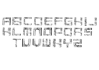
I however, developed the idea digitally by finding the most common shapes used and created various letter forms gradually simplifying them as I experimented quite a few times.


I think these designs were the more successful ones as they are not too similar to the work they came from but also took the elements of the shapes quite well while looking very simplistic and clean.


Similarly, to the previous idea our second idea also uses a grid system in order to create the word "CONNECT" from wool. Using wool gave us the freedom to loop it and bend it however we want as opposed to the tape. However, this idea was very time consuming and we used a fence with small squares which made it harder to loop the wool around it, which I think made this idea nor quite successful and refined as we had liked it too.


However, I thought the lines made by the wool could create a spaced out jagged pattern when inversely cut into letterforms; also by making the letterforms black and white the textures are highlighted and gives the letterforms some 3D elements to it.

Our third idea was the theme of “perspective” and relationship between each work in the exhibition, which was strongly shown in the exhibition. We still took the tape-like letterforms as inspiration but linked them together digitally in order to create a sculpture like structure and overlaid the design on top of one of the exhibitions (Jesse Darling’s ‘March of the Valedictorians’). This puts the design in some context, where it’s put in a situation where different structural forms can be seen and formed while a viewer may be moving around the sculpture itself. If I were to develop this idea further I would start to look at the sculpture with the overlaid design to see if various letterforms can be created while going around and possibly seeing it in different perspective and angles.