To start this module, we were to design three 3D typographic
designs in response to an exhibition that is currently in Yorkshire Sculpture
Park. Firstly, we explored and experimented on creating 3D sculptures ourselves
using collages and prints. Following a trip to the park, we decided to create
our 3D typographic forms on ‘Occasional Geometries’. This exhibition was
curated by Rana Begum and was centred on abstract minimal installations which
lends itself to the movement of the audience, various perspectives, changing
light and the relation of different work that are spaced out in the exhibition. After doing further research on the exhibition, we decided
to create our three 3D typographic forms on the theme of grid systems while
interlinking the idea of relationships between work and minimalism shown in the
exhibition.
For our first typographic form, we decided to use tape on
tiled walls to effectively show the geometric lines when used on grid system.
We decided to use existing structures to create our typographic forms which
links to the exhibition’s influence, which is Richard Wentworth’s work ethic of
“isolating an object that already exists, bringing together and stage-managing
found things not usually related to art...” Using existing structures made it
easy for us to create letterforms as we already have a template or guideline
for the letterforms that we were creating, also it restricted us in a way that
we could only make straight line and could only make them go up down and
diagonally. However, at one point we did try and create letter from going away
from the tiles and onto the grided floor and tried to create a more 3D shaped structure-
although in my opinion it didn’t really work as it looked awkward and too
forced.
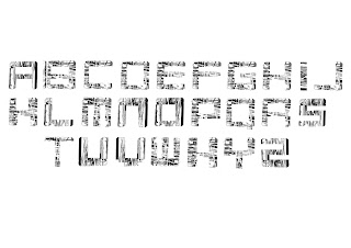
I however, developed the idea digitally by finding the most common
shapes used and created various letter forms gradually simplifying them as I experimented
quite a few times.
I think these designs were the more successful ones as they
are not too similar to the work they came from but also took the elements of
the shapes quite well while looking very simplistic and clean.
Similarly, to the previous idea our second idea also uses a
grid system in order to create the word "CONNECT" from wool. Using wool gave us the
freedom to loop it and bend it however we want as opposed to the tape. However,
this idea was very time consuming and we used a fence with small squares which
made it harder to loop the wool around it, which I think made this idea nor
quite successful and refined as we had liked it too.
However, I thought the lines made by the wool could create a
spaced out jagged pattern when inversely cut into letterforms; also by making
the letterforms black and white the textures are highlighted and gives the
letterforms some 3D elements to it.
Our third idea was the theme of “perspective” and
relationship between each work in the exhibition, which was strongly shown in
the exhibition. We still took the tape-like letterforms as inspiration but
linked them together digitally in order to create a sculpture like structure
and overlaid the design on top of one of the exhibitions (Jesse Darling’s ‘March
of the Valedictorians’). This puts the design in some context, where it’s put
in a situation where different structural forms can be seen and formed while a
viewer may be moving around the sculpture itself. If I were to develop this
idea further I would start to look at the sculpture with the overlaid design to
see if various letterforms can be created while going around and possibly
seeing it in different perspective and angles.


No comments:
Post a Comment