I chose Rana Begum the curator of 'Occasional Geometries' as I feel it's easier for me to develop logotypes to rebrand her as I have previously looked at geometric forms and grid systems- which is very much her way of working.
Who is Rana Begum?
Begum is a very minimalist designer and is inspired by architecture, Islamic art and constructivism. She's also an observer of geometry in everyday life as seen in her Instagram uploads where she often takes pictures of stair, buildings, traffics cones etc. She often do not make work with conceptual meaning but rather abstract and simple designs that are intriguing in a silent and calm way ("It's not shutting 'look at me, look at me' but sometimes it's just about pausing and noticing how certain elements light, form and colour - come together." Begum uses light, form and colour as the bases to her designs and uses the manipulation of colour and light and movement of audience in order to create various perspective to her designs, which makes the audience stop and look at the small details and get engrossed in her work. also, in my opinion her "conceptually thin" designs may come from her cultural background as she has suffered from racism in her childhood (being a British-Muslim) that she has decided to create work where people just see what they see and it eliminates some kind of differentiation.Logotype Design 1
My first logotype design is inspired by Rana Begum's observations on everyday life geometric forms. For my design I decided to take random objects that vaguely resemble 'RANA BEGUM'.

Rather than trying to create the actual letters I decided to simplify some letters such as 'E' and 'M' as forcing them into actual letterforms may be too basic and literal and not experimental enough. I then decided to simplify the objects even more to geometric shapes, inspired by the font 'Futura' - I'm using 'Futura' as it's the most geometric and linear typeface from Vignelli's six basic typefaces.

After creating this design, I tried to simplify it even more and extract the most basic regular geometric shapes i could find from the design in order to create an altered version of it.


I found four characters that i thought were the most regular and geometric out of the characters the it used and created aneven more simplified version of the previous logotype design. I thought this design was even cleaner and uniformed in comparison to the other design as it follows a rule and it is restricting me to use a certain amount and type of character
Logo Design 2
My second logotype design is inspired by natural occurring patterns and lines in nature- particularising stems and leaves. I had this idea of simply outlining the letter on the leaves, however I thought it looked too simply and almost drawn by hand.
I then decided to outline the leaves geometrically by finding points where they would meet in order to create those sharp point that 'Futura'. I've also decided to be a bit free with it by having some lines not meet properly with the stem of the letterform and created triangles to resemble the folds that the leaves made, making the logotype have a more stylised aesthetic.


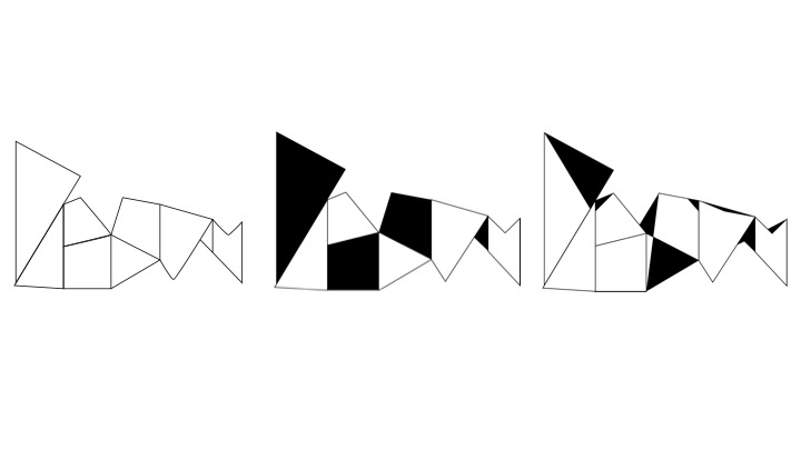
Logo Design 3
For my next logo design i was inspired by Begum's 'The Folded Pages' exhibition where she constructed large steel sculptures utilised the shadows that the folds made in order to give an impression of the sculpture being flat and 3D at the same time. For my design i decided to use geometrical shapes similar to the folds and overlapped them on top of each other and spell her last name out. I then took it to Illustrator and simplified the design and refined it further by making some shapes black to create more depth to the design.

Logotype Design 4
My fourth logotype design also takes inspiration from Begum's 'The Folded Pages' exhibition. I decided to use 'Futura' for this design to really highlight the sharp and rigid geometric lines the font has. I folded the letter randomly in order to see how different letter may turn out when some parts are omitted. I ended up with interesting cuts made on the letters- some of them looking abstract and illegible when on their own. I played out the letters in a very uniformed and straight way which made it look very formal and silent I think, therefore I tried to make it more playful by decreasing the leading and even making the letters irregular to their baselines. I think this made the logotype more dynamic and lively as the jagged letters seem to be part of a puzzle or game that they need to be 'connected' together.
Furthermore, I also experimented with lowercase letters folded the same way, but instead I didn't put any kerning on the letters which made the logotype 'one' and connected, which kind of made it fluid in a way.


Logotype Design 5
For my final logotype design idea I decided to distort the letters instead. By distorting the letters I found that they created a kind of 3D element to it as the distorted lines kind created a shadow. I liked this as even though the letters are somewhat cut it cuts vertically making them still legible to the viewers. In addition, I also developed this design by creating diagonal cuts on the letters creating this scattered jagged effect which makes the design more dynamic and have more movement.


No comments:
Post a Comment