Monday 25 February 2019

SB2: Some Initial Ideas

After the briefing I've decided to start mapping out some rough ideas on which topics I could do. I was more drawn to Studio Brief 2 first, therefore I decided to think of some rough ideas for this brief first and move on to Studio Brief 1 later.

Idea #1

President Duterte of the Philippines proposing to change 'Republic of the Philippines' to 'Republic of Maharlika'. 

  • Main argument being that it's named after the King of Spain and changing it to 'Maharlika' would erase the colonial past of the country.
  • 'Maharlika' is to describe a freeman (In Filipino context, its the 'idyllic civilisation spoiled by the colonisers)


Idea #2

Online Identity - people having multiple identities online 'Context Collapse'.

Idea #3 

Cultural Appropriation or Appreciation OR Are Asian artists considered Niche of Novelty?
Why is it okay for western artists to emulate Asian culture and people perceive it as exotic whereas if Asian artists emulate from Western culture it's seen as as a joke or 'trying too hard'. 

https://youtu.be/iLVvdbrXYkw
Thoughts & Reflection:
These are just some of rough initial ideas I have for SB2, I think they are quite varied ranging from political, social and cultural which means that I may have lots of different avenues that I can do it from. Although right now they are just ideas I will still need to research more into them to see if they are sufficient and interesting enough for me to do and carry on, as well as have something sufficient to show for the interim concept pitch; and which theme and concept I like the most, in order for me to generate ideas for the practical part of this brief.

Start of OUGD505 (Briefing)

Design Practice 2 - 30 CREDITS

Wednesday 8th of May (DEADLINE) 1:30/ 3:00

*individuality and effectiveness as a designer will be assessed
*personality, tone of voice and creative concerns 
*role of graphic designer/ designer

FIND SOMETHING YOU'RE REALLY INTERESTED IN...

STUDIO BRIEF 1: MAPPING


*to make a map documenting journey around Leeds.
*research and experience 
*2 copies of the final map
*mapping exhibition deadline - 29TH of MARCH
*20th, 26th and 27th March - SCREEN PRINTING ROOM AVAILABLE ONLY FOR GRAPHIC DESIGN

*challenge what a map is 
*map no bigger than A0
*map other people's routes? follow someone?
*mapping direction of something?
*what are you mapping? time? date? day? sunlight? sunset?
*where did the context come from? and what you do with it?
*how do u relate that experience, journey to a visual form?

DELIVERABLES

*2 maps
*6 design boards
*blog

STUDIO BRIEF 2: PRODUCT, RANGE & DISTRIBUTION


*responding to a social, political, cultural and ethical issue and the role of the designer
* body of research that explores concepts such as political/ cultural etc. and their respective design outcome 
* research should reflect own ideologies, concern and ambitions

PART 1

*what is the issue that you want to talk about and research
*RESEARCH (primary and secondary) - in order to explore all the opportunities 

PART 2

*body of practical work that 
*explore relation between 
*think of the distribution - whats the best possible way of distributing and communicating the idea e.g. flag, poster, digital campaign etc. 

DELIVERABLES

*resolutions, products, outcome appropriate
*6 design board
*blog
*summative evaluation

EXAMPLES:

*EU-UK (artists led remain campaign)
*Me & EU - postcards to reconnect UK to Europe in the wake of Brexit 
*William Knight - Flags for the Forgotten (brings awareness) 
* Metahaven - reflecting political and social issues (work with objects and products)
*In Loving Memory of Work: A Visual Record of UK Miners' Strike
*HORT - capitalism and consumerism 
* Dosdecadetres - Institute of Sustainable Production brand identity 
*A-Z : Coast to Coast Shore to Shore
*GraphicDesign& : 'Hope to Nope: Graphic and Politics 2008  
*Low tech Magazine - Solar power website 
* A Typographic to readdress design history to gender inequality
*Good Surface                                                                                                                                         

Friday 15 February 2019

End of Module Evaluation

Overall, I think this whole module has been the most stressful and often unproductive I have ever been. Firstly, especially because we just came back form the holidays and had employability week for 2 weeks I think it had messed up my whole work schedule and pattern in general. I do understand that it is all part of the module and part of being organised and timing myself right, but at the same time, I feel like I just couldn't get enough time for myself in order to work on two briefs at the same time, because we also had activities that we had to do outside of employability week hours in order to present in actual employability week lectures, so I think that's when my work started to pile up.

I think the biggest mistake I made as well was the fact that I got really stuck on the SB1 RSA brief that I was doing that I've neglected the Graphic Design aspect of it that halfway through it, I was already questioning myself if I was doing the right thing or not, and because I was answering the RSA brief it felt like I was but at the same time, I wasn't and would probably not get a high grade because the work I was doing is not applicable to Graphic Design as much. I also didn't get to have a crits or ask questions because at the same time I didn't have much time to think about SB1 because SB2 was just slowly taking over my time more than it should, and I couldn't stop because it was a collaborative week and we had to work around everyone's schedule, especially because there were four of us. At the final crit though, I feel like all the thoughts that I've had about my work not really being applicable had just been confirmed, made me relieved and panicked in a way because now I know I can work around it to make it applicable to Graphic Design, but at the same time I only had 1 week to do it all, along with all the other work piling up. Although, I did manage to create a solution I know it's not the best I've done so far.

SB2 on the other hand was very easy going in a way that I was able to communicate with our collaborators really well as we had similar likes and ideas that we could bounce back and forth each other. Communicating and giving feedback and opinions was also really important, because at times I feel like the collaborators form Illustration wasn't really giving ideas or suggestions back but rather just confirming they are happy with what we had that i really had to go and ask them what thye think of specific things within the publication. Collaborating with Jocel, did help though because she was always there ready to bounce ideas and opinions with me and discuss things that I couldn't with the collaborators. However, during this whole module, SB2 was also taking over a bit too much of it which was constantly stressful, but I think we pulled through at the end.

All in all, I didn't quite enjoy this module much, and hoped that we had extra time on it as it seemed really short. The briefs that I did which seemed fun in the beginning became a bit too much sometimes however, I think that I pulled through and got myself on track again and made solutions and final outcomes which I'm okay about but not exactly happy with to be honest.

SB1: Final Outcome (Catalogue Insert)

After my development and refinements, this is my final outcome.

The use of the dark brown side of the paper highlights the embossed further making it a more impactful design which can appeal to the audience firsthand. In the addition, the paper stock also reflects the material for the product as well which solidifies the whole visual aesthetic of the product and the catalogue insert design itself. While embossing, it's weight also made it very easy to create prominent embossed shapes. Practically, it's also very cheap which makes it ideal for mass production when it is inserted in furniture catalogues. In addition, to the paper stock, the binding method is also appropriate and fits the them of the design as it highlights the handmade and natural style of the design and the product, giving the overall design a friendly and approachable feel. Coptic stitch binding also allows for a secure and durable bind to the design making it very practical for use, although the only downside is the fact that it may take longer to produce a mass of the design.

The typeface sued 'Futura' is also very appropriate and compliments the overall look of the design. It's modern and contemporary characteristic matches the homely and rough style of the design which make sit much more suitable than basic serif types or neutral fonts like Helvetica and Arial. Using it in the publication is also effective as it encompasses the information about the design and product which lets the readers know what it's all about without any lengthy information added. Also, having illustrations alongside may help the readers visualise the layers of the product better along with the embossed design that goes along with it.

Having the embossed design as the main point of the publication gives the insert an point  of interest and edge amongst competitors as it has a very dynamic and interactive aspect that readers can really engage with and play around with, which in turn may make them actually purchase the product.

However, having said this there are some things that I want to improve on the design. As I ran out of time, I didn't get to laser cut the tile again so some letters still don't up. I thought this was a really big let down because the title is the first thing people see and in the last module, I was pointed out on how the audience will react to a publication that doesn't have a title, as mine didn't have one. However, for this module, although I did try due to time constraints I couldn't , therefore I tried to compensate with the insert B6 publication title in order to give the readers a clearer indication of what it is.

Also, the colours on the insert publication, smudged and are quite faded and patchy, which may be the printer's fault. If I had more time I wish to have been able to print and bind it again. Overall, though I think I did an okay job at producing an outcome in the last week which is sufficient enough and is quite resolved in a way that it answers the brief and also reflects the solution that I had produced for the competition brief as well.


SB1: Submission Boards

Here are the submission boards that I've created which were a requirement to the RSA 'Beyond the Kitchen Table' brief that I did for SB1.


Thursday 14 February 2019

SB2: Distributing Zines

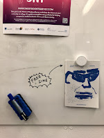
Today me and Jocel finally distributed our zines to Village and around our university in order to reach out to a wider audience outside the university but also from University grounds.

It's placed in there free zine area in their exhibition along with other extra zines. Also, we found a similar free leaflet that has an astrology theme which we thought was quite nice because it may also get people to get our issue. However one thing I did realise is that maybe we should've printed the Pisces issue because IT IS NOW THE PISCE CYCLE OF THE ZODIAC SIGN. However, because we were thinking we would be able to finish production when Aquarius was still in cycle we printed Aquarius instead. It's our mistake, however, people may still be willing to grab a copy of it hopefully.

Overall, I hope people would actually grab a copy of the publication and enjoy reading it and possibly learn about their own signs as well as about the Aquarius sign a little bit more, although I do understand as it's catered to a creative student demographic some if not most of it wouldn't be as relatable, nevertheless I hope it will still serve it's purpose and engage people to zodiac sign in a better way in how we have approached it in the publication.


Tuesday 12 February 2019

SB1: Further Developments

Following my decisions yesterday, I developed the idea further.

Information Insert 

As well as visual information, I wanted the readers to obviously have actual written content they can read in order to have knowledge on what they are trying to buy in order for them to actually engage and buy the product. I thought of having a small B6 page publication insert which have short summarises and illustrations o f each part in order to give the readers a quick and easily understandable information rather than lengthy information like in  normal catalogues. I experimented it on the Bockingford white paper that I had however, I didn't like how it contrasted too much with the brown tone of the Cairn Eco Paper. Perhaps the previous Fabriano Unica Cream paper will work better as they have similar tones as the Cairn Eco paper and have similar qualities that present the idea well. Also, I printing the illustrations black but I think they contrast the paper stock too much so I'm going to opt for brown too in order to compliment the aesthetic overall making the whole design look complete and professional.


Typeface

I decided to use 'Futura' as the typeface for the publication, as I felt it fitted and complimented the rough and 'organic' look of the embossed design due to its modern and contemporary characteristics. As well as the fact that I liked how quite geometric the typeface is that it's looks professional and casual at the same time. Also, I choose Futura as the typeface as if I chose a serif font I think it would just overkill the aesthetic of the design and if I chose a neutral type like 'Helvetica' it would just look really really bland, and I thought Futura was a good mmix of a fun and informative type that's why I chose it.

Stab Stitch Binding

 Although, I did say I intended the design to be a concertina I did want to explore another avenue that I could possibly do for the binding as I felt that it should be able to take the readers on a smooth and controlled manner in order for them to understand the layers of the pages and how they interact and relate to the publication inserted within it. I thought that stab stitch would be a great quick binding method that isn't only durable but also aesthetically pleasing to look at. However, upon doing this binding, I found that the pages didn't flip as smoothly as I envisions and made me scared of flipping the pages in case the paper rips. Reflecting this on an audience POV, readers would probably have a hard time navigating through it and would not try to read further because of this making it ineffective. Therefore, I may explore other methods instead, and also take into account the publication insert as well. Should I bind it together with the concertina design? should it be an insert within an insert to a catalogue?


Lasercut

Previously, the laser cut title didn't work well because of the letter not cutting properly, therefore i decided to make them all capital sand it a much bigger point size hoping all of it would cut through. However, a similar thing occurred, although it is much better than the previous one. But, because of time constraints and availability of room facilities, I couldn't develop more therefore I had to use the one I had. The title is much more readable now, still not complete which is a shame as it's for the front page and its needs to be impactful and easily understandable by the readers when they read it. Although, because it is an insert within a catalogue, would the readers already probably guess its
content? Or could emphasise the title by having it on the front of the B6 publication insert instead. Furthermore, I've also laser cut the missing layers of the design as well as the new version of the final layer which shows the all the layers better and more clearly.


More Embossing

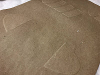
After choosing my final paper stock to start emboss on the Cairn Eco Kraft stock that I have.The embossing went really smoothly and I was able to make various versions of it, as well as a version with both of the differing brown tones shown. I did this as I still wasn't sure which side was better aesthetically, as I felt that the dark brown side was more prominent and would maybe have more impact with the embossed shapes, however the light brown has a nice soft tone and aesthetic to it which I also liked. I asked some of my peers for opinion and they agreed with on on the dark brown side and suggested it was the better side as well so therefore I think for the final I am choosing the dark brown side of the paper as the main front of the design.

dark brown side
light brown side

Binding Method 


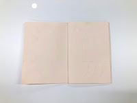
After the stab stitch binding, I thought of coptic binding as another alternative as I've also decided that I'm going to sew in the insert B6 publication so it's secure inside as well as give the design some depth and bulk when handled. Coptic stitch is perfect as it securely holds the pages together without them ripping or breaking apart.


Thoughts & Reflection: 

I think that this development and refinement stage was really fruitful and speed up my design process better in order for me to produce my final before the deadline and still have time to do my writing for design boards. I think that I've resolved my ideas more now in order for my final to be resolved.

Monday 11 February 2019

SB1: Initial Development Experiments

Following my initial ideas, I picked idea #3 which was the (Design Concertina) idea. I felt that this idea could really translate the solution really well as it has a strong dynamic element and tactile aspect which could appeal to the target users. I also think that using this will also give the target users more interest towards the product as they get to touch similar aspects of it just like how they would when viewing the actual product in store. Users will have a better understanding of what they are looking at and refer back to their own references on how they want the product to look aesthetically in their own homes. Furthermore, it's also dynamic in a way that users can interact with it due to it being a concertina shape and being able to pull out the different sections give them a better sense of the product design.

Printing Process

In order to further solidify this idea, I thought of embossing as an effective process in presenting these concepts. Apart form it's tactile quality, embossing also gives a very nice natural, and homely feel to the whole design, which reflect back the tone of voice  and ethos that the product is trying to convey - a way to become more socially active and communicate more in the kitchen area and beyond. 


Laser Cutting

In order to create the embossed pieces, I had to laser cut the shapes first. The shapes themselves turned out really well and they were cut to size of the actual publication already which is B% (as this is how most catalogues are set out). However, when I tried to laser cut the Title (A Multigenerational Kitchen Island) some of the letters didn't cut all the way through maybe because they were in small letter and were too small to cut. However, I still used them in my embossing experiments as I didn't want to waste time as well as materials. Although, for further developing the design I well make sure that I change it's setting, maybe change it all to capitals?


Furthermore, in order to apply accurate information in the design, I thought of having the shapes that are going to be embossed as the scale down version of the actual measurements of the product:
  • Main Table - Originally 2 m x 0.80 m ; scaled down to 20cm x 8 cm
  • Pull Out Table  - Originally 1 m x 1.4 m ; scaled down to 10cm x 14cm 
  • Cabinet - Originally 0.26 m x 0.15 m ; scaled down to 26 cm to 15 cm
Paper Stock

Bockinhford (190gsm)

I decided to experiment with this paper stock as I really liked the clean almost frost white colour that it has. I thought that the embossed shapes would look really nice and prominent on it. 

+ shaped were really prominent maybe because of it's thickness?
+looks really clean and sleek

- can get dirty easily
- in certain lights shapes might not be seen properly
- looks a bit clinical
- is it too basic and simple?

Fabricano Unica Cream (250 gsm) - 

Afterwards, I decided to experiment on the cream version of the paper stock as I thought the cream tone would give the the design the character that it lacked when on the white paper stock. I just thought that on the white paper stock it looked too plain and doesn't really have any appeal at all. 

+ more pleasing to look at that the white version
+ also prominent shapes maybe due to it being 250 gsm thick
+ It would look good with another paper stock or combined with something darker to bring out that 'natural', homely feel. 

Cairn Eco Kraft (170 gsm) - 

I also decided to test on the Cairn eco paper as I really liked the earthy natural quality it has. I think that using this paper stock will also be a good visual reference on how the table will look like and the material that it will be made out of. I think it may also effectively highlight the homely style and friendly quality that the product in meant to portray to the audience.

+visually it strongly references and shows the material the product will be made out of
+ aesthetically successful at portraying the homely feel
                                                      +cheap
                                                      +easily embossed on even though it's only 170gsm. 

                                                       - may rip easily when being rolled when embossing
                                                       - two sides have slightly different tones (may not be consistent?)

Thoughts & reflections:

After doing these experiments I showed it to my peer in order to gather feedback. All of them really liked and favoured the Cairn Eco paper stock, as they thought the embossed shaped were a lot more prominent and noticeable on it because it's dark. It also made them think of the material the table is going to be made out of (wood), which I think highlights that it succeeds this representation when shown to the actual audiences as well. Overall, following my peers I think I will chose the Cairn Eco stock as the final paper stock to use as it does the job aesthetically as well as design wise. It's also very cheap, however the two different shade on both sides, I think I can work it to my advantage as in embossing you also get two different surfaces, therefore working this to my advantages, the audiences can feel various textures and colours whilst going through the concertina as well, enhancing their experience and senses, which may engage them more with the design and the product.

Friday 8 February 2019

SB1: Initial Ideas (Bringing back the Graphic Design aspect to my Idea)

Immediately after the crit, I decided to think of ideas which I can show my designs in a more effective way.

Idea #1 - Design/ Function Booklet

For this idea I was thinking of creating a manual book let that would reflect the ideas that I had on the proposal board for the brief. Similar to the proposal board, the manual will show the expanding diagram solution with the information and details about it. The manual however, will take the readers step by step and will include more information and description about the product, much like what they would see in catalogues. I also researched some of the catalogues that the sponsor companies of the brief have and they were all pretty much standard catalogues therefore maybe having this kind of manual will interest more audiences.

+ will act similar as a catalogue 
+ shows detailed visuals such as the screw/ drills which would help audiences to choose it would be appropriate for their needs etc.
+ can be easily mass produced as it can be digitally printed.

- people may think it's redundant as they may feel like the catalogue is already enough. 
- isn't interesting enough to stand on it's own


Idea #2 Design Blueprint

Feeding off the proposal board again, I'm thinking of creating a blueprint which shows the diagram in a more tactile and visually interesting way by using specific paper stocks and colours that would refer to the materials used for the actual product. The blueprint can also be extended to become a poster of leaflets and other promotional product which can be distributed in order to promote the product.


+ can be transferable in different mediums
+ can be very tactile and play with textures etc. to show the qualities of the product 
+ can be put as inserts in catalogues which may make the audiences read through further and look  at other products. 

- a mix of digital and handmade techniques - can be hard to line up or take time to produce.
- needs to be with something else to attract consumers
- consumers may not know what it's for at first glance - so will still need to include a good amount of descriptions.

Idea #3 Design Concertina 

For this idea, I thought maybe adding the 'tactile' element with a concertina book design would be quite interesting. I thought of possibly printing each section of the furniture on each page of the concertina reflecting how they are made in 'layers' or sections; as well as give the readers clear pace of how they look visually. Putting in the tactile element to it, I thought maybe using embossing or textured process would work really well in order to translate the idea of a natural and homely product that may appeal to the target users.


+ Clear visualisations of the expanding diagram idea
+ Dynamic and tactile element which adds a personal touch and more appeal to present the ethos of the product
+ can stand on it's own or be inserted in existing catalogues

- will need to have the right paper stock in order to not look tacky
- will need to be hand made so might take time 
- not time efficient so mass production might be limited

Thoughts & Reflections:

I think that as of now I've finally thought of sufficient ideas which I can pick and refine in order to translate my ideas  effectively and produce a piece of graphic design which successfully presents the ideas that I have as well. Also, in the time that I've got left I think that I'll be able to initiate some development and the final for these ideas in order to submit on time on Friday.

Final Crit

Today, we had our final crit for this responsive module and thankfully after the crit I got the clarification that I needed in order to steer me back in the right direction for this brief.

These are the responses that I've got in the crit:


Afterwards, it was clear that I was doing more product design as people pinpointed how it was like a manual or instruction and a proposal for something, which they were right about, at the same time it wasn't really related to my practice. Thankfully though I got suggestions and ideas on how I can bring back graphic design into it which was reassuring.

Thoughts & Reflections:

The crit went as I expected and at the same time I think that I've got the things that I wanted to hear as well as ideas on how I can tackle this problem. People suggested that maybe I can take this 'instruction manual' aspect and create an actual manual for the product elements that users can read. Maybe a blueprint showing the different elements with reference to the product elements itself, or a branding campaign?

At the end of it, I think it's more about using all the research and ideas that I've already got for the actual RSA brief and implementing it to more in my Graphic Design practice.

SB1: Existing Publications in General

I also looked at existing publication in general along with the ones that you see in university. I found that they are much more experimental and require much more effort as they have actually been made by hand rather than by a machine which may make their mass production quality less efficient. However, they look very interesting and definitely eye-catching


  • Very dynamic and has impactful use of printing and design processes.
  • Interesting binding method which may appeal to their audience and enhance its aesthetic quality.
  • May be able to be mass produced in a large amount due to time and labour costs


Thoughts & reflection:

What I've gathered from this is that these publication has effectively used design elements such as colour, type and paper stock in order to present their concept in an interesting and effective manner. Reflecting this back to my own design, I think that I should also the same and really focus the link between the design elements and the actual product in order to relay the information to the users in a much more engaging and enjoyable way rather than just making a manual that they'll have to read.

Wednesday 6 February 2019

SB2: Final Publication

After all my refinements and developments, this is the final outcome that I've produced. As I've said in my previous blog, I liked the Cyclus Offset 100gsm paper stock much better therefore I decided to use it as the paper stock for my final. Not only is the paper stock light enough and it has a very zine-like feel, but it's also very cheap (£0.56 per A1) therefore it would be quite affordable it the publication was to be mass produced. Calculating the price more accurately, with the publication being A5 in size and having 20 pages and 11 spread only 5 pieces of A3 are needed so one publication is only (£0.70p); adding the printing cost in the university (£2.50); with the sticker and poster cost (£1.00 = £0.50p each)  the whole publication cost us (£4.20. I think this is quite reasonable and is probably the cheapest we can get it. 


From my developments that I did, I decided to keep the decisions that I've made as I thought that they already made the publication look good as it is and that if I decided to try and develop it more that it wouldn't feel as complete (also, because me and Jocel have decided to have those same elements of: type, type style, size etc.) that if I was to change something it would mean that I also have to tell Jocel in order for her to change her designs in order for us to have cohesive layout that would represent the whole branding aesthetic of the publication issues. In addition, I also think that they compliment the publication nicely and communicates the concept very well as well as the practical elements such as the hierarchy of information by using different point sizes and styles in order  to indicate to the readers and guide them through the publication. 


Furthermore, throughout the whole process of creating the publication, I have constantly been communicating with Olivia, in order to gain feedback and opinions from her for how the publication should look and feel overall. In addition, to the meetings that we had as a group of 4, we've kept in touch through email and sent files through our shared Google Drive. I think through this constant communicate with her, I felt more confident in creating the publication as there's someone that would help me if I was stuck on something as well as confirm that I am doing an okay job so I could develop further. In addition, to this as well, collaborating with Jocel was also good because I had someone to talk to everyday so I had constant feedback form both sides which made everything so much easier. The only thing Olivia mentioned as feedback that she'd like to change was changing her name from Olivia to Livvy in the credits, which I immediately did, other than that she was really happy of how it turned out which I was really happy about as well, especially because I was worried if she didn't like how I edited her collages, however she thought it was really nice and put together well.


I am also aware that I didn't really explore on any binding method for the publication. This was because I already knew that i was going to use Saddle Stitch as my binding method as it's the most time and cost efficient method of binding, especially for mass produced zines. It was also appropriate for the zine as it doesn't have that many pages and therefore could be stapled easily together. I thought that if I experimented with other binding methods it would be quite pointless and would just waste my time when I already knew what binding method to use that is not only cheap but also time and labour efficient too.


For additional content for the zine , we also though that it would be nice if there's additional content that readers can use and keep with them. We thought having a sticker and poster set would be nice as it's quite fun and fits with the zine publication theme as well. It can also be very engaging and is also another way of trying to get readers to anticipate for the new issue. For this publication I decided to take aspects of the collages that Olivia created and made them into stickers. I tried to pick aspects which fit with the theme of fantasy and mysterious as well to fit with the whole aesthetic of the publication. For the poster, I decided to use the double page spread that I put in the publication as it seemed to be the most impactful of the collage designs and looks and feels appropriate for the zine. In addition, it was also the page that both Jocel, Olivia and Nusheen really liked therefore I thought it would also be good for the readers to have as well.

Thoughts and Reflection:

Overall, I think that the publication is very well put together and is considered very well. I think that we were also successful at presenting the theme and concept that we wanted to portray for the Pisces character, as we didn't want it to look too obvious and basic, therefore we choose it's characteristic that would be interesting to use. I also think that everything has been considered very well design and practical wise which would help use in the future if we actually continue to make this into a monthly issue series. Furthermore, I also think that the collaboration aspect of the brief was also really good as we were able to communicate well together and bounced ideas together every time we had interim meetings as well as communicating through email and sharing a Drive. I also thought ti was a good decision for me and Jocel to work with two Illustrators or else it would've been to hard if we only collaborated with one as there's a lot of things to do - we didn't want to overwhelmed them with info therefore working both together and separately has helped us make quick progress with the publication issues. 

All in all, I'm really happy with how the publication came out and I think that it communicates the theme well, as fits its target demographic through the niche content that will understand and engage with as well as relate. In addition, it's also a good way to ease them through the whole idea of zodiac signs as it involved minimal jargon which can be overwhelmed and confusing.