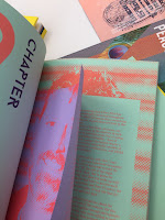
The talk was very informative and I got a lot more information about papers than I already have. Also, by showing examples of which paper stock is appropriate for a kind of publication gave me a sense of which paper stock and weight I should make my publication with. They showed a variety of different publications such as fashion/home magazines, business magazines/ cards, zines which also showed where certain paper stock is appropriate in relation to its context.
I also found some interestingly bounded books that I thought I could use as reference for my own publication. These publications (a) aren't actually with anything instead there'd a page that acts as a belly for the pages that are slotted in on each. The main pages of the publication are cut through a few mm smaller than the 'belly' so it can slot through freely.
 |
| 1a |
 |
| 1b |
 |
| 2 |
Thoughts & Reflection:
I thought the talk was quite fun and interesting, it was also nice how they brought in books which we could go, through and feel the actual textures of the paper stock giving us a more tactile and physical interaction with the paper stocks so we could actually tell which ones we liked and not like as well as which one we thought was appropriate for our publication. However, at the same I also thought that it didn't help me a lot in a way because they mostly talked about how text and images can be digitally printed of hand printed on the papers, but I've already had in my type may be engraved all throughout the book, so in that aspect I thought that some information wasn't relevant to this current module, however I am also aware that it will be relevant in other modules so I did take note of that too. However, the different types of binding that I found interesting in the talk was quite beneficial and I might try experimenting with them too to see if they work for my publication.
Paper I got from G.F Smith's paper samples:
I also got some sample paper from G.F Smith that I thought I could use in my publication. I choose:
- Plike/ Black/ 240 gsm - I really like this paper stock and the smooth but matte finish that it has. I was wondering if I can maybe make in into my cover and the weight of the paper is not too thick or thin either which may appropriate to what I want for my publication.
- Plike/ Orange/ 330 gsm - This paper stock is exactly the same as the previous stock however it's thicker. Rather than the 240 gsm stock maybe the 330 would be sturdier as a cover stock. I might test the two and see which one is more appropriate. Also, picking the colour orange I feel like was a bad and good decision at the same time. I based these selections from the first crit we had where people suggested using bright colours in order to relate it to the signs and message of my content, however I feel like as my idea develops maybe it would not be as appropriate.
- Original Gmund/ Blanc Verge/ 120gsm - This paper was too thin and I feel like would be hard to keep sturdy if detailed laser cuts would be made on it.
- Colorplan/ Factory Yellow/ 270 gsm - I also thouht of this stock as a cover option. It has a standard rough matte finish compared to Plike though, I don't think this will matter as much for my design decisions.


No comments:
Post a Comment