After the session we had in the studio, some of my group were still around and we discussed things which e thought could be improved design-wise. Most of us were pretty disappointed at the direction that we are heading with the concept that we have because we feel like we have totally forgotten about the whole "making the circle the centre of the whole exhibition" and making it the most consistent and flexible item of design. We feel like we have gone down the easy and obvious route or following a very structure museum aesthetic, making the whole design lacking in impact, boring and quite bland. We feel that it won't work as well as we thought it would because of how we are executing things now, as feel like maybe a slight change needs to be done it order for it to not be too late and still head on a more exciting and interesting way of working with the concept/idea that we have.
Some of use had a problem with the type-heavy designs as it seems like a bad decision as it makes everything very serious and just lacking in energy. It doesn't seem to be very innovative and fresh and can be quite old, therefore more focus on design using colour, symbols or pictorial could be a way of improving the whole exhibition design. We had these ideas down last week, but it seems that we forgot about these ideas and led to a very different one which some of us didn't really like. However, because not all of our group mates were in this discussion, we feel that talking as a full group tomorrow will be best to sort out the basic and whats lacking in our exhibition design, in order for us to comprise and well as be happy and confident with the designs that we are going to make.
Monday, 30 April 2018
STUDIO BRIEF 2: Publication First Draft
In the group I am one of the people in charge of creating the publication/archive for the exhibition. I've started creating a publication relating to the concept/idea that we have in mind. As we were going for the traditional museum feel for the exhibition, we thought of possibly making a very type heavy publication which visitors can look and read through. We've also talked to Ben and Pat and they've suggested using it as a possibly invite to get people to come to the exhibition; by giving them all the information they need they can come to the exhibition and look at the specific micro-genres and objects that they are particularly interested in. Also, among the group we've decided to choose Bodoni for the title and headings and Futura for the body text as Bodoni can fit the overall aesthetic of traditional and archaic but Futura is much more legible due to it being a sans serif font.
For the front cover of the publication. I've took direct reference from Darwin's On the Origins of Species book. I think it's quite effective and is quite eye-catching and matches the feel that we are going for with the whole exhibition. I've also consulted my group and they've liked what I've done with the front cover, which I was quite happy about.
 Possibly, including table of contents would be ideal giving a more ordered and structured appeal to the publication, much like a book or an archive that people can follow to look at which part they want to read.


For the front cover of the publication. I've took direct reference from Darwin's On the Origins of Species book. I think it's quite effective and is quite eye-catching and matches the feel that we are going for with the whole exhibition. I've also consulted my group and they've liked what I've done with the front cover, which I was quite happy about.


I've chosen a column grid system to implement in the publication, to have a strong structure which can make the writing easier to read and follow, as there is a lot of writing as the publication is quite type heavy with minimum pictorial to it. I think having the three column grid is quite nice as it keeps everything neat and tidy, however I feel like it will be too much writing on the pages and I feel like the whole type-heavy idea may be quite too much and make the publication quite bland and boring. I feel like if I was a visitor I would not want to read this much writing on the pages and focus more on the exhibition, thus possibly making all the writing redundant on this design. Therefore I thought of maybe adding large double or single sided illustration to break up the type heavy pages in the publication to make it more varied and free. I've talked to my groups about this, but some of them liked this idea and having this structured three column grid with paragraphs for each micro-genre, however some have opposed and thought of suggestions such as having illustrations to break up the pages like I've said or include little pictorials for each genre, as well as keeping the description to a minimum of 1-2 sentences. I feel like these suggestions may improve the design of the publication, as I feel like now, it just look a bit too much and quite intimidating too, because although the whole concept is to be quite traditional and museum based, I don't think museums even have these kinds of publications which are kind of newspaper-y and full of texts all over.
I will definitely think over the design of the publication as well as get more feedback on the critical we'll have tomorrow on how it should be developed and to which direction- a. keeping it type heavy and very strongly and tightly structured to the three column grid or b. make it more varied and dynamic with having illustrations and designs or possible contents as well as slightly adjusted minimum writing. I think we need to have a compromise in order to make a better publication, because this publication could also be the invite and the invite is the most important thing to actually get people interested in making people come to the exhibition. It has to be exciting and intriguing at the same time and worthy of sharing to other people or to social media, creating wider exposure to the exhibition as well.


STUDIO BRIEF 2: Exhibition Branding
Things for today:
- What is the basic concept?
- What researched it's based on? Gather it for presentation...
- Does it communicate core ideas of the exhibition? How does it communicate?
- It is clear and simple?
- What are the rules? Why type, colour, layout, productions is used?
- Logo, typeface, image
- Rule on how to treat image? use Circle?
- Formats for social media?
- Colour in limited range/ pantones?
- Production--> method, paper stock, materials, cost...
Things I'm doing:
- Publication Design
- Layout of Archive/Catalogue
- maybe have it all word/paragraphs --> visual description
- maybe have the publication as the actual invite?
- a4 publication
- newsprint material?
Sunday, 29 April 2018
STUDIO BRIEF 2: Independent Research for Group Project
We were to independent do our own interpretations of the concept idea that we have and pitch it to the group tomorrow so that we can gather more design ideas in order to actually start our exhibition design. These were the design ideas which I created in accordance to the 'Origin' idea that my group had.
For the typography, I decided to sample a strong sans-serif font like Futura to possibly give a more contemporary feel to the exhibition. I was thinking we can still go for the museum-y aesthetic however make it a bit more modern and contemporary by firstly choosing a san-serif font as the bases of the titles and overall typeface used throughout the whole exhibition design. On the other hand, I also sampled Bodoni as it's the typeface closest used in Charles Darwin's 'On the Origins of Species'. Because my group wanted a strong museum aesthetic to the whole exhibition, possibly going for a more traditional element to it and going for a more stern and serious serif typeface like Bodoni will show this feel of the whole exhibition, if it was to be chosen throughout the publication, poster etc.
 |
| typeface choice top- Futura, bottom-Bodoni |
 |
| logotype ideas 1 |
 |
| logotype ideas 2 |
 |
| logotype ideas 1 |
 |
| logotype ideas 1 |
 |
| collateral ideas |
 |
| layout idea |
 |
| publication idea |

In terms of social media, Instagram was something I thought could be heavily used, as most people use Instagram nowadays to find events and take pictures as well as hashtag things they like in order to find it or let more people know about it. I also thought of some simple hashtags which could be used through the whole exhibition, as well as a grid layout for the actual posts. By making a circle grid it automatically relates to the circle theme we have as well as keep the feed of the account very consistent and strong. It's also quite unique and interchangeable such as making a gif or video in a circle mode, effectively zooming in on pictures or videos etc. keeping audiences entertained and intrigued at the same time.
 |
| social media idea |
Friday, 27 April 2018
STUDIO BRIEF 2: Starting to Develop our Concept (Origin)
Origin: Micro-genre's of Music
typography- technology brings a new genre
- evolution of typography
- symbols for genres
- having wristband made out of of the rolls in the cassette (if glove idea won't work)
- Bodoni for typography?
- Archive of the micro-genre's/ book for cassette and flag
- stands for cassettes
- earthy, brown, black colour, red, green, natural, beige-y colours
(Logo, colours, typeface - visualise through collages, mood boards, presentation to present to group on Monday)
- zine for publication of categorisation of genre's
- cursive font?
- postcard invite? O on one side etc.
Photoshop Advanced Induction
DIGITAL PREPARATION OF POSITIVES FOR SCREEN PRINTING
- started of with a desaturated layer (layer 1)

- Threshold adjustment (pixels can only be black and white)
- Clipping Mask (Release clipping mask) isolating a layer so any changes only affects that layer.
- *OVERPRINTING - getting a new colour from to colours
- Maximum frequency for screen printing is 50 ppi.
- Angle (Moire Patterns) for one ink is 15 degrees
WORKING WITH HALLF-TONES
- Turn image to grayscale and save as a tif.
- Don't output from Photoshop but output from Illustrator. *USE BLACK AND WHITE PRINTERS
- *Workshop file = Illustration PDF.
BITMAP ON PHOTOSHOP
- Increase resolution because we are working with a bigger page (1,200)

- Frequency no less than 50 (540) and angle of 15 degrees.

- *Workshop file = Photoshop Bitmap technique.
ALTERNATIVE TECHNIQUES
Digital Colour Mode (CMYK = process colour (for ink/printing) and RGB(screen))
Digital Colour Mode (CMYK = process colour (for ink/printing) and RGB(screen))
- Shade of grey in the channel is directly linked to the amount of ink in the channel
- CMYK can be considered as information about ink or printing an image
- Frequency - 50plimax
- 4colour angle - 45. 75, 15...
- Photoshop - split channels create greyscale of each ayer and bitmap each image applying the halftone (using different angle for each positive).
- SPOT COLOURS - one spot ink us used to print a specific colour
- CMYK - four process
- PANTONE COLOURS - spot colour references in commercial use - commonly use for branding for accurate colour options; insuring consistency.
- Pantone colours have a unique reference colour and is a direct reference for the printer to choose the right reference colour
- Each swatch on a pantone colour indicates the base colour mixture for that pantone colour.
EXPLORING SPOT COLOURS ON PHOTOSHOP
- CHANGE IMAGE TO GRAYSCALE BUT NOT REALLY NECESSARY
- NEW CHANNEL --> COLOR LIBRARY --> BOOK: PANTONE Solid uncoated
- SOLIDITY PERCENTAGE - indicates the opaqueness of the ink/colour
- SPOT COLOUR CHANNELS file formats - TICK 'SPOT COLOURS' under save and you can save it as a Photoshop or a TIFF file.
- Go to Illustrator to print spot colour
- *ONYL USE HALFTONES (angles) IF TINTS ARE USED.

STUDIO BRIEF 2: Idea Generation
Yesterday, we started working in our groups in order to think of a starting concept and an idea for the exhibition that we are meant to brand.

We decided on going for 'Origin' as out starting point because while writing mind maps we actually put a lot of ideas for this key word and thought it was very straightforward but at the same time we can create a lot of designs from this concept. Thinking of 'origin' we decided to think away from design and origin's in general to get visual cues from other disciplines apart from graphic design. We found origin of species particularly interesting and further thought of having a Museum theme and museum layout but reference it in terms of music and cassettes. Our group found this really interesting and thought of having the name layouts like how species are described e.g. wit latin names and dates etc., as well as museum layouts like having white gloves and frames and sections of the museums; we thought we can have sections of music in relation to their time period or geography.


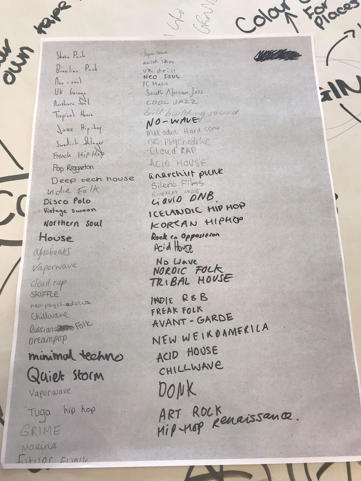
We also got all the micro-genre's everyone in the class are doing in order to possibly decide whether to section the micro-genres by time period or geography to make it as simple and understandable as possible for the viewers to see when they come to the exhibition.


We started just writing key words that relate to micro genre and design in general in order for us to pick the most appropriate concept that we can go for. We also thought that we should keep it very simple and understandable just like OK RM, because we thought their best designs were actually their simplest designs.
We decided on going for 'Origin' as out starting point because while writing mind maps we actually put a lot of ideas for this key word and thought it was very straightforward but at the same time we can create a lot of designs from this concept. Thinking of 'origin' we decided to think away from design and origin's in general to get visual cues from other disciplines apart from graphic design. We found origin of species particularly interesting and further thought of having a Museum theme and museum layout but reference it in terms of music and cassettes. Our group found this really interesting and thought of having the name layouts like how species are described e.g. wit latin names and dates etc., as well as museum layouts like having white gloves and frames and sections of the museums; we thought we can have sections of music in relation to their time period or geography.


We also got all the micro-genre's everyone in the class are doing in order to possibly decide whether to section the micro-genres by time period or geography to make it as simple and understandable as possible for the viewers to see when they come to the exhibition.
Our group has got a solid idea so far and we are planning on doing more research in order to get more ideas for what to do in terms of branding in social media and the outputs that we need to make to brand the exhibition.
Thursday, 26 April 2018
STUDIO BRIEF 2: Start of Group Work
- put together a pitch 10/15 minute to staff and second years about our idea, concept, branding collateral for the micro-genre of music exhibition.
- come up with a title for the exhibition.
- how the content, place of the exhibition relates to the design.
- 2/3 people max. to present
-put location, time (week starting 4th June)
-lvl 4/5 exhibition
-social media links and hashtags e.g insta @laugraphicdes
*strategy for social media- countdown? build up interest, going on live on insta/social media, mentioning people, hash tagging,
*strategy for social media- countdown? build up interest, going on live on insta/social media, mentioning people, hash tagging,
-contact details
Considerations
-format of poster,flyers, social media
-signage or way finds
-invites
-costs
-production (collateral must be reproducible)
Individually
- have to work on at least one thing on the group work
- document own work in blog REGULARLY.
RESEARCH
- under the same sun
- experimental jetset
- a practice for everyday life
ITSNICETHAT VIDEO (OK RM)
- theatrical/fairground concept
- taking that concept and using it to design various activities and themes within the exhibition e.g. use of space and objects to have a narrative with each other, having activities, a publication.
- try to keep designs simple as possible, don't make it too complicated
- investigate materials to be used
- making diagrams and models of how everything will look like
- looking at details
- finding materials that have their own visual identity that is outside of graphic design the might not be used in design
- different visual cues to use in exhibition.
Typography Idea Quick Crit
I talked to Ben about my typography ideas and got some feedback that I can work on and think about with:
- For making the 'hybrid' English and Korean typography maybe using a sans-serif, quite structured Korean typeface and making it the grid for the typeface.
- If I was to take the calligraphy idea on: maybe from the typeface that I made I can hand draw it on my flag design.
Because I'm doing the typography based on sounds of the syllables I may take the Korean syllable equivalent of 'A, B, C, D' etc. and try to make those the grid for the typeface.
Peers also gave me suggestion like, just using Korean typography and writing a translated version to make it quite simple.
Peers also gave me suggestion like, just using Korean typography and writing a translated version to make it quite simple.
Wednesday, 25 April 2018
Typography Ideas
I listed both alphabets so I could get an idea of how I could combine them together but quickly found that because the Korean alphabet heavily relies on syllables and sounds they have a lot more vowel sound than English, so i thought it would be easier to use the basic A,E,I,O,U to not make myself confused.
 |
| English and Korean Alphabet |
 |
| Incorporating the (are,i,o,u) of Korean Alphabet to English alphabet |
 |
| Putting together Korean consonant equivalent with English Alphabet |
 |
| English 'A' and Korean 'A' vowel combination experiments |
 |
| Experiment with 'B' and Korean 'A' vowel |
Because I didn't quite like it with both vowels, I thought using a consonant would give it a different feel. However, for me it still looks quite weird and awkward and just dint work with both are overlaid or combined together. I did notice that just having them next to each other is looks more effective and readable as well.
Because fundamentally, I'm basing the typography on the Korean way of writing (syllable rather than linear), I thought maybe just replacing the Korean consonant in the syllable with the English consonant would be effective enough for it to be readable both ways, though, I know I would probably need to give indications of what the Korean part is but because English consonants are mixed in it would give indications to non-koran readers what and how the syllable can be read.
I started experiment with it here by jut writing it roughly, but I found that writing the consonant first would be best because it can give indication how the whole syllable can sound making it already half effective, I thought it also resembles the Korean syllable block writing so it's very much effective legibility wise and visually.


I also thought, maybe hand written typography might be appropriate. There's a lot of Korean calligraphy and I thought maybe calligraphy-like typography mixed with the English Alphabet could successfully mix both culture together, as well as appropriately showcase the aesthetic of Korean Hiphop through it.
 |
| example of Korean Calligraphy |


I may try doing this by hand using inks swell and scan them in to get better textures and thicker more authentic lines closer to calligraph, but I do also like this idea because it gives off a more traditional feel and can add to the aesthetic of my design as well if I were to apply this.
Monday, 23 April 2018
The Korean Language (Hangul)
Korean = 한(Han)국(guk)어(eo)
- Korean is quite a complicated language in terms of its grammar. Traditionally Korean speech is made up of nine parts, however the basic form of a Korean sentence is 'subject-object-verb', though the verb is only required and immovable.
- Korean is not written linearly like the English alphabet but rather it's written in blocks to represent a syllable. e.g. dog is written in three letters in English but dog in Korean is only written in one syllable (개).
- There are some differences to Korean language and dialects in different regions of the country. Dialects can be separated by the different intonations and stresses on certain syllables of the word. Examples such as Seoul (Central) dialect speakers make use of vowel lengths whereas speakers from the South tend to stress certain syllables and use pitch accent.
- Korean has a complex honorific system- -ssi (씨), -nim (님) can be used at the end of words and sentences when addressing to an older more respected individual. -ya or -a (야, 아), gun (군) can be used to addressed younger individuals with gun (군) being used to addressed to younger single males in formal occasions.

- https://en.wikipedia.org/wiki/Korean_grammar
- https://en.wikipedia.org/wiki/Korean_language
- https://en.wikipedia.org/wiki/Korean_honorifics
After, reading through extensive information about the language I found that only some parts are only relevant to my research and only small parts are really related and important in my design and idea generation, therefore I didn't go into too much detail about learning about the language.
Initial Idea Crit for Both Flag and Card Ideas
Today, we had an initial crit of out designs with our group for the second part of this module. In the critical I got to listen and look at the different genre's and designs that other people in the critical created and researched about. For me, my crit turned out pretty well, as I got really good feedback about my designs and good suggestions on how I can improve it better.
These were the suggestions I got from the critical:
These were the suggestions I got from the critical:
-
judgemental - overground/undergorund side, light and darkintegrating images etc. - what do you see?politicallearn english through rap - maybe integrate korean and english sentences together, using some images to represent some words or combine the words that sound similar but mean different things in the language. e.g. no jam = no fun.using metaphor to filter thoughts - creating scenescensorship -urban dictionary - make book . translate metaphors in englishperspective with asian art - maybe use it as griddavid hockney document*8 ton truck - maybe base the whole cassette on songs on 8 ton truck. -wraparound the design on the inside; ,maybe section it with CMYK colours.

crit notes made by people in the group for me Overall, I actually quite liked some of the suggestions that were given to me e.g. the idea of making a book or dictionary about Korean phrases and words and translating it to english. Was thinking maybe this could be my object, as I could relate the book to the most commonly used phrases or themes in songs in Korean Hiphop, and it could be like an informational book as well of all the different types and the rappers in the micro-genre. I also liked the idea of playing around with the typography of both English and Korean and maybe altering them and possible combine them. I may aim to work on the typography aspect as now we need to think and start doing typography design for our designs.

Friday, 20 April 2018
J Card Initial Ideas Crit
After creating our J card designs we then had a crit. From the crit I got some helpful feedback and things that I may use for the future developments of my designs.
In the crit people seem to like the first three designs. People liked how the major and minor had "very effective minimal line work" and on the structured rhyme design how its "very dynamic". Most people really liked the colours on the traditional design (red, blue and white) with some suggesting to incorporate it to other designs with less vibrant colours like the major and minor design. The trap inspired design didn't really get any feedback due to it maybe being "too dull". I may need to re-think on how I could represent this music in a more effective and impactful way in order for it to be more prominent and eye-catching. Someone also reminded me of text layout, which I have started to think about when I was doing these designs. I thought I could put the text on the ares were there's less designs and patterns , and with thinking of the text layout I may also need to think about the typography that goes with it. Also, someone wanted to see the Korean alphabet typography, just like from the flag design ideas, which makes me think that maybe adding more of the Korean Alphabet for the typography may improve the overall aesthetic of the designs that I'm creating.
Overall, this crit has helped me a bit on how I could push the idea further, with people giving me helpful suggestions and well as things that made me question myself on further layout of my overall design. Also, looking at other people's design, I noticed they really pinpointed septic event or interesting facts about their genre e.g. Kocha and his criminal justice design, which made me think that I may need to do more in-deoth research in order to create more unusual but innovative ideas and designs.


5 J Card Initial Ideas
Today we started our initial ideas for our cassette tape cover designs. I decided to use the J2 J card design because it gave me enough space for design as well as the text through the extra flap design.
1) This design aims to represent the major and minor scene of Korean Hiphop. Through my use of two contrasting I aimed to show this, as well as the contrasting designs for each colour of the design. I also thought the wraparound colour would work really to really emphasise this. I exaggerated crops of my previous designs but I think I'll try and find a more fitting image to play around with as it doesn't really fit the concept well.
 |
| cover |
 |
| inside design |
2) I aimed to show the internal rap structures and parallel use of syllables for rhyming in the Korean Language. I tried to be representational in my design by heavily incorporating geometric designs. I think the inside design works quite well, but I could've emphases the structure and repetitiveness of syllables more by making the geometric design more parallel of each other.
 |
| cover |
 |
| inside |
3) The aim for this design was to emphasise the culture that was incorporated into Hiphop which was brought in from America. As Korean rappers aimed to localise the genre by using the Korean language to rap ing I have incorporated the Korean language through typography. Also, I incubated collages of King Sejong, who created the Korean language in an attempt to make it more traditional. I also chose the colours of the Korean flag, which gave it a really nice bright contrast. Out of all the designs I made, I like this one the best, and it's something I can probably work better, e.g. the background repeated pattern. I could probably use other patterns of textures incorporated in Korean culture in order to emphasise the localisation further, e.g. instrument, fashion etc.
 |
| cover |
 |
| inside |
4) This design aims to represent the trap feel of the music that became the trend starting from 2011-2012. I think it's quite representative of the current Korean Hiphop music sound and scene. The minimal design is also representative of the beat and electric feel of the tracks although I may need to think about maybe putting in more designs as it may be too minimal.


Thursday, 19 April 2018
Flag Design Initial Crit
After creating my 5 designs, we then had a silent crit and I got some suggestions and ideas from my peers which I could take into account and use in order for me to develop me flag design.
From the crit, most people thought the textures were very effective and work quite well combined. Although, more usage of brighter colours was also suggested, also someone suggested suing the Korean Flag colours, however the Korean flag colours are blue, red and white, which are quite minimal and doesn't really have much of an impact to my designs. People also liked the incorporation of the Korean alphabet to emphasise on the genre so I'll probably explore the a bit more, maybe make some alterations to the alphabet etc. Overall, the crit was very positive and I got some very helpful feedback for me to explore with and develop my flag designs more.


From the crit, most people thought the textures were very effective and work quite well combined. Although, more usage of brighter colours was also suggested, also someone suggested suing the Korean Flag colours, however the Korean flag colours are blue, red and white, which are quite minimal and doesn't really have much of an impact to my designs. People also liked the incorporation of the Korean alphabet to emphasise on the genre so I'll probably explore the a bit more, maybe make some alterations to the alphabet etc. Overall, the crit was very positive and I got some very helpful feedback for me to explore with and develop my flag designs more.


5 Flag Design Initial Ideas
For these designs I've used images from Flckr which relates and has some reference to Korean Hiphop. I've also used the bitmap technique that Pat taught us prior to making these designs.
1) Folktale - I wanted to show the idea of folktales and traditional Korean fairytale characters being used as metaphors in some of the rap lyrics used in Korean hiphop, such as a bulsagari or a monster that eat metal in order for it to grow bigger. I've used rough textures in order to show how folktale can be used to show power in rap lyrics and the mystery and added interest to the lyrics when added. The use of bright colours emphasises the impact of the lyrics as well.

2) I've emphasised the repetitive aspect of this design by getting inspiration from a frequently used phrase in Korean Hiphop- '8-ton truck'. Though it may be too simple and straightforward, I think it's still interesting as it can describe the repeated use of the phrase by different rappers, interpreting the phrase in their own ways through the different colours overlaid in the design.
 |
| original design |

3) For this design, the idea of Verbal Jint's rhyme scheme was explored. The idea for this design was taken from his parallel rhyme structure using the Korean language. I think the use of textures work really well for this design because it kind of adds depth to it e.g. the blue bitmap. Also, the emphasises on the Korean language is included clearly, as well as the idea of geometry that references the parallel rhyme structure. I think it may look quite nice green printed as well as digitally printed, overlaying both layers together, and screen printing may highlight the texture effectively as well.

4) For the fourth design I wanted to show the sound of the music through the textures used. Contrasting two textures in order to show the trap sound that rappers sued in their songs nowadays. I was trying to visually represent what someone my feel when listening to the music, particularly getting inspiration from Keith Ape's hit It G Ma. Also, I think it evokes the minimal instrumental use in traditional beats but also the chaotic and kind of 'turned up' feeling someone might feel listening to it.

5) The fifth design that I made is meant to represent the use of sex euphemisms in Korean Hiphop, as lots of rappers use euphemisms in order to describe this in their rap. Though it may be theme censoring themselves, it also seems cleverer and creates for an interesting storyline for their raps. This design features aspects which can middle refer to sex and feelings associated with it, reflecting the idea of the euphemism in it.

Subscribe to:
Comments (Atom)