Overall, I genuinely really enjoyed this module. Out of all the modules that we did this year, this module seemed the most engaging and interesting to me and I was really motivated to make my designs, especially when I was starting to develop my final j-card and flag ideas. Maybe because the module was about music genre's that I was really engaged as I enjoy really niche genre's general. In addition, through this module I've become more confident with my screen printing skills and I feel like I can definitely do screen printing form scratch to finish well and confidently now than I did before in previous modules. I've learnt proper screen printing techniques that I didn't know before, and I think this will definitely be something that will help me in the second year when we do more screen printing and the briefs and modules are much more independent. Furthermore, I think I've managed my production time quite well this time as I screen printed in a really convenient time and I was stressed out about it as I thought I'd be, leading to me making some good prints (although I could've decided on my paper stock more carefully). Also, I was able to make my flag design and object in a convenient time so for this module I didn't felt as pressured with physically producing my work.
The group module was also quite enjoyable as we were put in groups with people that we knew and can get on with but at the same time with people who we haven't really talked to properly yet even though it's nearly the end of the year. I think also, through this I've become more comfortable with talking to people with my opinions as I knew their ways of working at they know mine, therefore we were able to communicate well and solve problems really quickly and pull ourselves together before it wad too late, without any miscommunications or any fights, unlike the last groups that I was in. This group work also help me realise how ways of thinking and working towards a real live brief or actual exhibition would be, as we were thinking of very realistic ways of designing and production our designs; thinking about costs and efficiency as well. Overall, both studio brief were very enjoyable and interesting in there own ways and I was able to learnt very different things that I can take with my for next year from both briefs which is I think a great way for me to come and have for next year where it will be very different and I will have to be more independent and communicate and use the people around me, especially my peers more and getting ideas from them rather than waiting and receiving them when given.
Wednesday, 23 May 2018
Packaging Design
- relates to the object design
- cardboard - feels rougher and rawer fits the underground aesthetic and hiphop in general (mixtapes)
- screenrinted with inside j-card pattern
- less controlled and reflects the rebellious aspect of korean hiphop
- scoring the opposite side for easier cassette insert but also adds for the overall look
- more interesting that the obvious O-card

I've developed my packaging idea into using a screen printed cardboard stock in order to fit my overall design aesthetic. I really liked this idea and how the textures came out however, the only problem I had was how to cut the template out.

At first, I decided to cut it out the same as a cardboard mailer (thinner version) which turned out okay, however once I started to fold it, the fold lines were too thick and just made the whole packaging really wildly and bulky which ruined the whole design sand point of the packaging.


I however, adapted the cardboard mailer template to an O-card (suggested by Ben). I realised that the O-acrd was a much better option because it was very practical and product efficient as only a little bits needed, hence why I was able to make a lot of versions of it.

Also, ben suggested me to score the fold lined form the outside so the inside fold lines wouldn't be as tight and restrictive of space. I found this very helpful and made me realise easy it was and also the outside fooling, gave my packaging a nice look to it as you can see the corrugated card that was inside the cardboard material, making it look more authentic and rawer.

Overall, I really liked how my packaging turned out and I've also created some sticker designs in order to seal the O-card together. I was recommended superglue but I thought putting stickers over it would look nicer (also it's similar to the packaging for the object design, making the collateral cohesive).


J-CARD, FLAG AND OBJECT FINAL CRIT
On Monday we had a final critique on all our design collateral for this module and although we realistically don't have time to do any major changes o our designs I took this final crit as an opportunity to reflect on my designs instead and see if there's something that I could've done better from the suggestions and comments that my peers gave me.
To be honest, I didn't really get much feedback, because people literally just said how they liked something and didn't really specify why so I couldn't really get much of it. Also, the only critiques I got was about my rationale writing which to be fair I wrote quite quickly so it didn't quite make sense, so I've changed that already n my final design boards. On the other hand, someone did say to put stickers on the cassette or shoes however, I tried that and I didn't quite like it as much because of how matte the sticker was and the white colour of the sticker just sticks out too much that it ruins how the actual cassette or shoes look, therefore i didn't do it and just stuck with the cassette and shoes on their on, and also I've already put designs and stickers on the packaging of the two designs therefore I feel like putting more would make it look too much.
Though, from the crit I didn't get as much feedback as I'd like, looking other people's work, I felt like people really took the time to consider their colour scheme, style of working into consideration because most of the work I've looked at were very cohesive while already expressing the theme of their micro-genre and they've also picked concepts which were very niche and unique so they were able to make really interesting and innovative designs.


Final Track Playlists
Previously, I've stated how I wanted to separate my trackless based on the 'old Korean Hiphop' and 'new Korean H hiphop' due to the different eras and the sounds of the two. However, as i've changed and developed my j-card design, I decided that I have to change this concept as it will greatly effect my j-card concept design ideas. Therefore, I've decided to change the concept to having the Side A as 'overground' rappers while Side B is focused on 'underground' rappers.
Side A was decided to be for 'overground' rappers, as they are seen as the popular and more generally known rappers in Korea, where their songs are at the top of the charts and are played in the stress of Korea, earning lottos of money and living a very luxurious life, through public appearances and going to award shows and earning recognition for their work. The songs that I've chosen are songs which have reached the top of the music charts in Korea as well as y very well known artists sculptures has Verbal Jint, Heize and Epik High.
On the other hand, Side B consists of songs which re y 'underground' artists. Underground artists are often artists who are just starting out, or have been underground for a long time but haven't broke out or had exposure yet (or choose to stay underground). They also often sell or show their work through music websites like Soundcloud and Spotify garnering a small and niche audience; they perform in underground and small niche clubs, selling mixtapes and collaborating with fellow underground rappers as well. They also often create 'crews' making music together in the meantime. The songs on this side of the tape, are some of the most famous songs by 'famous underground rappers' (famous as in the Korean hip-hop scene in general knows them but not the general public), as well as emerging artists. furthermore, if you noticed there are more songs on Side A than Side B, reflecting the idea that overground rappers are more privileged and 'have more' than underground rappers in general.
I think doing this is a really nice way of reinforcing the concept and idea that I have for my J-card designs and although it will be very subtle on the J-card design it still adds an extra detail and meaning behind it making it much more interesting and impactful, aesthetically as well as conceptually.
 |
| OVERGROUND |
 |
| UNDERGROUND |
Blacknut 'Beenzino'
(Narration:
[Ah… Beenzino….]
Beenzino
I wish I could become like Beenzino
Fucking swag
[Ah… Beenzino….]
Shit, if I became like Beenzino
I’d have the will to rap, fucking destroy it
Fuck Black Nut)
I wish it was mine, Beenzino’s money
Beenzino’s car, Beenzino’s clothes
Beenzino’s fan, Beenzino’s rap
The 24/7 everyday that Beenzino lives
The pay Beenzino gets per concert appearance
Beenzino’s schedule, Beenzino’s bank account
The entrance to Beenzino’s concert with the long lineup
The presents filling Beenzino’s waiting room
Beenzino’s popularity, Beenzino’s location
Beenzino’s nipples that bitches want to lick
Beenzino’s tone, Beenzino’s flow
Beenzino’s smile, Beenzino’s style
Beenzino’s face, Beenzino’s body
Beenzino’s IQ, Beenzino’s Seoul U.
The way Beenzino feels when he walks past a women’s university
If I could live as Beenzino for
Just 10 minutes, just 10 minutes
But the person in front of the mirror is me
That’s right, I’m just me
Just 10 minutes, just 10 minutes
No matter what I wear or how I style myself, I’m me
No matter how I rap, I’m me
Beenzino’s day, Beenzino’s night
Beenzino’s lips, Beenzino’s penis
Beenzino’s position on top of Beenzino’s bed
Beenzino’s exclamation, Beenzino’s ejaculation
Beenzino’s sweat, Beenzino’s partner
From college girls to super models it changes everyday
Beenzino’s breath, Beenzino’s skin
Beenzino’s flesh, Beenzino’s proportions
The mole beneath Beenzino’s eye smile
The passenger seat that’s pushed back in Beenzino’s porsche
Beenzino’s album, Beenzino’s hit songs
Boogie On & On, Far, Dali Van Picasso
Beenzino’s twitter, Beenzino’s insta
Beenzino’s follower count, Beenzino’s pictures
The way Beenzino feels when he’s on the stage
If I could live as Beenzino for
Just 1 minute, just 1 minute
But the person in front of the mirror is me
That’s right, I’m just me
Just 1 minute, just 1 minute
No matter what I wear or how I style myself, I’m me
No matter how I rap, I’m me
Beenzino’s armpit hair, Beenzino’s toenails
Beenzino’s pubic hair, Beenzino’s navel
Beenzino’s nipple, Beenzino’s tits
The shit on Beenzino’s panties, even that’s sexy
Beenzino’s guts, Beenzino’s organs
Beenzino’s kidney, Beenzino’s earlobe
Beenzino’s tongue phlegm, Beenzino’s sebum
The crust on Beenzino’s elbow
Beenzino’s dandruff, Beenzino’s dead skin cell
Beenzino’s sphincter, Beenzino’s booger
Beenzino’s piss, Beenzino’s shit
How would it feel if I became Beenzino
But I’m Black Nut
Just once, just once
But the person in front of the mirror is me
That’s right, I’m just me
Just once, just once
No matter what I wear or how I style myself, I’m me
No matter how I rap, I’m me
(Narration:
Idiot! Ha ha!
Hyung, Beenzino hyung
I really respect you
I really want to become like you
But it’s not easy
Just how the hell can I do it
Like hyung, huh? [Engine revs] HEY! Beenzino hyung! Tell me!
Where are you going? Don’t go! Tell me! BEENZINO HYUNG!
While researching more about the overground and underground scene of Korean Hiphop, I've come across a song by an underground artist called Blacknut. Blacknut wrote the song 'Beenzino' about overground rapper Beenzino. In the song you can see how Blacknut is jealous of all the things that Beenzino has like "Beenzino's money, Beenzino's car, Beenizino's clothes...". All these things are things which may be seen as a privilege or things that are easily attainable by overground rappers as they are often rich and popular. Stereotypically overground rappers are quite well-off as stye are well known by the public, therefore seeking more songs and having more advertisements and so on. As you read on to the song Blacknut starts to desire other things from Beenzino. He starts to say how he wants he's "skin" "proportions"as Beenzino is quite popular as a 'very good-looking rapper' and that he got famous not by his skill but through his looks. Here you can see a change in attitude in the song as Blacknut also starts to states how he wants "Beenzino's armpit hair, Beenzino's toenails, Beenzino's pubic hair, Beenzino's navel, Beenzino's nipple, Beenzino's tits." I think through these lyrics you can really see Blacknut's intentions and point for this song. It may have started off as a very jealous and materialistic song, however by the end of it it ends with a mockery and satire vibe as if Blacknut is pointing out how he actually doesn't want to be Beenzino, but rather stay as himself (or stay as an underground rapper), like he doesn't need all the fame and fortune because, "No matter what I wear or how I style myself, I’m me, No matter how I rap, I’m me".
I think this kind of sums up the idea and relationship between the overground and underground hip-hop scene win Korea, as some underground rappers may want to become popular and emerge overground, just like Beenzino and other rappers like Verbal Jint. However, some may don't wan to as they may feel less authentic due to stigma's of overground hip-hop being too commercialised and manufactured which is also touched upon idol group (Kpop rappers) who are seen as manufactured or don't know 'real hip-hop'; and this may also be because of the fact that in the early 90's idol groups were famous for doing hiphop and the fact that the people who made hip-hop famous in Korea was an idol group (Seo Taiji and the Boys).
Taking away from this research, I found it really interesting how Balcknut has written and articulated his lyrics from the listeners and readers thinking his jealous and almost looking up to Beenzino when in fact he's kind of mocking him in some way. I think this will be really interesting as a concept for a design as I can maybe use the lyrics as a kind of visual imagery and the focus of the whole design, focusing on typography and visual imagery.
Final Object Design
This is the final object outcome that I created. This design was derived from the idea that Korean has lots of homonymic and homophonic words due to it being a phonic language. Due to this it's quite to make metaphors and puns especially in daily conversations such as: When someone says "kwi-yeop-da" (you're cute) someone may jokingly say "kwi-oep-da' (i have no ears/ i can't hear you!". Similarly, it can also be a tool for Korean rappers in order to tone down their speech or hide real lyrics by using puns and metaphors as a creative tool in order to write their lyrics. An example of this is rapper San E who's song 'Bad Year' (2016) can be translated and interpreted in different ways. As the word 'year' (nyeon)' can mean different things in Korean: year, woman and bitch. He used this word and concept in his song to talk about a bad relationship with a 'bad woman/bitch' during a 'bad year', but on the other hand it can also be interpretated as a political punch towards former the Korean President, calling her a 'Bad B*tch'.
Because this is quite a complex concept, I felt like using a very simple tool using the same principle would work as well. Similarly, Ben also said the same thing to 'strip back' the ideas that I have. Therefore, the though of using shoes came up in a crit, and I thought it was quite a good idea to work around with. As shoes (shim-bal) sounds very similar to fuck (shi-bal) in Korean, I thought it was the perfect opportunity to show this concept. By using shoes, the first meaning of the word is already explain in a literal sense, however, incorporating the word fuck by altering the object (writing fuck in Korean using the shoelace holes as the grid) gives the object a bit more depth and explains the concept in quite an interesting way. As the Korean spelling for fuck is written in Korean rather than in English the object may confuse or interest the audience, similar to how people can be confused but the pun raps that rappers use with homophonic/homonymic words. In addition, it also shows how certain taboo words can be 'masked' through the use of a more mild or non-offensive words, as the first thing that will be understood in this designs is the object (shoes) itself and not the shoelace writing.
Visual wise, the overall colour scheme of the object (red, blue and white) is consistent with the rest of the design collateral making the overall design cohesive and visually pleasing to see altogether. Although it is quite simple it can attract an audience through the usage of two different shoelaces as it's not quite common. Although, at the same time, it may not be as effective as intended as it may just look like shoes with weird shoelaces tied around it, as the concept it quite obscure, making it really abstract and possibly really hard to understand or get unless explained.


For the shoe packaging, the shoebox is wrapped in stickers with writings, "Korean Hiphop" and "Hanguk Hiphop". This was to make the packaging cohesive with the rest of the designs as well as establish the micro-genre that I explored. Furthermore, I also think that it adds to the design aesthetic as it looks quite 'rough' and quite interesting. i think overall, it makes the design look uniformed.


Monday, 21 May 2018
J Card Final Design
From my design development this is the final J-card using that I created.
This final outcome was based on the over ground and underground scene in the Korean Hiphop industry. This concept is clearly shown throughout the j-card design, from the whole design to the little details in the panels and in the j-card. The top j-card design represents the overground scene where, artists are often very popular, earn lots of money and are very popular with the public. The cover design is titled 'Korean Hiphop' in Korean as well as with the English and romanised version in smaller text. I did this as I thought just having the title in Korean itself will be impactful and can gather interest form the audiences as it's in another language in the first place, implying a different culture and distinct appearance overall. The spine includes the Korean red and blue 'taeguk' design referencing the country the micro-genre is from as well as the word 'Overground' implying the context of the design. It will also be quite interesting to see for the audience if they see it from the side of the cassette case gathering intrigue and anticipation for what the songs are about. The two layers of the right includes the tracklist from both side A and B of the cassette, as said before in the development both tracks are on the top to make the inside design simpler to create physically. I'e also thought of giving some context to the text itself through it's layout. Having the Side A tracks in uppercase references the overground advantage of the artists while the lowercase Side B tracks shows the anonymity of the underground artists. I think doing this is quite clever although it probably wouldn't mean anything to the readers but rather it will give an interesting visual appearance to the j-card design and a dynamic an contrasting effect for it. The end panels include a liquified design the words 'Most Hated' which is Jay Park(overground) song describing the hate he often receives due to his overground status. Furthermore, the cove also includes a rough image of King Sejong the Great who is the king that created the Korean language, with his mouth covered, representing the censorship overground artist face while they are in public broadcast perfuming due to the conservative nature of Korea despite of the genre's popularity, this is also subtly reinforced by the asterisked words on the page. In addition, money is also reference which is often the big divider between the overground and underground, referenced by the coins and money bill for the overground and the won symbol (Korean currency).

On the other hand, the inside design is very minimal for practical purposes, but for reference purposes as well, as it can link to the underground artists being unknown to the Korean public. It does have some other references as well such as the red bitmap image of the old website layout taken from Giriboy's 'Whyyoumad' music video but also the Soundcloud like button referencing the underground rappers use of Soundcloud or Spotify as a means to put out their music and attempt to become known to the public.It also includes the word ;Underground ' on the spine referencing which side it is as well as the rest of the Korean flag on each corner. Theres also the taboo word 'fuck' without the asterisk implying that underground artist are freer when it comes to using swear words than overground artist; in that sense they are also freer to speak their mind as they don't have to worry about their public image.

Overall, I am very happy with my J-card design and i personally think that it is the strongest out of all the designs that I made for my overall collateral. It terms of it's production, I screen printed it on a tick 280-300 gsm grey paper stock because I thought of how the paper will fold. I wanted the paper to be quite stable and stiff rather than flimsy as it just wouldn't fit with the whole look if if was flimsy but also because it's going to be put in a cassette so I want it to not be ripped easily. Thick paper also absurd the ink better so using it is more appropriate for a clear and brighter screen printed image. Now all I need to do is think about the colour of the cassette that I'm going to put the card in, in order to highlight the design as well as reflects he micro-genre.
J Card Development
From the interim criteria that I had, these are the design developments that I did of army j-card designs. Firstly, I changed he yellow design detail to blue as per criteria suggestions because I figured out it will be easier for em to screen print as well as have a strong colour shame that don't stray away.
After some debate I also tried changing the tracklist type to a serif font (Times New Roman) which I surprisingly liked a lot as opposed to what I was thinking, because I thought it would be too much of a contrast, however looking at it now it actually highlights the mood of the design as well as accentuated the rough texture marks and the dark toned colours that are used overall. In addition to this, I also put the side B tracklist on the front which I think works quite well because then the inside would just be a pattern and production wise it would also be easier for me to print the inside layout because I wouldn't have to worry about lining up each layer according to the top layer as well. I also put a small detail on the top right corner of a money bill to highlight the difference in earnings between over ground and underground rappers. Other than that I didn't change much on the top design of the j-card. I did try different layouts for the tracklist, as Ben told me it would push the design further as it was too 'planned' in compared to overall design.


As to the inside layout, before I decided to put the Side B tracklist on the front I decided to make try some layouts with it, however, I didn't really like it so I think I'm going to stick with having the tracks on the front and keeping the inside just a pattern.


Flag Final Outcome
After the critique that I had this is the final flag design outcome that I made. From the previous design I didn't really change much as I thought it was already enough as it was and I didn't wanna do anything that would make it look too gaudy and disorderly. Although, my peers and Ben said that the rectangle behind the lyrics were nice, I personally didn't like it because it felt to restrictive of the lyrics although it did make it stand out. I just felt like it didn't really fit with the rough brush strokes that I made on the image, therefore at the end I decided to make it consistent with the brush strokes and used it as the background colour and design for the lyrics. I liked this one much better and I'm quite satisfied with how it turned out. The only thing was the text size previously was a bit too big, so I decided to print it out first to physically see the size of the text and I found that the text was indeed too big and too unbalanced on the page; I've also asked my peers opinion and they also thought the same, so I decreased the size of text in order to make the overall design more proportional and easy on the eyes.

Flag Crit
After I made my flag development ideas, I decided to get some peers, Ben and Pat to critical my designs. The first designs that I've done were seen as a bit too 'book covers' and don't really feel like a flag design, so it doesn't feel like it will have a lot of impact. I think after listening to these opinions I kind of get where it was coming from because it may seem too wordy and quite mild. I think the long lyrics were what caused this because of how long it is and doesn't carry much impact as the bigger typography as well as the image that is accompanying it on the page.


I was suggested to take this design forward because the use of paragraph was seen more impactful and the way it is put in a box as well as white makes it stand out better and given more importance in the design. The design also considers layout by having the text take nearly 2/3's of the page making it look more important, as well as the white background balancing the blue and red colours as well. I think after looking at designers like Todeschini Mamie and the Korean album covers, I've been influenced by some elements of their design techniques. Furthermore, I also think after the crit I'm going to take this design further as I do agree with the opinions that has been given to me and I believe this would refine my design for the better.

Flag Design
After, the interim crit my flag design didn't really get a good response so I decided to do more research on the overground and underground aspect of the micro-genre as i felt it would also fit with the j-card that I've designed.
Further testing the design, I got some peers to critique me, and some suggested for a white background for the lyrics that I've highlighted red in order for it to be red better as they're hard separate from the red. I've also decided to change the position of the Dali, Van, Picasso cover position to see how it will change the dynamic of the flag.


This flag development design is referencing the song 'Beenzino' by underground rapper Blacknut. The song talks about the different things Blacknut wants to have or imagines to have or get if he gets to be Beenzino (an over ground rapper) even for just 10 minutes.
For this first design I decided put the whole lyrics on the page while only highlighting the parts which are quite impactful and puts across the concept behind it, along with Beenzino's face, with text 'Beenzino's money' etc. to highlight the materialistic side of the underground scene. I've also put some details such as highlighting Beenzino's most famous song 'Dali, Van, Picasso' by adding the album cover aswell as and highlighting the hook 'Like Salvador Dali, Van Gogh, Picasso in my body, man I'm fuckin' artist'. To further emphasise what Blacknut desires e.g. a hit song like Beenzino, as underground rappers aren't known to the public therefore they suffer to have a hit songs which is know to everyone.
 |
| 1 |


For this other refinement, I've decided to strip back the lyrics to the lyrics where it starts with Beenzino's name as felt like doing this will give more impact to the flag and bring more interest to the concept behind it. it also clearly shows the message of the actual lyrics by Blacknut as well, as at first it may sound very materialistic by wanting Beenzino's fans, money, car etc. however, as you read on, it becomes a bit more ridiculous and too personal talking about Beenzino's external and internal appearances along with not so desirable things such as dandruff and sebum, making you realising that Blacknut is just being satiric and almost mocking Beenzino and over ground artists.

Illustration Induction [Advanced]
Colour


- global tick box - allows you to change and alter tints of a colour;
- cmnd + semi-colon to hide guide in illustrator
Research on Existing cassette tape designs
In order to get a better sense of how a j-card could be designed I've looked at existing j-card designs from several designers.
Goaty Tapes (Zully Adler)
Straightaway from looking at the Goaty Tapes, I can instantly tell the distinct design aesthetic and how they can be differentiated from other designers. Their designs are quite minimal and uses a balance of typography and visual imagery. Goaty tapes takes on a music genre successfully and utilises the sound, beat and tempo of the genre in order to create minimal design with intricacy. As said by Adler "I think that if you stick by the principle and do your best to make sure the packaging fits the sound, you aren't objectifying or overpowering as much as celebrating the music." I think Adler right here is talking about how the design and packaging is merely another mechanism of interpreting a genre and how each and everyone of us may interpret a genre differently and that the packaging merely help sets the tone of the sound of the genre.
As Adler started the company when he was in high school he chose tapes as a cheap and efficient method to source music as well as having a "very interesting and particular set of interacting shapes and surfaces". Adler successfully used the tape medium to create designs which are appropriate and maximise the usage of the j-card design. He mentioned how he has found ways in which designs can be accentuated and abstracted and altering the design of the actual j-card has helped enhance the quality of the overall packing design. I think this has also helped with his distinct minimal designs and his interesting sue of space and layout within the j-card. His minimal designs often cause intrigue and interest due to their abstract nature. I think his minimal aesthetic also comes from the choice of music that he often reference,. For example, for the band 'Soviet Pop' he 'chose the pop stuff because I thought that almost had a more subversive edge to it'. IN addition, he also mentions how the doesn't like creating 'wild or outlandish packaging' due to the burden of trying to find a special place for it, or making it seem very important due to it's 'sophisticated' designs.

Taking from this, I think that Adler is very considerate of the music that he chooses. His use of minimal design is also reflective of his opinions towards his opinions on packaging designs: "we shouldn't read into it so much. I trust that listeners can maintain their focus on the music and appreciate the packaging for what it is" in that I think he tries not too have a very subjective view of the music which he then puts onto his designs but rather they are quite subtle in their references.
I think for my own designs, I may also need to consider how I can use the different sides and layout of a j-card panel in order to maximise the impact of my design as well as effective reflect the micro-genre that I am exploring. Also, just like Adler I may also consider the relations of my ideas and concepts behind my designs in which I could be making them very abstract and conceptual leaving it up for the listeners and audience to interpret or be very representation of the information that I gather from researching about my music genre.
Todeschini Mamie for Le KAB de L'Usine
Swiss duo David Mamie and Nicola Todeschini work in collaboration in their shared studio in Geneva. In particular their work for production company Le Kab de L'Usine was really interesting for me due to the fact that they had very limited resources and materials to use, therefore playing around with layouts allowed them to have a more experimental and playful posters.


Goaty Tapes (Zully Adler)
Straightaway from looking at the Goaty Tapes, I can instantly tell the distinct design aesthetic and how they can be differentiated from other designers. Their designs are quite minimal and uses a balance of typography and visual imagery. Goaty tapes takes on a music genre successfully and utilises the sound, beat and tempo of the genre in order to create minimal design with intricacy. As said by Adler "I think that if you stick by the principle and do your best to make sure the packaging fits the sound, you aren't objectifying or overpowering as much as celebrating the music." I think Adler right here is talking about how the design and packaging is merely another mechanism of interpreting a genre and how each and everyone of us may interpret a genre differently and that the packaging merely help sets the tone of the sound of the genre.
As Adler started the company when he was in high school he chose tapes as a cheap and efficient method to source music as well as having a "very interesting and particular set of interacting shapes and surfaces". Adler successfully used the tape medium to create designs which are appropriate and maximise the usage of the j-card design. He mentioned how he has found ways in which designs can be accentuated and abstracted and altering the design of the actual j-card has helped enhance the quality of the overall packing design. I think this has also helped with his distinct minimal designs and his interesting sue of space and layout within the j-card. His minimal designs often cause intrigue and interest due to their abstract nature. I think his minimal aesthetic also comes from the choice of music that he often reference,. For example, for the band 'Soviet Pop' he 'chose the pop stuff because I thought that almost had a more subversive edge to it'. IN addition, he also mentions how the doesn't like creating 'wild or outlandish packaging' due to the burden of trying to find a special place for it, or making it seem very important due to it's 'sophisticated' designs.

Taking from this, I think that Adler is very considerate of the music that he chooses. His use of minimal design is also reflective of his opinions towards his opinions on packaging designs: "we shouldn't read into it so much. I trust that listeners can maintain their focus on the music and appreciate the packaging for what it is" in that I think he tries not too have a very subjective view of the music which he then puts onto his designs but rather they are quite subtle in their references.
I think for my own designs, I may also need to consider how I can use the different sides and layout of a j-card panel in order to maximise the impact of my design as well as effective reflect the micro-genre that I am exploring. Also, just like Adler I may also consider the relations of my ideas and concepts behind my designs in which I could be making them very abstract and conceptual leaving it up for the listeners and audience to interpret or be very representation of the information that I gather from researching about my music genre.
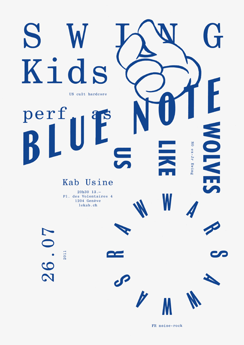
Todeschini Mamie for Le KAB de L'Usine
Swiss duo David Mamie and Nicola Todeschini work in collaboration in their shared studio in Geneva. In particular their work for production company Le Kab de L'Usine was really interesting for me due to the fact that they had very limited resources and materials to use, therefore playing around with layouts allowed them to have a more experimental and playful posters.

Especially in this blue and white poster, their use of layout is very striking as well as the effective use of both serif and sans serif fonts complementing each other's characteristics. I think what makes their typographic posters very effective is the fact that they are forced to only play around with their layouts and type meaning they were able to come up with interesting ways in which letter overlap and how kerning affects the look of the space around the text. Also, the fact that they only used one colour (because of budget) also puts most attention to the type itself making it even more effective for the layout to be noticed.
I think because I will also be having a similar format (such as having a limited colour palette) I think that I will also need to experiment with my use of type as well in order to give a more impactful design which uses typography in a very innovative way which also reflects the micro-genre that I am exploring.
Subscribe to:
Comments (Atom)