Goaty Tapes (Zully Adler)
Straightaway from looking at the Goaty Tapes, I can instantly tell the distinct design aesthetic and how they can be differentiated from other designers. Their designs are quite minimal and uses a balance of typography and visual imagery. Goaty tapes takes on a music genre successfully and utilises the sound, beat and tempo of the genre in order to create minimal design with intricacy. As said by Adler "I think that if you stick by the principle and do your best to make sure the packaging fits the sound, you aren't objectifying or overpowering as much as celebrating the music." I think Adler right here is talking about how the design and packaging is merely another mechanism of interpreting a genre and how each and everyone of us may interpret a genre differently and that the packaging merely help sets the tone of the sound of the genre.
As Adler started the company when he was in high school he chose tapes as a cheap and efficient method to source music as well as having a "very interesting and particular set of interacting shapes and surfaces". Adler successfully used the tape medium to create designs which are appropriate and maximise the usage of the j-card design. He mentioned how he has found ways in which designs can be accentuated and abstracted and altering the design of the actual j-card has helped enhance the quality of the overall packing design. I think this has also helped with his distinct minimal designs and his interesting sue of space and layout within the j-card. His minimal designs often cause intrigue and interest due to their abstract nature. I think his minimal aesthetic also comes from the choice of music that he often reference,. For example, for the band 'Soviet Pop' he 'chose the pop stuff because I thought that almost had a more subversive edge to it'. IN addition, he also mentions how the doesn't like creating 'wild or outlandish packaging' due to the burden of trying to find a special place for it, or making it seem very important due to it's 'sophisticated' designs.

Taking from this, I think that Adler is very considerate of the music that he chooses. His use of minimal design is also reflective of his opinions towards his opinions on packaging designs: "we shouldn't read into it so much. I trust that listeners can maintain their focus on the music and appreciate the packaging for what it is" in that I think he tries not too have a very subjective view of the music which he then puts onto his designs but rather they are quite subtle in their references.
I think for my own designs, I may also need to consider how I can use the different sides and layout of a j-card panel in order to maximise the impact of my design as well as effective reflect the micro-genre that I am exploring. Also, just like Adler I may also consider the relations of my ideas and concepts behind my designs in which I could be making them very abstract and conceptual leaving it up for the listeners and audience to interpret or be very representation of the information that I gather from researching about my music genre.
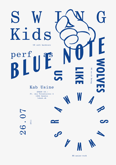
Todeschini Mamie for Le KAB de L'Usine
Swiss duo David Mamie and Nicola Todeschini work in collaboration in their shared studio in Geneva. In particular their work for production company Le Kab de L'Usine was really interesting for me due to the fact that they had very limited resources and materials to use, therefore playing around with layouts allowed them to have a more experimental and playful posters.

Especially in this blue and white poster, their use of layout is very striking as well as the effective use of both serif and sans serif fonts complementing each other's characteristics. I think what makes their typographic posters very effective is the fact that they are forced to only play around with their layouts and type meaning they were able to come up with interesting ways in which letter overlap and how kerning affects the look of the space around the text. Also, the fact that they only used one colour (because of budget) also puts most attention to the type itself making it even more effective for the layout to be noticed.
I think because I will also be having a similar format (such as having a limited colour palette) I think that I will also need to experiment with my use of type as well in order to give a more impactful design which uses typography in a very innovative way which also reflects the micro-genre that I am exploring.
No comments:
Post a Comment