Wednesday 31 October 2018

Book Experiment #1

Today I tried creating a draft of how I'd want my publication to look like. As of now, I don't have much content that I can use in relation to my experiment and production decisions, therefore I have based this experimentation on the functionality and aesthetic of the publication and some relation to the overall content and context that I've outlined in my brief.

I've used mount board as the main pages and experimentation material for the designs as I've intended to use this material, due to it's sturdy and durable characteristic also giving the publication a bulky and more tactile feel, which would hopefully make the readers interact with the publication more therefore become more interested in reading the contents inside.


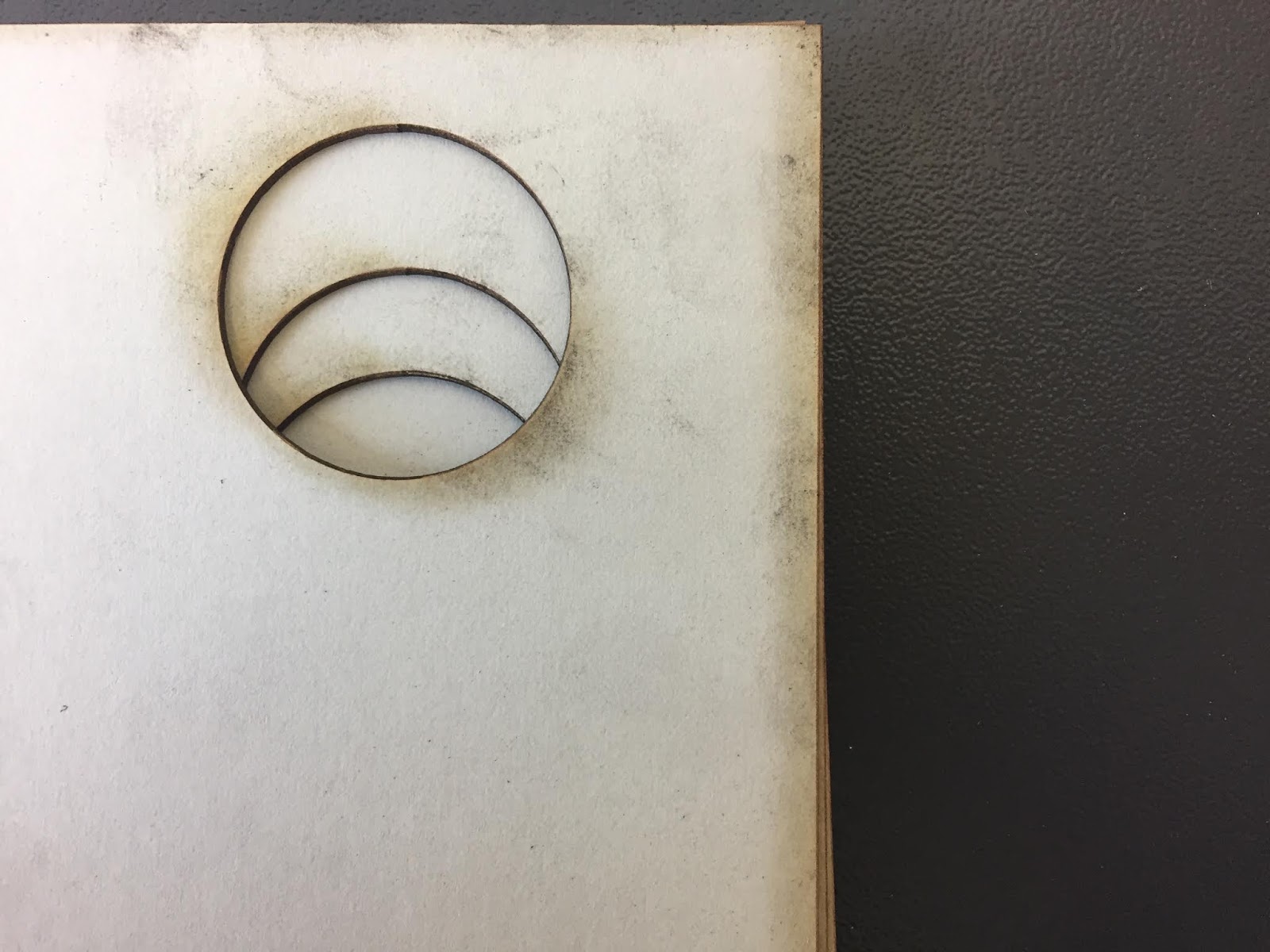
After doing several laser cut experiments, I've noticed that fully cutting the letters created inevitable burnt marks on the material which I didn't like at all because it just ruined how the design looked and makes it look really dirty and messy (A) which isn't attractive at all and probably won't attract readers to pick up the book. As I've also experimented with the different laser cut options, like engraving I've found engraving (B) to be more interesting and create a better outcome than laser cutting as it just outlined the design on the material leaving no burnt marks. In addition, I also liked how it looked quite 'hand crafted' making me think of the signs that I researched during the summer and how their hand crafted design gave a friendly and good impression to the customers. I thought this would be effective for my publication as I thought it would also fit the binding method that I am using , elevating the handcrafted/handmade look of the publication.

A)

B)

Furthermore, Ive also experimented with a new binding technique (single-page binding), which enables me to bind single pages instead of signatured pages. It turns out the same kettle stitch however, has a more complicated technique. As I have 10 holes for binding I had to use 10 needles and stitch each holes first before I could move on with a new page to stitch, The technique was just too labour intensive and long for me to do that if I was thinking of commercially producing and mass produce the publication it would be impossible as it has to be done by hand one by one. In addition, it also has a higher risk of complications than kettle stitch as the needles and thread can tangle together making it really confusing to untangle further longing out the binding. Although it does have some positives - it enabled me to obviously have single pages, which in turn allowed me to experiment more with the paper stocks and weights as well as paper sizes that I could use. However, despite this I feel like this binding method is more of a disadvantage in terms of production for my publication (and to be fair kettle stitch produces exactly the same outcome and is more convenient and quicker to do) therefore I've decided to not use this binding technique further as I feel like I've seen it's limitations already and has no point of being developed and used further in my experiments and my designs.


Speaking of paper stock and sizes, I'm thinking of possibly having different size pages giving the publication a playful and dynamic aspect which may draw people's attention. However, I found sugar paper to tear really easily especially with the binding method I've used, therefore I may not use this kind of stock but probably a thicker card like stock as it's much stronger as well as it looks much better due to it's smooth surface and feel which may give my designs a smoother and clearer finish.


I don't really have much content, however, I've tried doing a design which may work the same way and logic for my actual content. I've used the word 'Hide' and laser cut it which reveals the page on the other side. As the word hide is about covering something I thought doing the opposite of this may confuse or make the readers questions. It may catch them off guard of what the sign is really trying to tell them - is the actual word hidden because it's cut away and you can't see the counters and other parts that make it up? Why is it revealing something instead? Does the revealed page link to the previous page? As I'm trying to make the readers react to signs in various different ways and talk about semiotics, I thought of using these verbs and words may be effective as they're quite simple and straightforward which may make it easier for readers to understand the context and content of the publication. I think I will continue using this approach for my content, as of now I am really really stuck of what content I need and should put in order to answer my brief and really the message that I'm trying to put across to my target audience.


Thoughts & Reflections:

Overall, I thought this draft turned out okay. I definitely learnt not to use single-page binding for my publication as it took me aggggggggges to do. I guess I was just stuck on the idea of having single pages that I didn't think of other complications it would have. Therefore, reconsidering that I think I may stick to signatured pages binding like kettle stitch as it's just as effective as single page binding but takes less effort and less mistakes to be made meaning the publication can at least me mass produced to some extent. I think I did make some progress, with evaluating which paper stocks I could use and methods which will help me with my further experimentations and refinements. Also, I really need to start thunking about my content and what content I need to have in my publication, as I don't want to keep making experiments without considering the content as they dictate the production methods in order for a cohesive design to be created for an effective publication.

Monday 29 October 2018

Visiting Professional: Village (Ben Holmes)

Village Books : an independent book shop based in Leeds, working with young designers, international and local, curating various contemporary publications and books from art, design, travel, fashion, photography etc.

Exhibition in upstairs gallery - from local artists, designers, international/ students to get exposure; everything is in collaboration with the artists and non-profit and not for hire.

Why Self Publishing?

  • Book is a promotional tool to get people's attention; only looking at you work, seeing it, holding it, feeling it and focusing only on it for even a short amount of time.
  • Book is an artefact; creating a physical and visual material of the project. Making a physical manifestation can somehow draw a line and making a concrete evidence of the 'end point' of a project or an idea. *Nourished Journal, Library Paper
  • Book is an art; the book itself is the art, not the content in it. Working with the form and aspects of the book and creating art form through it.
  • Book an an opportunity as to collaborate; having the opportunity to work in collaboration within a book very beneficial for a graphic designer; you have the influence on reader's views, influence on how the message can be received, influence on how readers can experience the book. 
  • Book is a product; commercial value of a book; having consideration on how the book can be used as promotion and how it can attract people's attention and successfully make them buy the book, keep it and possibly share it with people come the true value of the product of the book. 
What they look for in a book submission
  • Concept of the book; the foundation and the most important aspect of the book; it has to be clear and the book itself should communicate it as well in order to be clearly understood and communicate to it's audience. *
  • Design of the book; working on how the book can be perceived, *Self Publish Be Happy (London)
  • Format of the book: *Till Death Do Us Part, *Funny Money
  • Printing Techniques: how images are printed on the book is considered. Is the printing unique to that one book? How does the paper stock relate to the printing technique used for the book?*This is the same ocean
  • Binding of the Book
How to sell your book?

  • Are you gonna make a limited edition of books for a higher prices or a mass produced books to be sold to everyone.
  • Think about the price -> the final price need to drive the product, think about where you're going to sell your book (the distributor of the book). production cost, distribution costs etc.
  • Distribution of the books 
  • Promotion of the book; on the internet or in shops? book launches, exhibitions for the book; great way to interact and sell to people *Offprint Tate 
Book Examples
  • *Ukrainian Street Dogs 
  • *Holy Water Zine - concept heavy; idea of presenting religious iconography and alcohol as equal things, creating links and ideas towards the concept.
  • *Gold Dust - demonstrating the 'real people' and cut through the preconceived stereotypes people have of a certain country (Ghana). 
Advice 
  • Self criticising - always crit the book, think about how the elements of the book realte to the concept of the book.
  • Always look for objective crits
  • Start small - less is more, does it say what it needs to say
  • Make mistakes -> mistakes can improve the work, try things out
  • Support others 

https://villagebooks.co/

Friday 26 October 2018

Laser Cut Further Experiment

From my ideas before, I lasercutted some experiments to see if my ideas really worked or not.

For the circle shape layout that I did, the shape and layout didn't exactly turn out the way I wanted it to. I originally wanted it, so that all 6 shapes can be seen on the first page then as flipped only one circle will be seen or it will gradually  decrease. However, only three circles (3) can be seen and the other three are seen from the third page. Also, it seems that the other three (4) are identical but turned the opposite way that's probably why they are the same but not facing the right way. 

1)2)

For me to do this properly I should've probably did some paper mockups to show which direction the shapes should go in order for them to turn out right on the actual material. However, I do like the 3D effect that it has given giving some depth to the pages and shape, which I think also makes it more interesting and intriguing to look at than flat shapes on the page. 

3)4)

I also wanted to do the puzzle effect on my publication, however they also didn't work quite well through the laser cutter (5). This may be because it is a serif type therefore the terminals are really small and detailed which makes it hard for the laser cut to cut it properly without burning off the ends of the letters or the actual letters itself (7) . In addition, also because the words are all in one page the words and letters themselves were very small so the letters just falls of or have been burnt when being laser cutted to its shape. Furthermore, I may have not set the right material to cut (maybe that's also why the burnt marks are severe), so I decided to change it to something thinner. However, it didn't cut through but just engraved on the material (mount board) instead (8-9). Also, I tried a different material (black card) and changed the material setting on the laser cutter to thin card hoping it would work however it still just engraved on it (10); although actually I liked the engraved effect however, I still would've liked if my original planned would've worked. 

5)6)

7)8)

9)10)

Thoughts & Reflection:

For this experiment I feel like all the ideas that I had just didn't work out because in my head they all looked really good and I thought that it would turn out really well and just be really simple however it didn't which made me realise that I didn't really consider how the laser cutting would cut the material that I am using and the different power setting that the laser cutter have. I feel like I didn't really think about how it will actually cut but just thought straight about the final product.

To make this technique work for the design that I want, I thought of possibly changing the font to a sans serif font like Helvetica, where there are less complicated and detailed terminals so it's much more easier for the laser cutter to cut it and I would less likely lose any material from my design. My other solution is to put one word per page instead, so that the words will be bigger therefore the terminals will be much more visible and easier to cut and less likely to break as well.

However, my only problem with this is I feel like this may take away from the meaning of my design and content as there is less visual evidence of it as they are more scattered in different pages therefore it may not be as impactful to the readers and not make it as effective and communicative of my content. I feel like I just need to find a certain way of laying out my typography on the page which works for the laser cutter and benefits my publication, as well as find out certain options on the laser cut that will make the design work out.

Thursday 25 October 2018

Advanced InDesign Induction

*Facing pages - Margin can be increased or decreased depending on how much of the page wil be used for binding technique e.g. stab stitch or kettle stitch.

Bleed (3mm) - allow for space for accurate trimming after binding.

*Print on paper slightly larger than the actual page sizes for bleed and margin.
*Print Booklet

Printing for saddle stitch

*Print Booklet Option -> [Booklet Type] - 2-up Saddle Stitch
*[Print Blank Pages] - will ignore all blank pages of book
*[Setup] -> Scale = 100% 
*Scale to fit - has implications to type as it changes the type size.
*Page Position - Centred (spread will be centred so content will be accurately printed especially for DPS's.
*Two Sided (for saddle stitch) - Short-Edge Binding

Printing for Section Binding

*[Pages] -> Range -> Print in section e.g. 1-16 
*Printing one page -> Range -> Print separately e.g. 5-6, 11-12

Printing for Perfect Binding

*Long-Edge Binding
*Margins may need to be bigger for room for binding
*Similar for Stab Stitch Binding

Printing for Coptic Binding (Kettle Stitch)
*Print Booklet Option -> [Booklet Type] -> 2-up Perfect Bound
*Signature Size - how many spreads will print out in section e.g. 16 for 4 pages

New Exhibition in Village Books

Yesterday, I went to Village Books to see their new exhibition. The new exhibition was 'Northern Rivers' by Lola Paprocka and Pani Paul, about the 'Our Strong Brotherhood' group from New South Wales, Australia. The exhibition also included a publication including all the photographs taken.  

The publication was quite simple; being saddle stitched and made from normal smooth photo paper. I think the title was foiled with gold foil which was quite a nice contrast to to the grey and white front cover. The composition and layout of the photographs were very varied keeping the flow of the publication varied throughout too. When I was their I didn't really get the content of the book as their were no text to put it into context however, maybe this was to highlight the actual pictures itself. Also, even though I didn't really get the content t first, I still thought it was quite nice how the photographs were carefully laid out and thought out including black and white pictures throughout as well as coloured in order to connote different tones. 


Thoughts & Reflection:

Overall, I thought the exhibition itself was quite nice, being in a small space it felt more intimate seeing the photographs framed around. Furthermore, the publication created alongside the exhibition was also quite nice visually, however, I kind of wanted to have more context behind it as I couldn't really understand what it was about at first, maybe having certain pages with context would have helped in giving a better understanding about the publication and exhibition. Linking this to my own publication, I thought that using various composition and layout would be quite beneficial considering that I wanted a variation of typesetting techniques in my publication. Also, I thought that giving as much context around my context would also be really helpful in order for readers to grasp and understand what they are reading. 

https://villagebooks.co/products/northern-rivers
https://palmstudios.co.uk/product/northern-rivers/

Laser Cut Further Experiments Preparation


I decided to do more laser cutting experiments for my publication as I really liked the technique itself and I think that it will be beneficial for giving my publication a more dynamic and interactive character. I also feel like using laser cutting will help give me a more varied and interesting types of shapes and irregular shapes to work with as the grid for the text that will be on the publication as well. Doing this I feel like help me create or maybe even force me to find different types of way in which I can compose and lay out the typography onto the pages. Using laser cutting will also give me more variations of techniques that I can use to give depth to my publication as I said in my previous blogs. 

In relation to the various techniques that I wanted to do, I wanted to try overlapping each pages in order to create one massive shape, where readers have to flip through in order to see the different layers within the shape as the publication progresses. For this idea, I wanted to include different parts of a sentence in each page as it not only gives the readers more reason to flip through the pages it also makes them intrigued to read on. I think that this may be effective in communicating with the reader as it makes them understand the content in the publication; at the same time the context is also highlighted as it successfully draws reader’s attention and make them ‘work for the book’ through different ways of design techniques such as laser cutting.

I feel like if I was to use this technique of overlapping laser cuts within my publication I have to make sure that I measure the shapes properly and accurately in accordance to the spine of the book in order for me to not lose any of the design as well as not lose the shape of the design, because it needs to be perfectly aligned so that it works all throughout the pages. As of right now I’m still debating on what binding technique is the most appropriate and effective for my book because I feel like similar binding techniques like using thread may have similar effects but at the same time it may change the overall aesthetic of the book which may affect how viewers may see it at first glance.

SEE THROUGH EXPERIMENT

Similar to the overlaying effect, I wanted to make use of both the negative and positive pieces of the laser cuts and create a puzzle effect, where the pages need to be flipped in order for the laser cut page to be seen by the reader. I thought this technique could give the publication some 3D effect with the negative remains on the other pages creating some interestingly laid out shapes that will make sense when the reader puts the top page back to reveal the actual sentence. Furthermore, I also wanted to use words and phrases which related to the technique in some way e.g. see through, look through, and make it look like a puzzle as well to connect and complete the content that I want to relay. At the same time, I think that this also relates to the content and context of my publication as it gives the readers some information that they have to follow within the book as they go through to it.

In addition, I also want to use two different colours for this design in order to separate the two layers and create a contrasting effect for the giving the publication some colour. However, at the same time, maybe this will take away from the 3D illusion as readers will be able to tell they are two different layers making it less effective. However, I would still like to experiment with this as it may become something more interesting within the pages in my publication.

Saturday 20 October 2018

Interim Crit

Yesterday, we had our interim crit for our publication. For the crit I had my experiments with me such as the binding techniques that I made and the differnt materials and printing techniques that I experimented with as well. 

With my crit group everyone had really good ideas and I feel like they all know what they want to do with just a bit more ideas needed and feedback needed from the rest of the group. However, when I came to explain my idea, I fee like I didn't really make it clear enough for everyone because I felt like everyone had a hard time giving me feedback. No one really talked when it was my turn and I fee like because I didn't explain it enough I got feedback which is directed to a different design route than I intended which is kind of disappointing. I tried to make up for my really bad explanation when I was asking the group questions and got some feedback which may be quite helpful:

  • Colour - people suggested I use bright colours like yellow or red, to make grab the readers attention as well as have some connotations relating to messages and signs (though this may be really loose).
  • Serif font - they liked the idea of using a serif font instead of a san serif font creates a nice contrast to the type of content thats going to be in the book.
Overall, I feel like I didn't really get anything much from the crit partly because I know I didn't explain myself clearly to everyone, although I did appreciate everyone that gave me feedback and tried to help me out. Next time, I will make sure to properly write down or remember what I'm going to say in the crits as I know I might not be able to get another time to get feedback from other people around the class and at the same time I don't want to waste my time or theres. 


Embossing Experiment

From the laser cut that I did I decided to emboss the letters that was cut out. I thought it was a good idea to do as it would give me an alternative choice of another technique in which I can make my front cover out of. I used different kind of paper stock to test this in order to have variations of paper weights and colours to possibly choose from.


I did all steps that I learnt from the embossing induction and was able to emboss my designs really quickly.


In particular, I really liked the emboss that came out of the white card stock that I made. The embossing came out really well and is really prominent on the page. The same thing also came out on the cream paper stock that I used and I think these two paper stocks made the embossing came out in great quality due to them being really clear and bright in colour. In addition, I also like how there's  a little bit textured/rough and not completely smooth which adds to the embossing quality as it highlights the embossed texture of the paper stock.


I tried to use sugar paper as well but it turned out creased and curled itself when it dried because of how thin the weight of the paper is. Also, because of how thin the paper is the embossing didn't look as good either. On the other hand, I also tried the same mount board that I used for my laser cut experiment but in beige/brown, however I didn't wet it as it would just fall apart because its all layered paper. It turned out really well as made the embossed letters really stand out on the page, which may look really nice as a front cover or part of the publication in general.

I also asked fellow peers which paper stock they preferred and they also preferred either the white or the mount board stock. They liked how the embossing look really prominent especially on the mount board and overall most of the materials got nice feedback.

Thoughts & Reflection

At first, I tried this technique as a way to use the extra letters from my laser cut experiment but it actually tuned out really well and better than I expected. In a way I was also quite glad I picked a serif type face as the soft curved counters and sharp serifs made the embossed letters look quite pleasing. In addition, for this technique I feel like a serif type was also more appropriate as it's quite traditional and hand crafted. 

This technique reminds me of the technique that was used on the vintage books that I saw during the Kirkgate Market Fair and how the leather or material sued for the book looked almost engraved with letters. That being said this technique may be more appropriate to more serious and traditional types of books rather than a contemporary reading publication that I'm designing. Although, this technique is really fun and easy to do, I don't really just want to use a technique just for the sake of having another printing method in my publication because it won't really relate to my content and would maybe look out of place in the publication. Maybe I won't use it heavily but on certain aspects and details of my book. e.g. certain words or letters. However, I do need to take into account the paper weight of my book pages as if they are quite thin embossing might be hard or impossible to do as it will curl up.

Laser Cutting Experiment

I did a laser cut experiment as I thought of maybe having a laser cut front cover so that the message on the first page will appear through the front cover. I wanted this as I thought the title 'READ ME' would be represented literally with the readers literally reading the content without opening the book and without them realising it as well. I chose the typeface Bodoni for this experiment asI thought choosing a type with serifs would be better to showcase the negative spaces from the laser cut design. I also experimented with the different styles within the type family to see how each of them look and feel when maybe used as a front cover typeface. I quite like the italic design and the design with smaller leading and quite stretched out. I feel like these two styles have a more impactful feel, interpreting movement and dynamic elements that can be seen in how the letter and sentences are composed and layout in the publication. 

1)

I used dove grey mount board for this experiment to show a more prominent laser cut design (I'll probably do an experiment for the kind of paper weight I want for my publication for a more accurate decision making for myself). When I laser cutted with mount board, there was the burnt remains on the letters' outline which I forgot about and I didn't really like. I changed the material option on the laser cut to decrease the burnt marks instead which made it slightly better. However, I still didn't like as I don't really want slight burnt marks on the front cover of my publication, as it doesn't make really relate my concept nor may it gave my publication the right impression to it's target readers. 


2)3)

304)

Thoughts & Reflection:

I feel like I still need to do a bit more experiment for this technique as I'm still not quite sure if I will use it or not. I also need to consider the after effects of laser cutting e.g. burnt marks and test a few more options to see if I can eliminate this effect altogether because it's not something that I want in my designs. In addition, apart from the front cover, I may also would like to put some laser cut designs within the pages of my publication, creating a more interactive aspect within it, therefore I would also need to experiment with different paper stock as well to see which paper weight is the most appropriate and effective. Overall, I feel like this technique could work really well for my publication because I can do so much with it which can highlight aspects of interactivity e.g. layering, overlay, using negative space etc. however, I just need to do a lot more experiment so I know what and how it can work well with my content and context and how the laser cut design can match with the normal pages of the publication.