From my ideas before, I lasercutted some experiments to see if my ideas really worked or not.
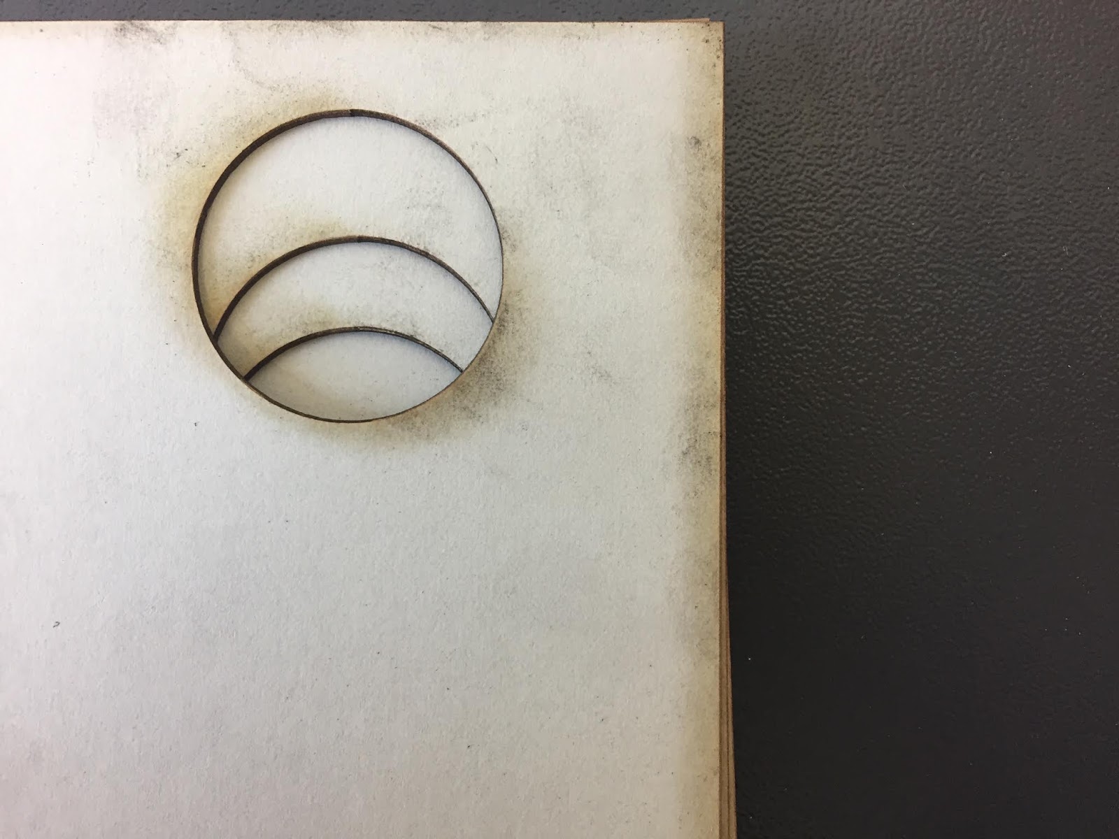
For the circle shape layout that I did, the shape and layout didn't exactly turn out the way I wanted it to. I originally wanted it, so that all 6 shapes can be seen on the first page then as flipped only one circle will be seen or it will gradually decrease. However, only three circles (3) can be seen and the other three are seen from the third page. Also, it seems that the other three (4) are identical but turned the opposite way that's probably why they are the same but not facing the right way.
1) 2)
2)
 2)
2)
For me to do this properly I should've probably did some paper mockups to show which direction the shapes should go in order for them to turn out right on the actual material. However, I do like the 3D effect that it has given giving some depth to the pages and shape, which I think also makes it more interesting and intriguing to look at than flat shapes on the page.
3) 4)
4)
 4)
4)
I also wanted to do the puzzle effect on my publication, however they also didn't work quite well through the laser cutter (5). This may be because it is a serif type therefore the terminals are really small and detailed which makes it hard for the laser cut to cut it properly without burning off the ends of the letters or the actual letters itself (7) . In addition, also because the words are all in one page the words and letters themselves were very small so the letters just falls of or have been burnt when being laser cutted to its shape. Furthermore, I may have not set the right material to cut (maybe that's also why the burnt marks are severe), so I decided to change it to something thinner. However, it didn't cut through but just engraved on the material (mount board) instead (8-9). Also, I tried a different material (black card) and changed the material setting on the laser cutter to thin card hoping it would work however it still just engraved on it (10); although actually I liked the engraved effect however, I still would've liked if my original planned would've worked.
5) 6)
6)
 6)
6)
7) 8)
8)
 8)
8)
9) 10)
10)
 10)
10)
Thoughts & Reflection:
For this experiment I feel like all the ideas that I had just didn't work out because in my head they all looked really good and I thought that it would turn out really well and just be really simple however it didn't which made me realise that I didn't really consider how the laser cutting would cut the material that I am using and the different power setting that the laser cutter have. I feel like I didn't really think about how it will actually cut but just thought straight about the final product.
To make this technique work for the design that I want, I thought of possibly changing the font to a sans serif font like Helvetica, where there are less complicated and detailed terminals so it's much more easier for the laser cutter to cut it and I would less likely lose any material from my design. My other solution is to put one word per page instead, so that the words will be bigger therefore the terminals will be much more visible and easier to cut and less likely to break as well.
However, my only problem with this is I feel like this may take away from the meaning of my design and content as there is less visual evidence of it as they are more scattered in different pages therefore it may not be as impactful to the readers and not make it as effective and communicative of my content. I feel like I just need to find a certain way of laying out my typography on the page which works for the laser cutter and benefits my publication, as well as find out certain options on the laser cut that will make the design work out.
No comments:
Post a Comment