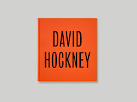
*A Practice for Everyday Life (APFEL) is a London based graphic design studio founded by Kirsty Carter and Emma Thomas.
APFEL worked in collaboration with Tate Modern in order to create a catalogue for their David Hockney exhibition in 2017. APFEL wanted to focused on Hockney's charisma as an artist and therefore used images of young Hockney in both front and back covers as well as recent photographs of the artist. This helps take the viewers on a journey throughout the book and help them realise the changes throughout the decade and how Hockney's style and techniques have changed. I think doing shows how they really considered the artist as well as the audience as I feel like they have thought about creating this book from the audiences' perspective. There's also the consideration of using chapters within the book. Although, it may seem like a small detail, I feel like having separate sections of the book really emphasises the different era's in Hockney's life. In addition, it's also a great way of phasing the book, as it's a book with over 200 pages, it can easily be overwhelming therefore creating chapters allows the readers to read which chapters they'd like and at the same time give them some space in between each reading.
APFEL also gave importance to their use of typography. Carter mentioned, "...we wanted this sort of presence of the opening chapters to be on their own and the type just singing to itself, rather than it being in juxtaposition of the text and image". Their choice of a type only chapter opener pages gives "breathing space between plate sections" - like I said before it helps creates space .It may be kind of obvious but it also makes the readers pay attention as well as get ready for the chapter that they're about to read.
Their consideration for type goes far and beyond by choosing the font 'Bureau Grotesque Condensed'. The decided to gave greater context to the use of typography as another way of implicitly relating it to David Hockney which I think was very clever. As 'Bureau Grotesque Condensed' was created in a foundry (Stephenson Blake) in Sheffield in the 1800's which is in the county (Yorkshire) that Hockney is from. Though it may be unnoticeable unless explained I think it's still a great way of highlighting the content and putting the typography in context with the content. I think, this makes the typography even better as it has a much deeper meaning and context behind it rather than just using a typography which may fit the tone of the book and has vague connotations to the context.
"Our objective was to create something that felt appropriate and had an affinity with Hockney's work, without being too directly referential.
Furthermore, APFEL also played around with using scale. Their usage of scale in relation to Hockney's work is probably the most notable in the book. As they explained Hockney has various ways of working and styles of working, the scales of his work vary as well therefore using this in order to play around with scale in the book is quite interesting. Having a full bleed image on one page may give you a different impression in comparison to a small image on another page, which reflect Hockney's painting and his style onto the page making it effective and communicative to the readers as they will get to experience the essence of Hockney's work and style through the book itself.
Thoughts & Reflection:
Overall, I really liked how well-thought out and detailed this publication was. APFEL effectively captured Hockney as an artist through implicit and non direct contextual references which runs throughout the book consistently. I think it also answers the 'brief' perfectly as the book was to coincide with Tate Modern's Hockney exhibition. The thing that really stuck to me was their consideration for the typography. As my publication may or will be heavily reliant on typography, I would also like to use or manipulate typography as a way of implicitly giving contextual reference to my publication, as I feel like it will make it much more meaningful and support my brief stronger than choosing a typography which only meets the surface of the context and content of my publication. APFEL's detailed interpretation and understanding of their content and context has inspired me to do similar to my publication in a way that will enhance it's quality and communicate effectively to it's target audience.
https://www.itsnicethat.com/articles/nicer-tuesdays-march-2017-talk-a-practice-for-everyday-life-110417
https://apracticeforeverydaylife.com/projects/david-hockney-2
http://www.ripostemagazine.com/a-practice-for-everyday-life/
https://www.youtube.com/watch?v=O5FVQtvL3Tk


No comments:
Post a Comment