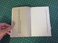
I tested the binding on an A6 size as I thought it would give me an idea of how small I want the book as I want it t be comfortably held by the reader and something they can read on the go. As for the type on the book (1) it's just a sample title that I wanted to try out. I used Helvetica as I thought a simplistic san serif type would be fitting for a quick read book and I thought that maybe using a simple typeface won't take away the focus on the composition and layout of the words and letters as well as the pages of the book. In number 2, I tried different cut through shapes which I may use in the actual pages of the book, I was thinking of maybe layering the shapes as the pages are flip and reveal something as it goes along (e.g. a sentence) which will keep the readers intrigued making them 'work for the book' and to get the information that they want or is made to do.
I also played with how the sentences will be laid out and composed on the pages (3,4), taking into the account if the pages will be cut etc. I kind of like how the sentences are laid out although it doesn't really follow a grid system, instead it may follow how the pages will be cut out of flipped. However, although the type won't necessarily be the most important aspect of the publication, it's also important that I consider where and how I lay them out on the page as they act as the visual mechanisms that will guide the readers through the publication. In regards to paper stock, I think using a sugar paper material or paperback book material will be ideal for this kind of binding as it will allow me to add lots of pages within and still be quite sturdy and strong at the same time able to glue together easily.
Thought & Reflection:
This binding method may be one the most suitable methods for my publications as it's very functional and does the job. However, if I was to be really adventurous and extravagant with the content pages of my book, it may not suit the overall aesthetic of my publication as the normal binding may make the whole publication look separate and confusing. In addition, the binding may also make it hard for reader to flip the pages when there's tip ins and extra pages, as I'm intending to put possible tip in's in the book. On the other hand, functionality wise it's a great binding method as it can hold lots of papers together and can be used for both paperback hardback covers. I feel like after I listed what I thought about this binding method, it may not be the best binding method for my publication. I will continue experimenting with other binding methods so that I can maximise the reader experience of the book as I feel like that is the main objective of my brief and my publication overall.


No comments:
Post a Comment